Gabe Abadilla
 Gabe Abadilla
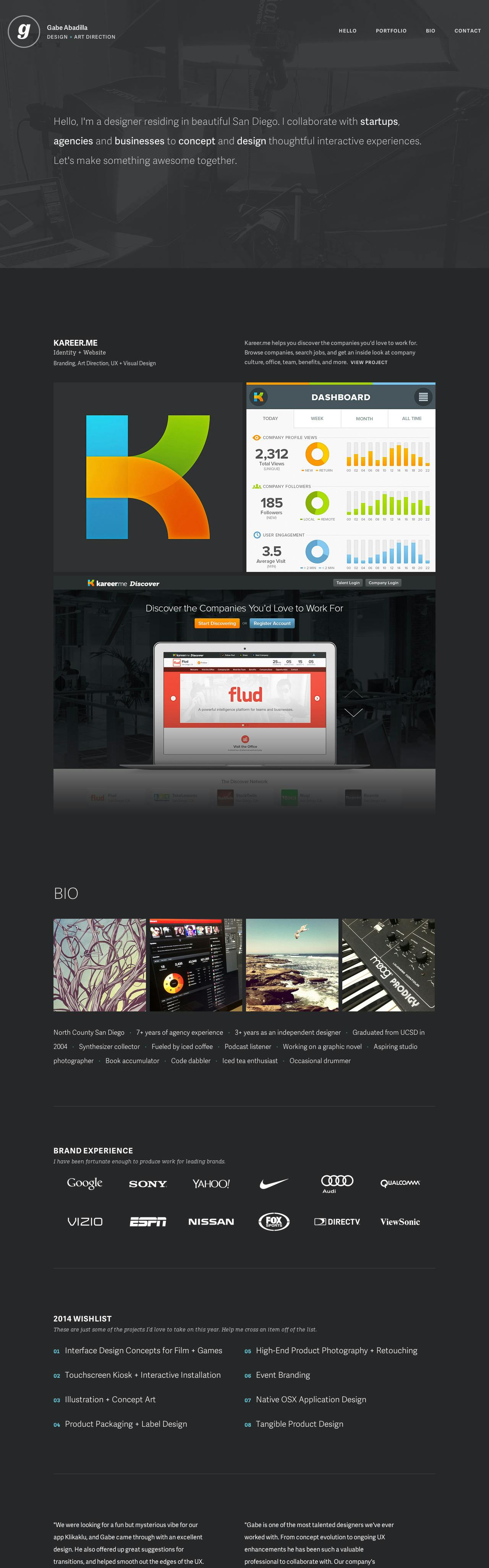
Beautiful dark color scheme and spacious arrangement of content in this (super) long One Pager for US designer and art director Gabe Abadilla. I’ve edited the screenshot with a fadeout after the first portfolio item so the One Page screenshot isn’t crazy long.
I think Gabe has nailed the arrangement of content bringing focus on his (well presented) work followed by very slick organization of client logos, bio, contact information and social networks. Lovely touch with the subtle fade-in navigation as the user moves their cursor towards the menu icon. I love how he has laid out his bio in point form and I can appreciate how he states what specific work he is after.
Loads of breathing room, slick arrangement of content and a very good responsive adaption awards this One Pager ‘Most Loved’!
This website has unfortunately been redesigned or gone offline, so I have removed the direct link to it. The screenshot below hopefully preserved enough of the design but if you are really keen to inspect further, try this Archive.org link. FYI: the site was first featured on 05 February 2014.