Choose Home
 Blue Stag
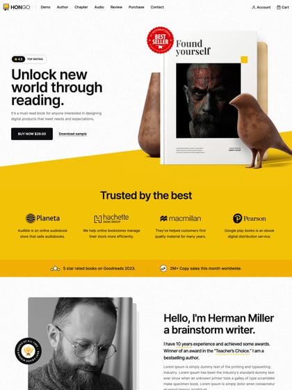
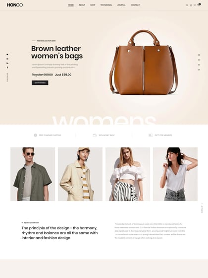
Neat parallax effect and zoom of the tees as you begin to scroll this Landing Page for the Choose Home non-profit campaign.
This website has unfortunately been redesigned or gone offline, so I have removed the direct link to it. The screenshot below hopefully preserved enough of the design but if you are really keen to inspect further, try this Archive.org link. FYI: the site was first featured on 29 April 2020.

