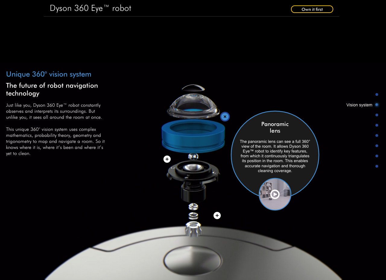
Dyson 360 Eye robot
Author unknownParallax scrolling and interactive One Pager that allows a potential customer to explore the technology of the Dyson 360 Eye™ robot. Definitely feels like some inspiration taken from the recent Apple Mac Pro Landing Page but all good. Make sure you rather use the dot navigation to the right opposed to scrolling, the experience is just a bit better.
This website has unfortunately been redesigned or gone offline, so I have removed the direct link to it. The screenshot below hopefully preserved enough of the design but if you are really keen to inspect further, try this Archive.org link. FYI: the site was first featured on 16 September 2014.
