Ladniej
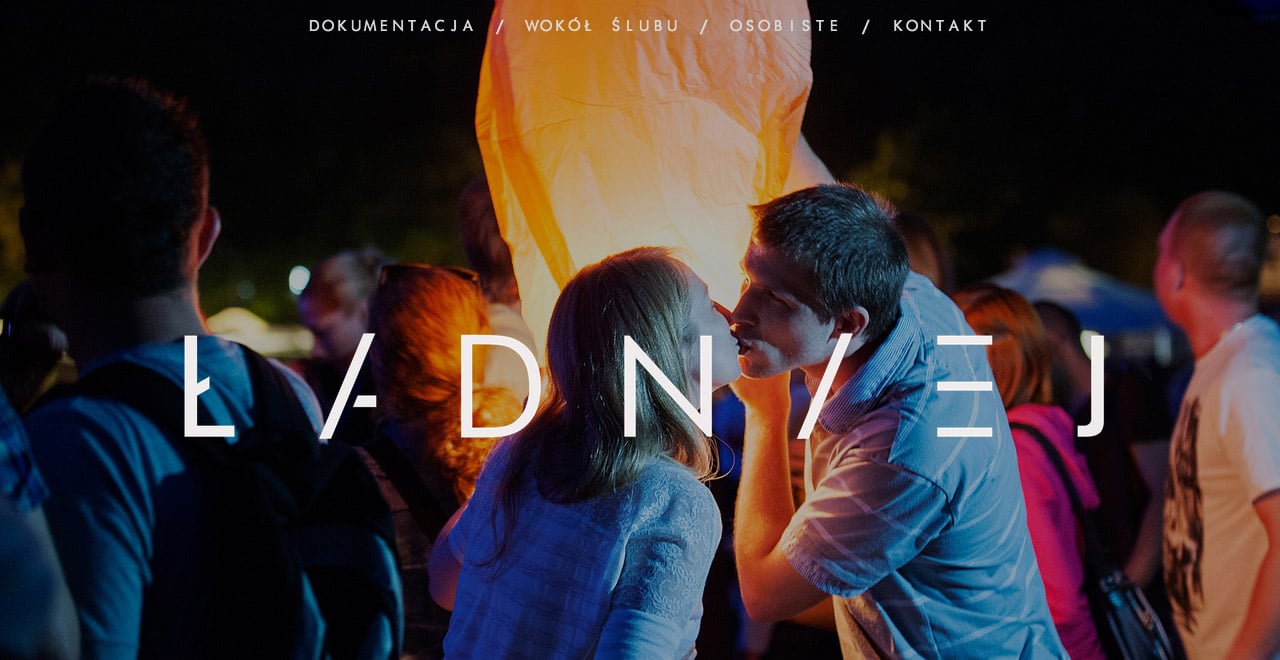
Author unknownUnique layout in this One Page portfolio for Polish photographer, Bogna Kociumbas. I’m not sure if I 100% agree with the UX (with the +’s and x’s) but the imagery is super quality and it eventually leads to a clear contact form. Also love the intro load transitions with the logo.
This website has unfortunately been redesigned or gone offline, so I have removed the direct link to it. The screenshot below hopefully preserved enough of the design but if you are really keen to inspect further, try this Archive.org link. FYI: the site was first featured on 23 July 2014.
