Nike Better World
 Nike
Nike
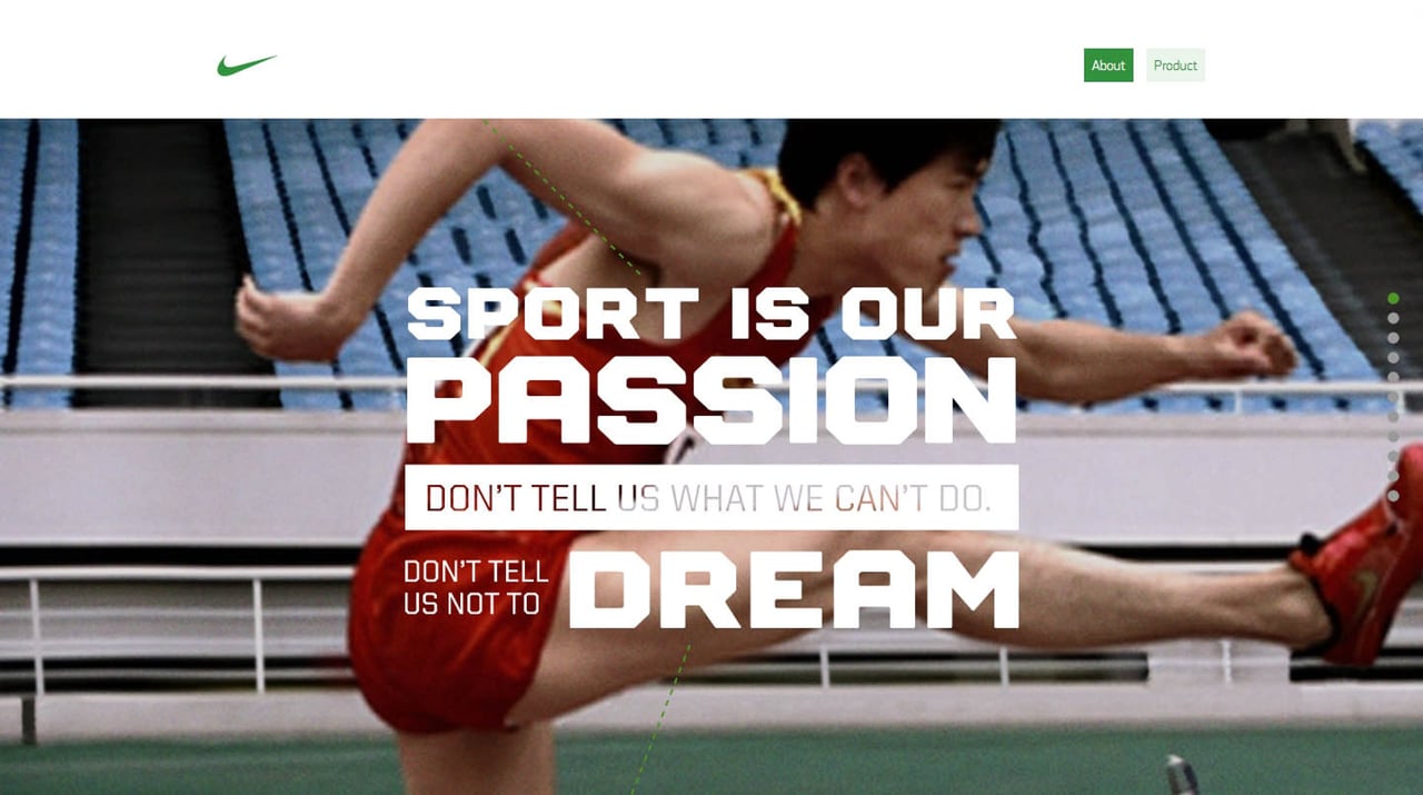
One Page Website for the iconic 2011 Nike Better World campaign. What makes it iconic is this was the first mainstream use of the Parallax Scrolling effect in a Landing Page. The website is no longer online but preserved in this video. Ian Lunn has documented how to recreated the website here and Smashing Magazine have gone behind the scenes here.
This website has unfortunately been redesigned or gone offline, so I have removed the direct link to it. The screenshot below hopefully preserved enough of the design but if you are really keen to inspect further, try this Archive.org link. FYI: the site was first featured on 05 January 2011.
