Nique Woodhouse
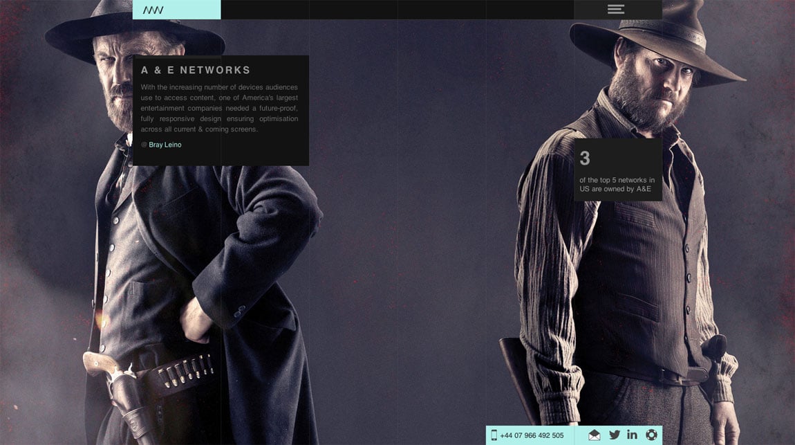
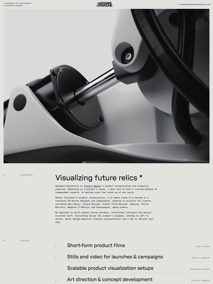
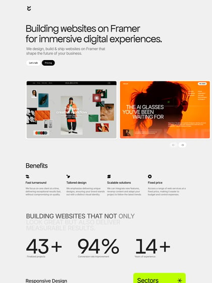
Author unknownFor some reason I’m just loving the big imagery and flow of Nique Woodhouse’s portfolio. Each project only has a handful of big beautiful images, a mini project overview and an impressive post-launch stat. All that along with the subtle keyboard nav infographic makes this One Pager feel so uncluttered and minimalistic. Great job Nique!
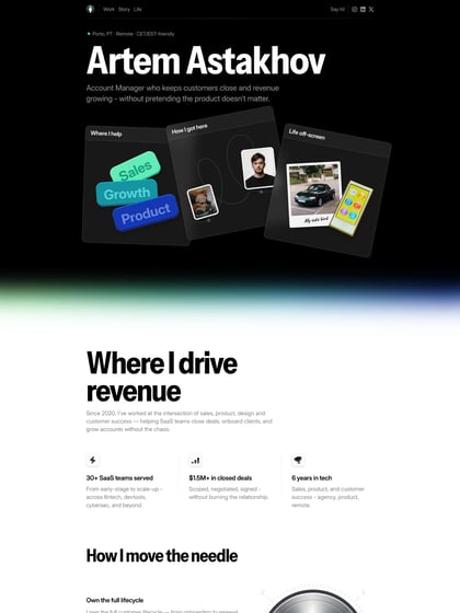
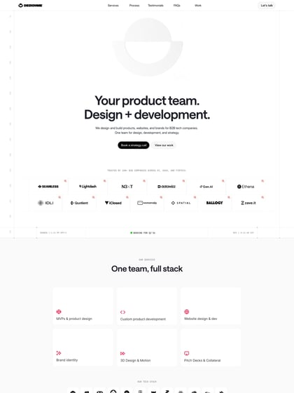
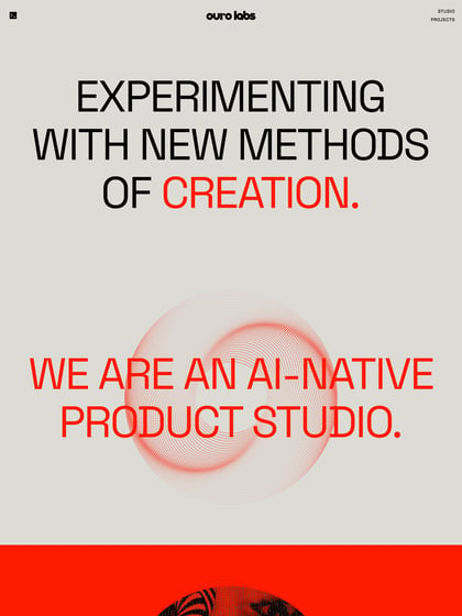
This website has unfortunately been redesigned or gone offline, so I have removed the direct link to it. The screenshot below hopefully preserved enough of the design but if you are really keen to inspect further, try this Archive.org link. FYI: the site was first featured on 25 February 2013.
