PixelZeesh
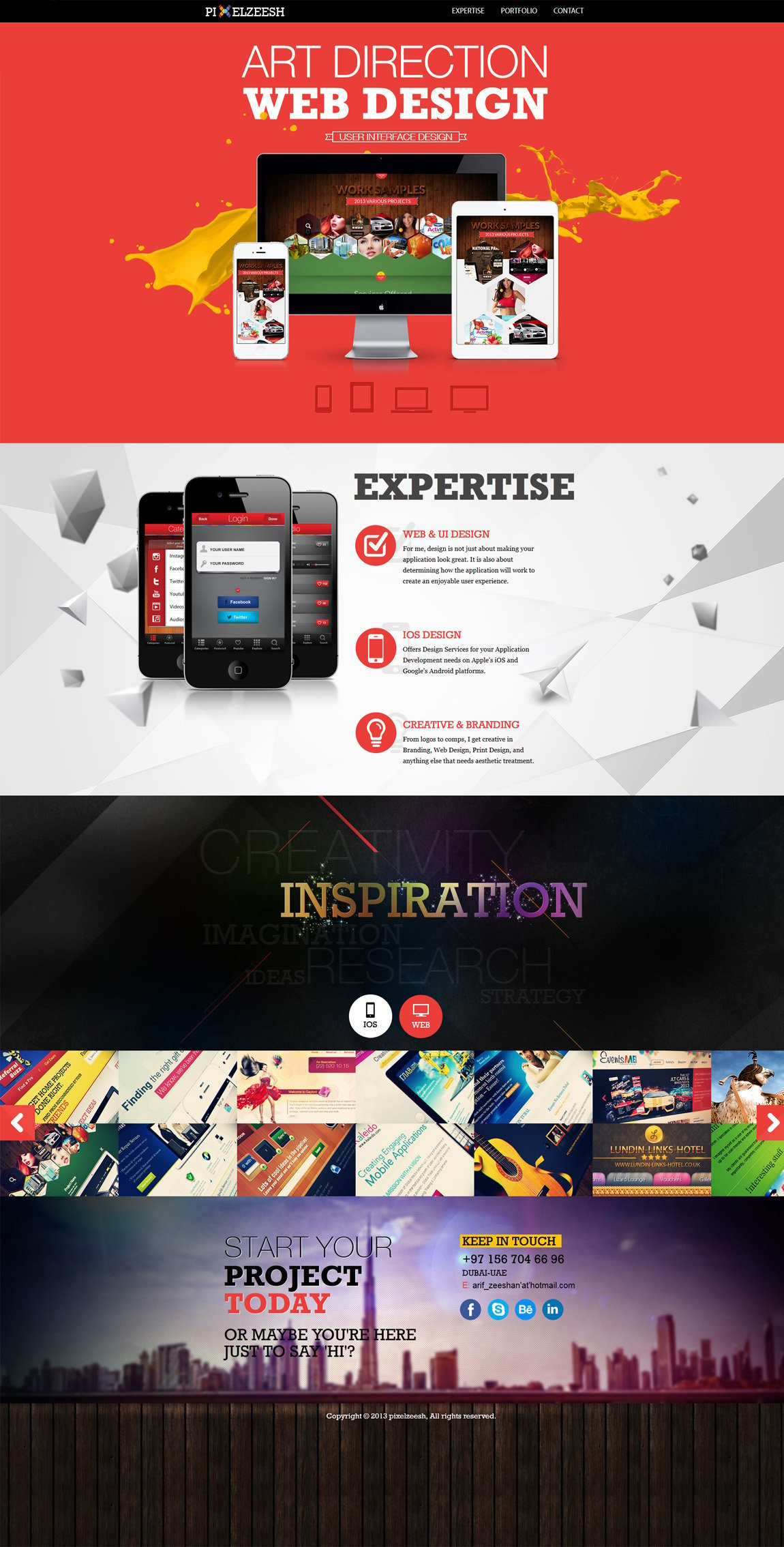
Author unknownThe design of this colorful One Page portfolio is great but I can’t stop looking at the “User Interface Design” banner in the first section, seems off.
This website has unfortunately been redesigned or gone offline, so I have removed the direct link to it. The screenshot below hopefully preserved enough of the design but if you are really keen to inspect further, try this Archive.org link. FYI: the site was first featured on 30 April 2013.
