Planetary
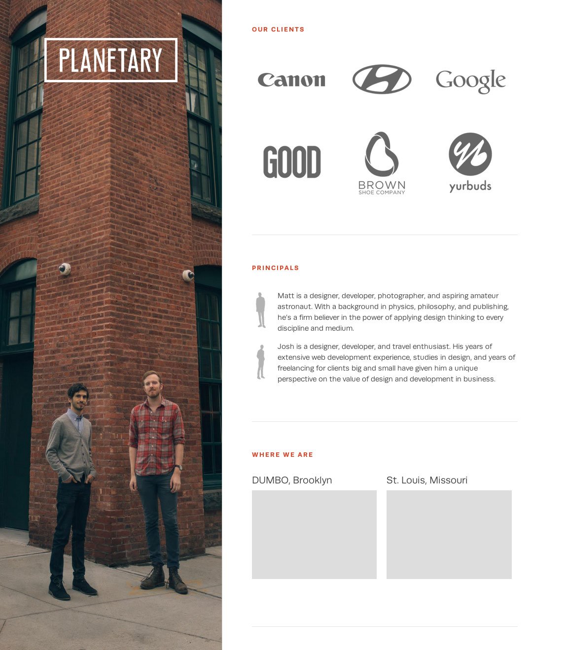
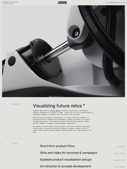
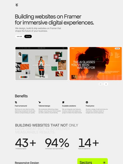
Author unknownAmongst all the conventional portfolio layouts its great to see something fresh. This unique left aligned One Page portfolio for dev duo, Planetary, features two columns that move at different speeds as you scroll down the page. Also a nice touch with the team bio section that uses a miniature silhouette of the big image to the left.
This website has unfortunately been redesigned or gone offline, so I have removed the direct link to it. The screenshot below hopefully preserved enough of the design but if you are really keen to inspect further, try this Archive.org link. FYI: the site was first featured on 05 December 2013.
