Sakari
 Matteo Modica
 Sublimio
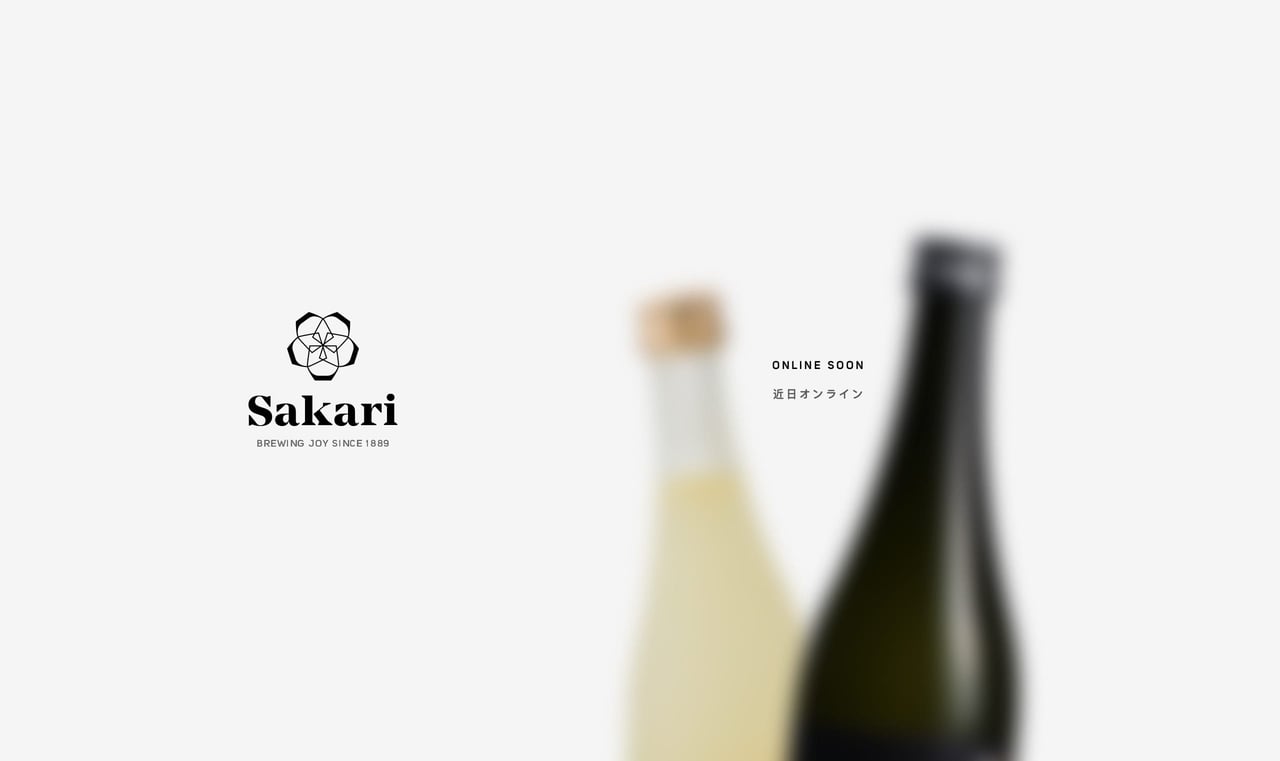
Minimal launching soon page for Sakari sake. Neat touch with the initial blurred bottle animation. Also note how the text stays between the two bottles on all resolutions. A great reference to lovely attention-to-detail, even on a seemingly simple site.
This website has unfortunately been redesigned or gone offline, so I have removed the direct link to it. The screenshot below hopefully preserved enough of the design but if you are really keen to inspect further, try this Archive.org link. FYI: the site was first featured on 26 October 2020.
