← All typefaces
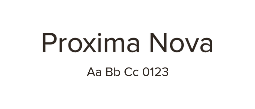
Proxima Nova
Proxima Nova combines geometric shapes with a more traditional sans-serif text rhythm. It is a useful reference when you want a website to feel approachable without a strongly decorative type style.
- Style
- Sans serif
- License
- Paid license ↗
- Designer / foundry
- Mark Simonson Studio ↗
Affiliate link. We may earn a commission if you buy through this link.
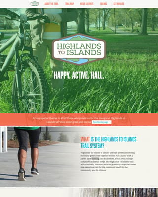
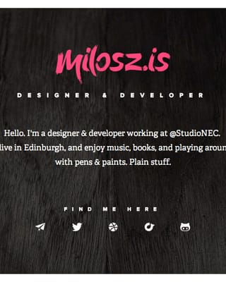
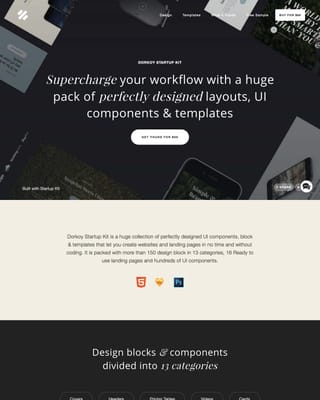
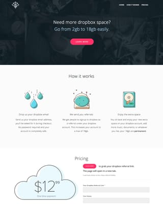
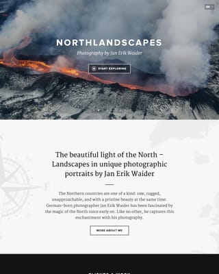
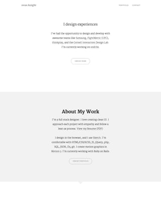
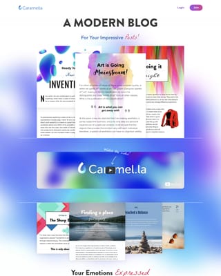
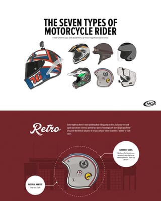
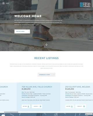
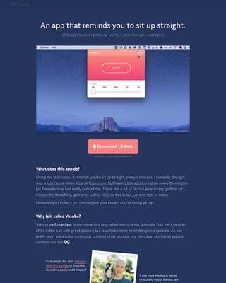
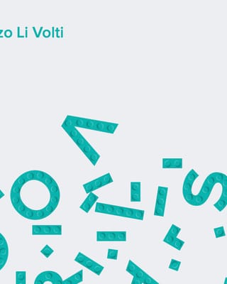
Websites using Proxima Nova



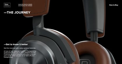



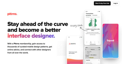
Proxima Nova font pairings
Used together in our collection. Open the examples to see how each design combines them; font credits do not specify which font is used for headings or body text.





Alternatives to Proxima Nova
Montserrat
FreeA stronger geometric heading direction; compare the wider forms and paragraph texture.
Explore typefaceLato
FreeA warmer humanist alternative when reading rhythm matters more than matching geometric details.
Explore typefaceManrope
FreeA geometric option with a contemporary feel. Test its numerals and heading widths.
Explore typeface