More Metric Examples
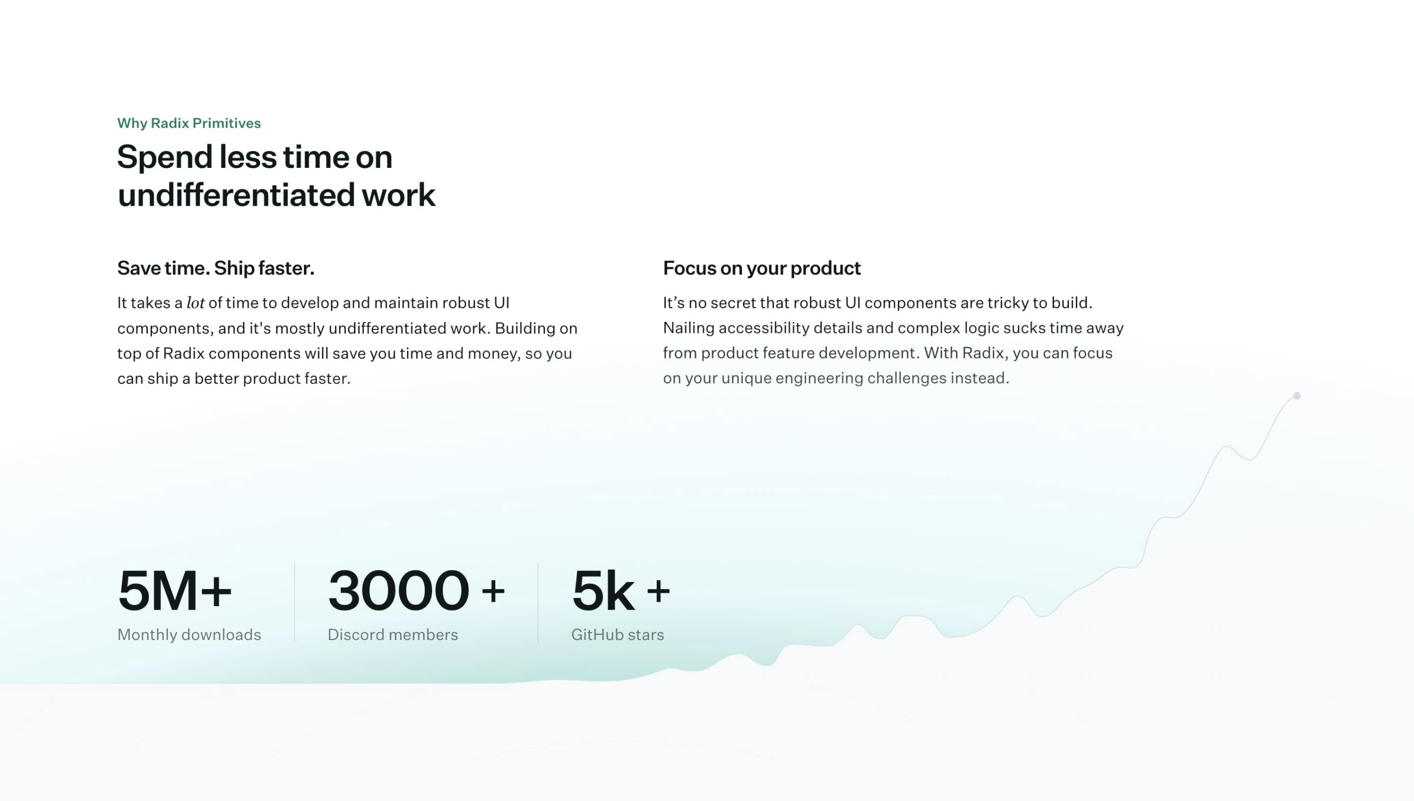
Clever use of landing page section whitespace to create this beautifully designed graph under the Radix UI metrics.
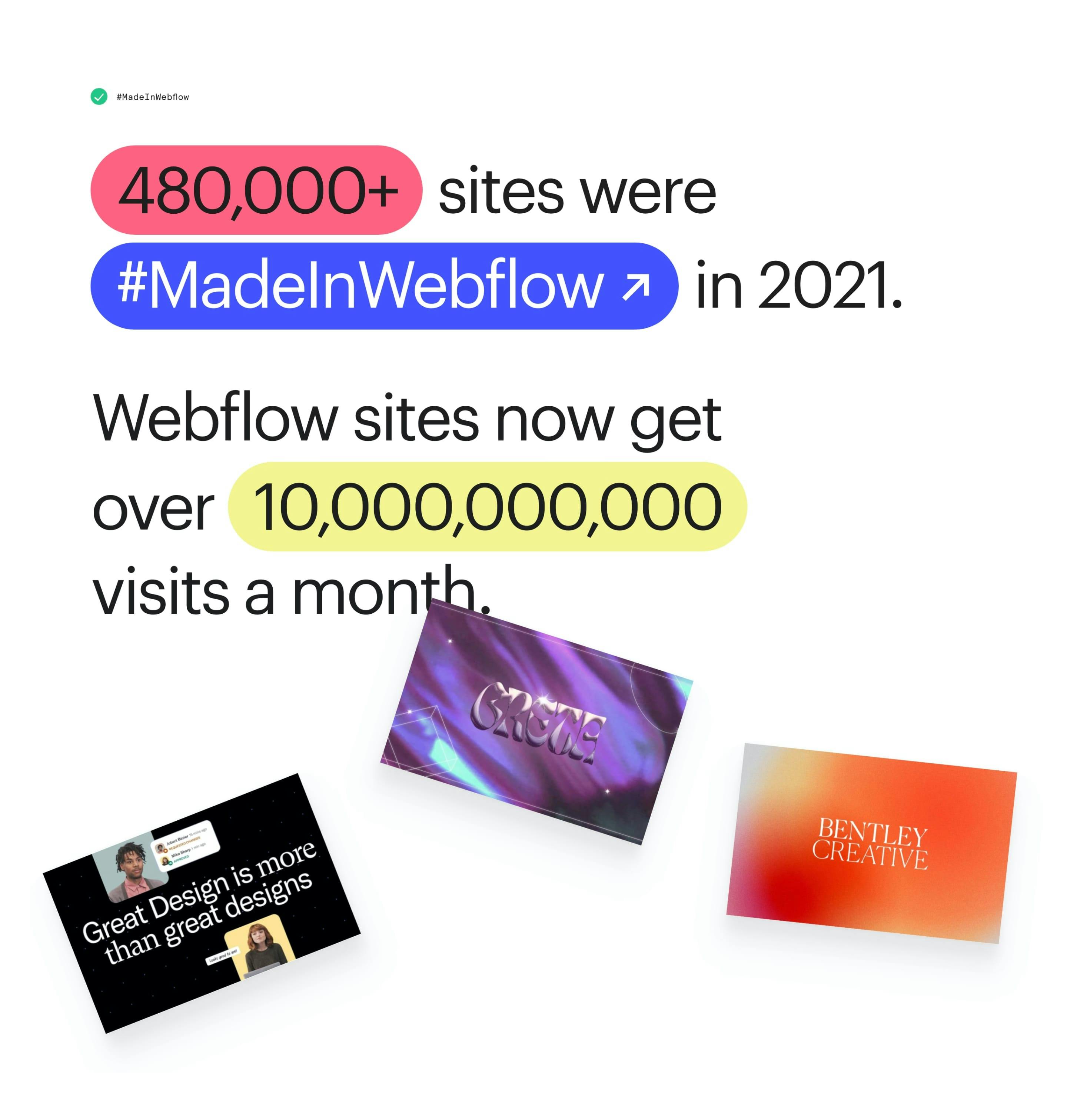
Neat touch with the hand drawn highlights, after the load animation.
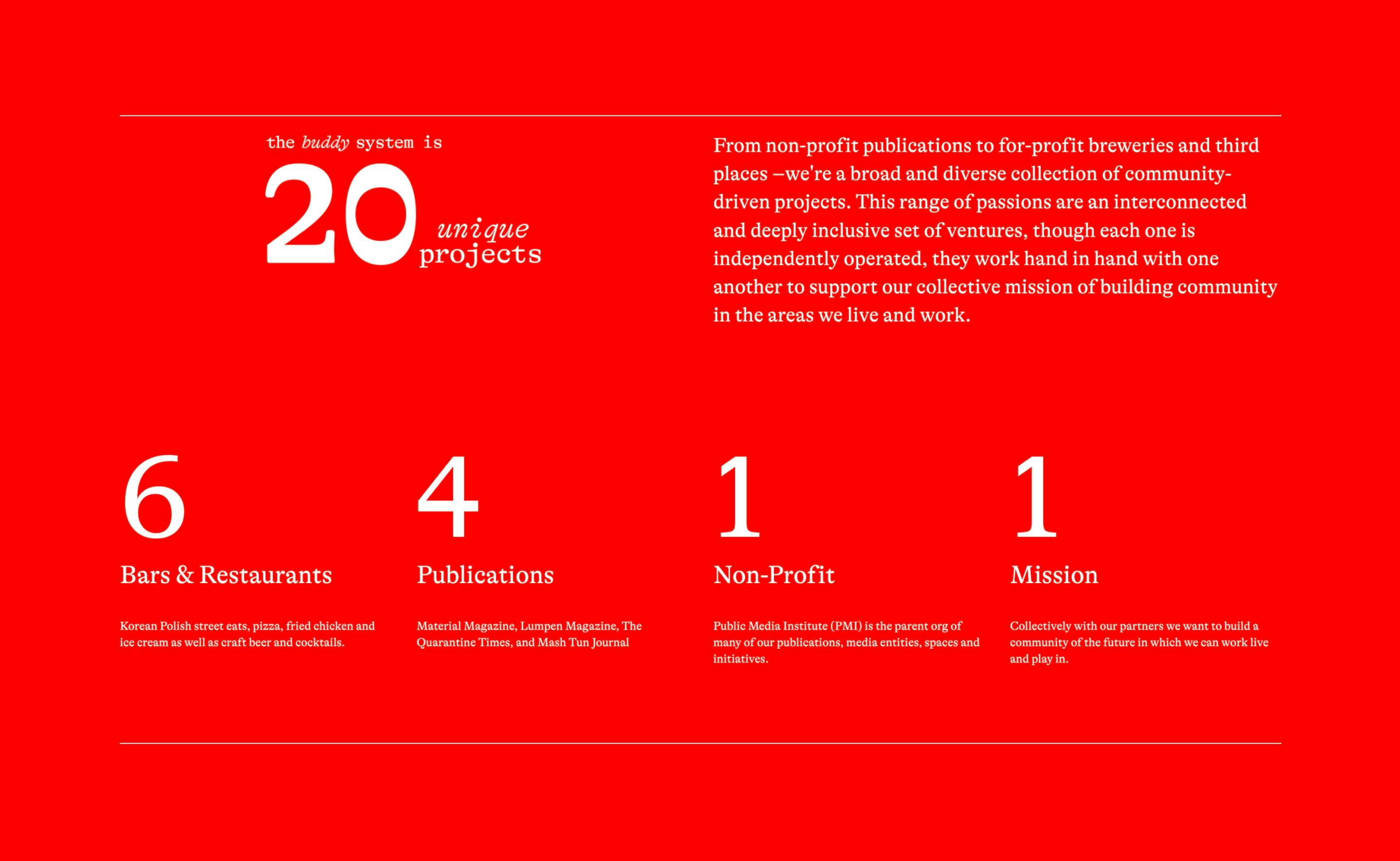
Hectic red this but neat layout with unique typeface.
