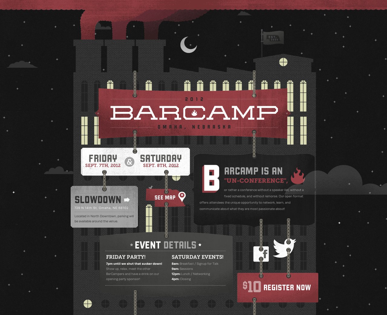
Barcamp Omaha 2012
 Grain & Mortar
Such great work on the illustrations, the animations and parallax scrolling with the clouds. Check out our interview with Creative Director, Michael DeKay, where we talk about the build.
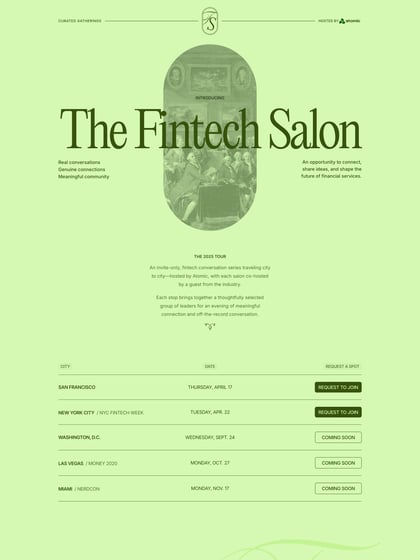
This website has unfortunately been redesigned or gone offline, so I have removed the direct link to it. The screenshot below hopefully preserved enough of the design but if you are really keen to inspect further, try this Archive.org link. FYI: the site was first featured on 29 July 2012.
