Bobby
 Yummygum
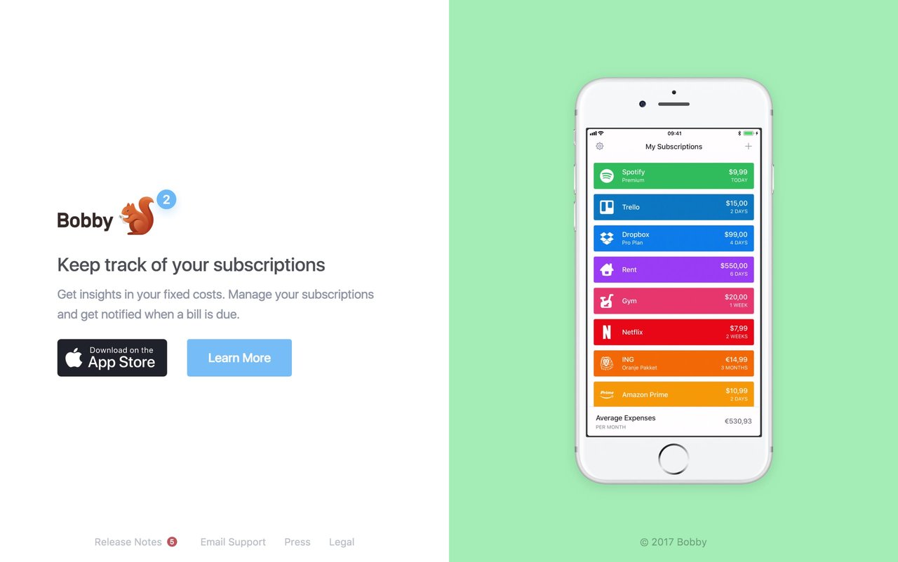
Minimal centrally-divided One Pager for Bobby subscription tracking app featuring info left and a clear device demo to the right. Lovely touch with the subtle “Learn More” transition in the left frame. Make sure you read the case study with insight on the logo and color palette of the app.
This website has unfortunately been redesigned or gone offline, so I have removed the direct link to it. The screenshot below hopefully preserved enough of the design but if you are really keen to inspect further, try this Archive.org link. FYI: the site was first featured on 09 October 2017.
