The team members are fixed position to page edge, and central member - at a lower z-index - for smooth overlapping on small screens. Brilliant. See demo here.
More Team Section Examples
Consistent card layout with member left and titles top-right, organized into a neat grid layout.
Square One have divided their team section into Family (co-founders) and Friends (devs, designers & subcontractors).
Really appreciate the extra effort illustrating all the team members. Everyone is so well presented and even includes their fav quote + team nickname on hover.
Look at these happy docs, a team section that makes you feel they really care (and love what they do).
You get a good feel for the team work environment within the shape slider.
Lovely touch with the casual and business mode slider. A client wants to feel the team they're potentially hiring will be approachable during the process and this eases those concerns.
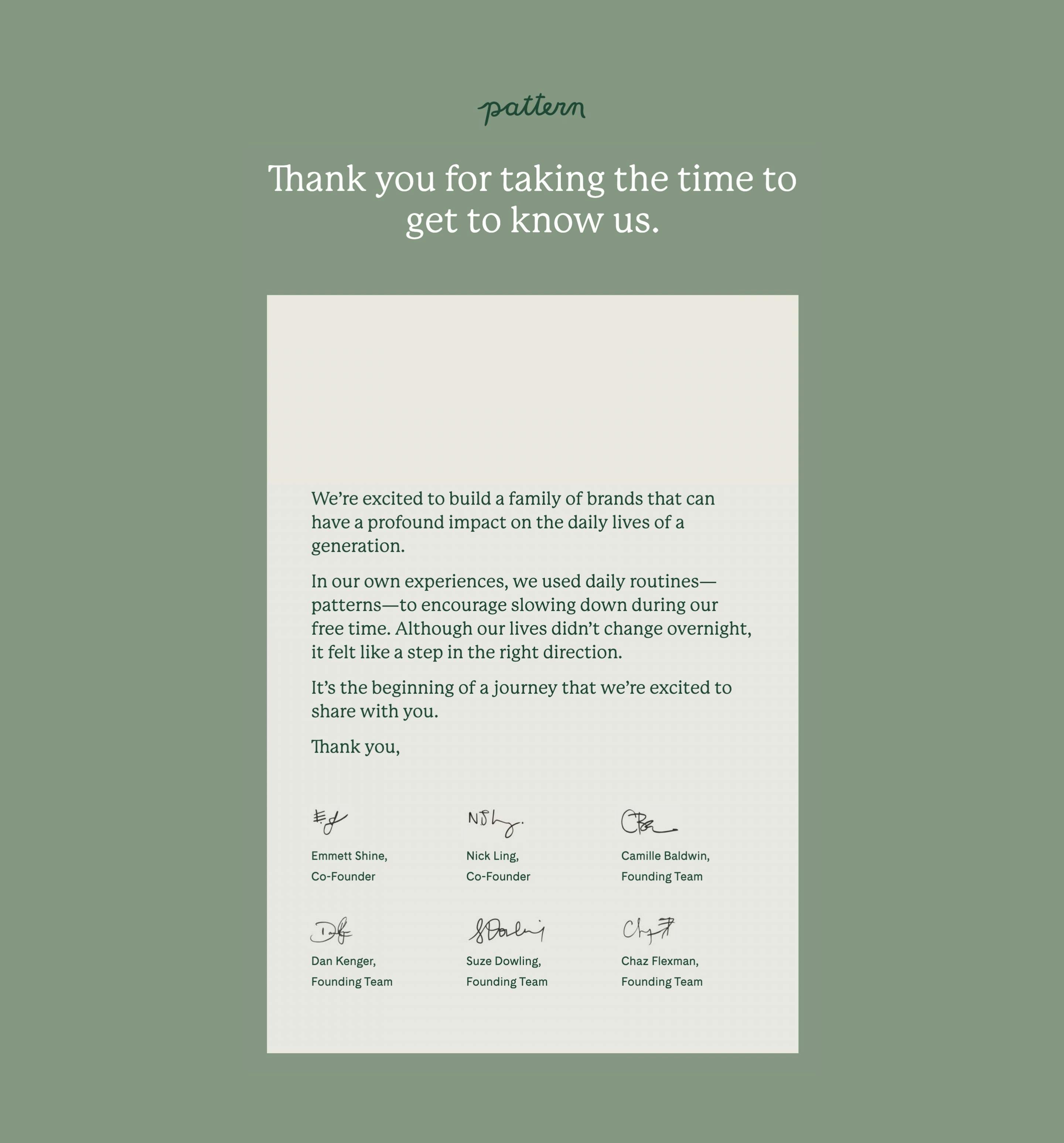
Lovely touch adding member signatures in a note styled team section. I captured this years ago and unfortunately it's no longer online. Glad it's safely preserved now.
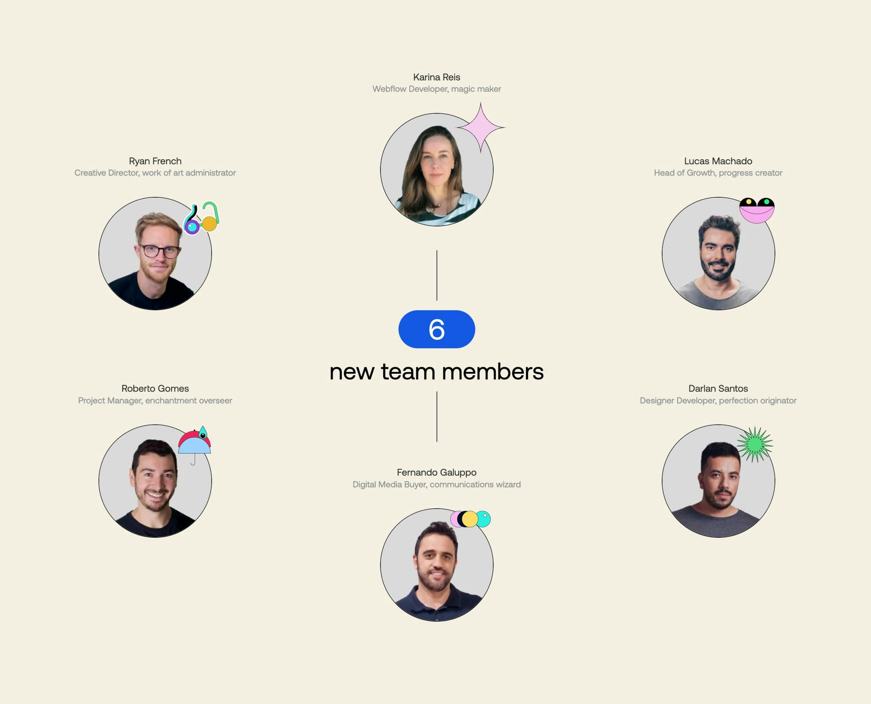
Neat infographic highlighting the new team members joining.
