Feels
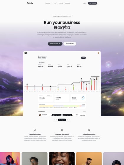
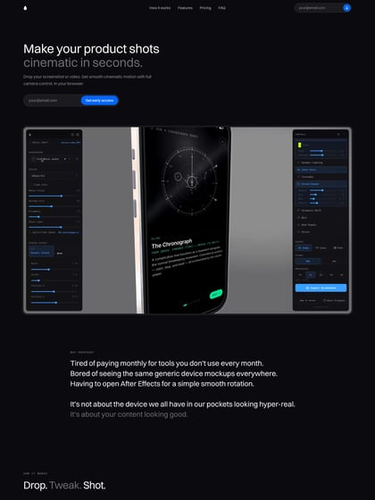
Author unknownClean, minimal One Pager with good whitespace for ‘Feels’ – an app that helps influencers and creators collaborate with brands. Love how they handled the multiple client logos with a subtle animation vs a slider. Quick shout out to this monster .com domain O_o
This website has unfortunately been redesigned or gone offline, so I have removed the direct link to it. The screenshot below hopefully preserved enough of the design but if you are really keen to inspect further, try this Archive.org link. FYI: the site was first featured on 06 December 2016.

