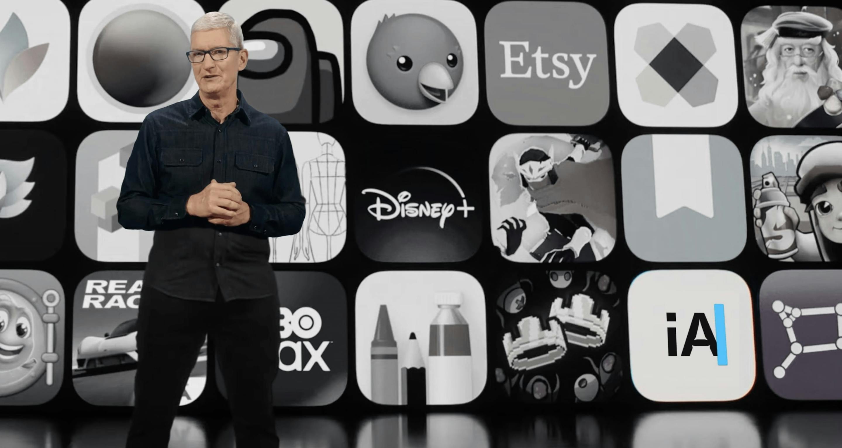
Huge boost of social proof having their product featured on an Apple keynote
More Testimonial Examples
Buckle up. We have well known opinion leaders, talking about transformation (where the service took them), sharing solid metrics, as well as embedding the actual client videos within the slider. So we're not just telling them, we're showing them. Dare I say this as good as a testimonial slider can get.
Loads to love here. On the UX front; the expansion of the arrows on hover and the subtle bounce animation on the cards. On the content front; highlighted takeaway up top, good avatars, their company positions plus brand logos for a bonus visual reminder.
Seen a lot of "Tweet testimonials" in my day. This was by far the most fun!
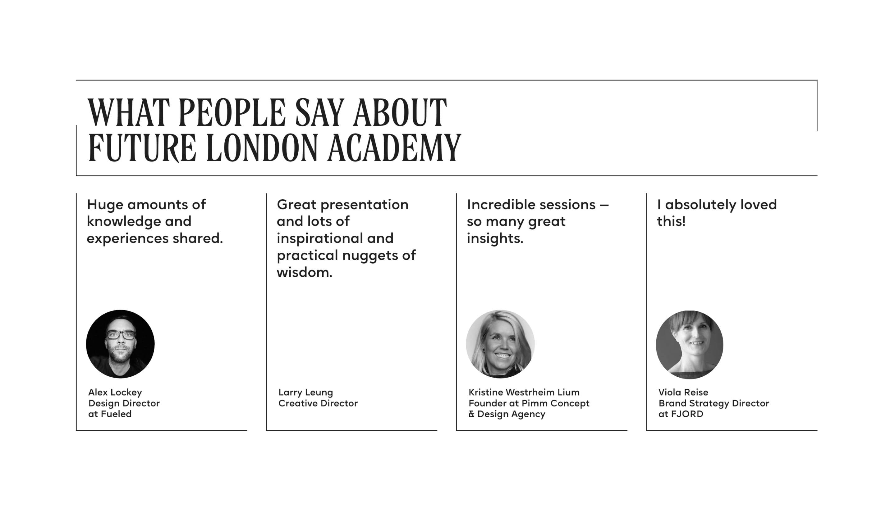
Minimal line aesthetic, includes companies for credibility
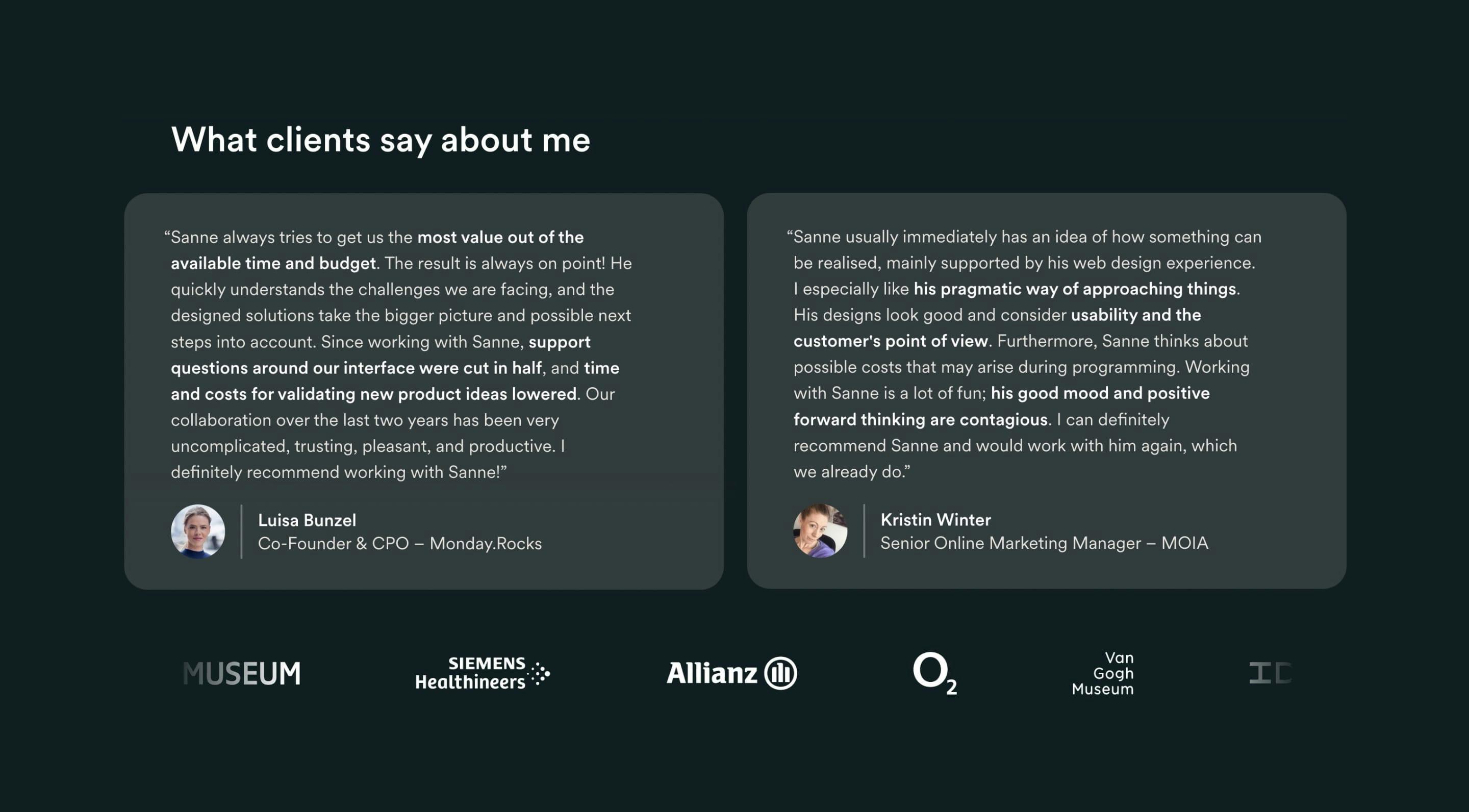
Client logos scroll with fades on ends
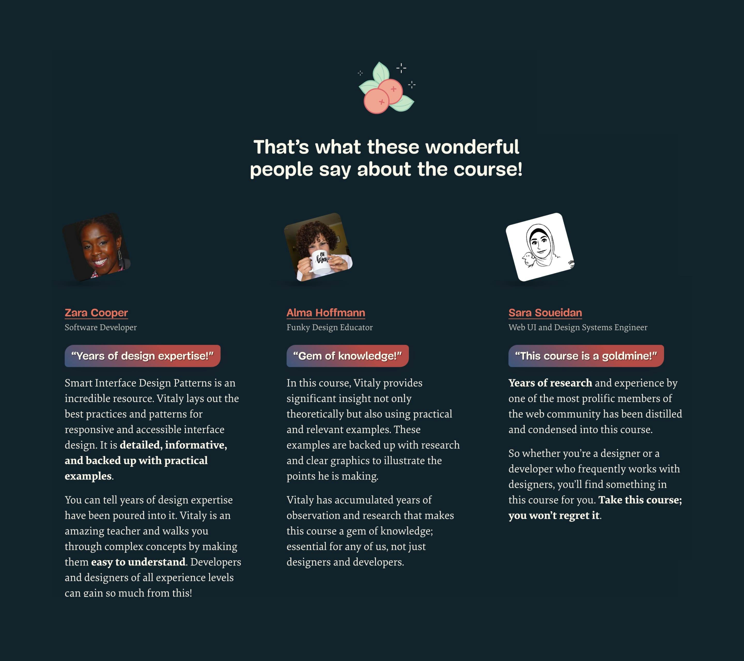
Summary extracted into a colorful gradient block
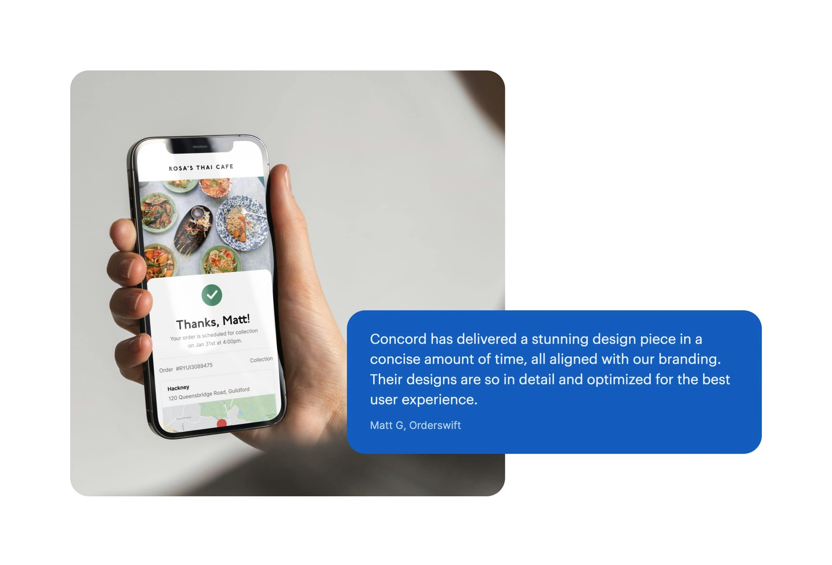
Testimonial user’s name pairs with app screenshot name, also hand held, bang bang
