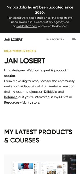
 Mobile hero view
Jan Losert
 Jan Losert
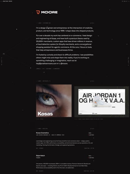
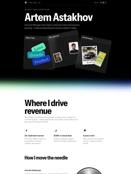
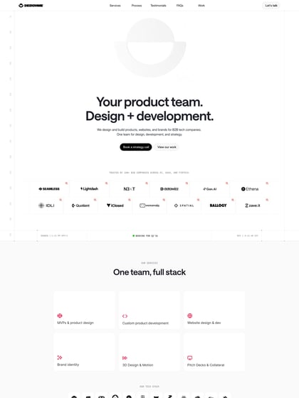
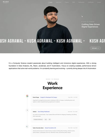
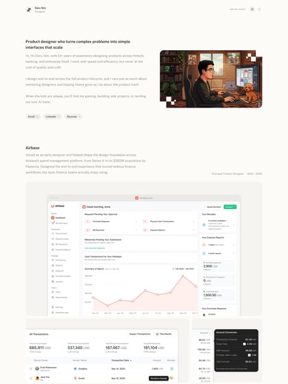
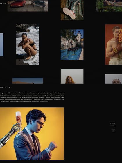
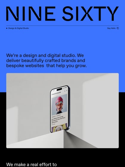
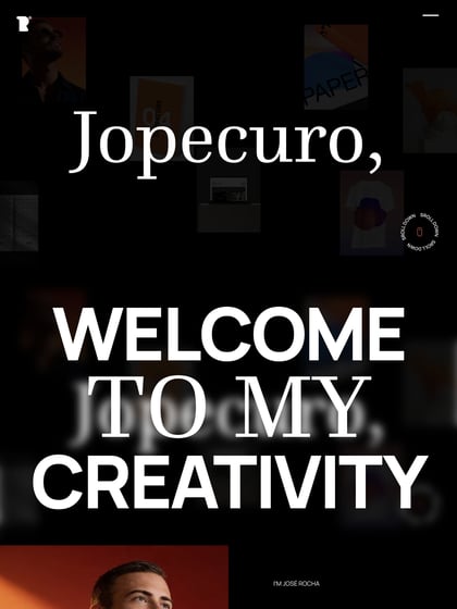
Lovely One Page portfolio redesign that fills a large screen well for UI designer, Jan Losert. The Singe Page website features a slick load animation, a super subtle parallax effect as you start to scroll and great use of whitespace with big clean typography. Make sure you resize your browser to see the attention to detail on mobile resolution – a completely different header design. Lastly, what a lovely touch with that custom 404 page with a different photo of himself. Great to see Jan stick to the One Page format since we featured him back in 2014!

