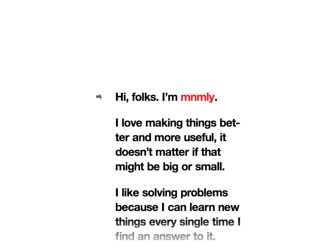
mnmly
Author unknownWe get a lot of submissions going for that an uber minimal approach to a One Pager – which is actually the hardest to pull off well and often looks quick and dirty. This is a great reference of a very minimal One Pager with some added love.
Yes, it’s Helvetica but it’s clean with a lovely touch of a fading white gradient at the top and bottom of the page when scrolling. The links are a simple prominent red but also feature a neat glitch effect on hover. The fixed position minimal logo really allows us to remember the brand as we read. Lastly he has some fun with the class and ID naming when you dive deeper into the source code.
I’ll leave you with this… next time you create your “super minimal” One Pager ask yourself, if you were the visitor – is the page interesting enough for the user to want to know more (and follow you).
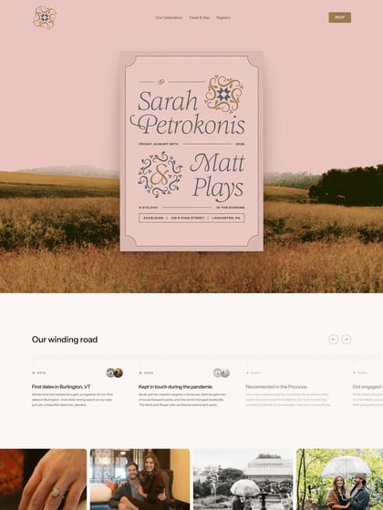
This website has unfortunately been redesigned or gone offline, so I have removed the direct link to it. The screenshot below hopefully preserved enough of the design but if you are really keen to inspect further, try this Archive.org link. FYI: the site was first featured on 17 March 2014.