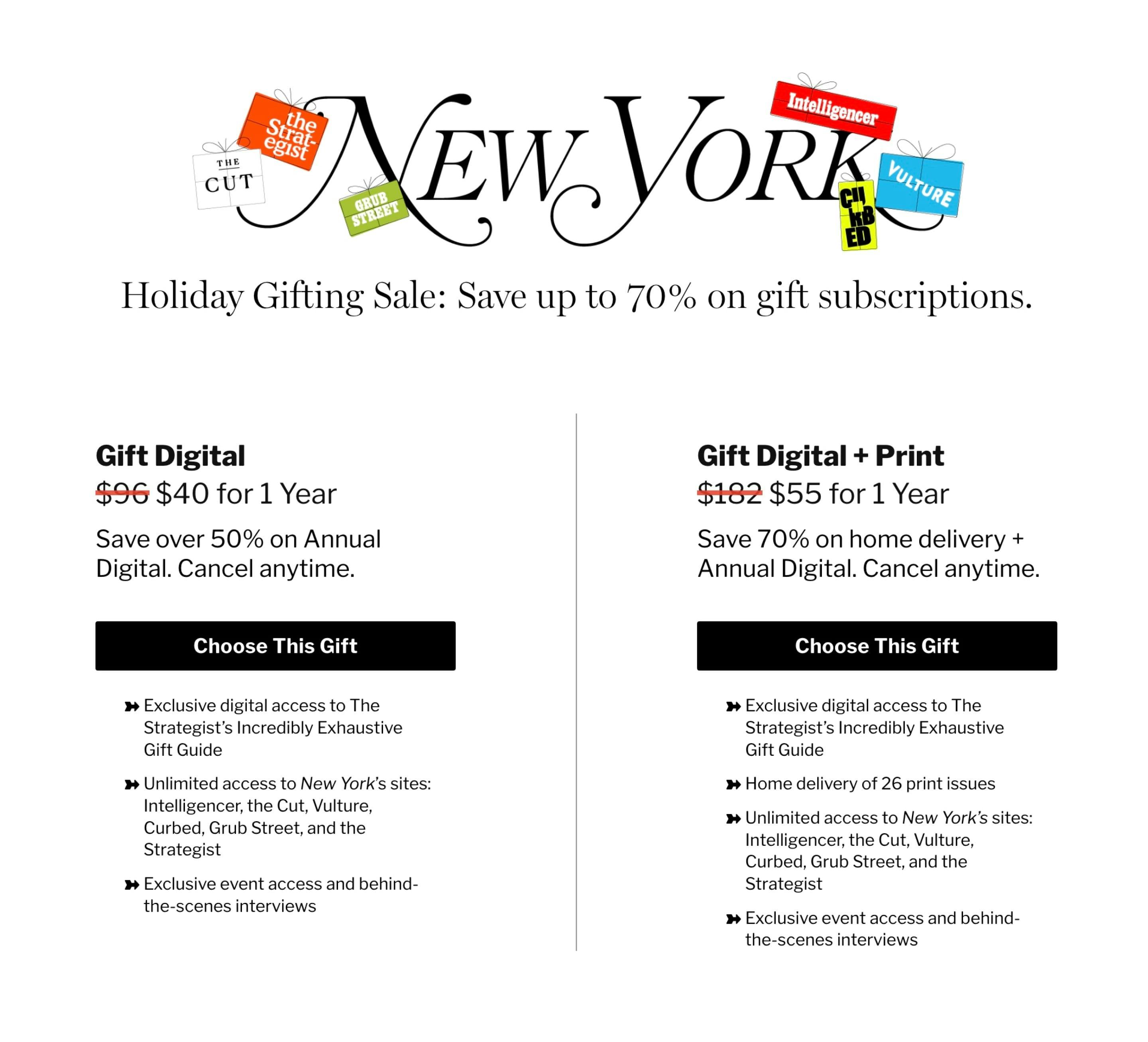
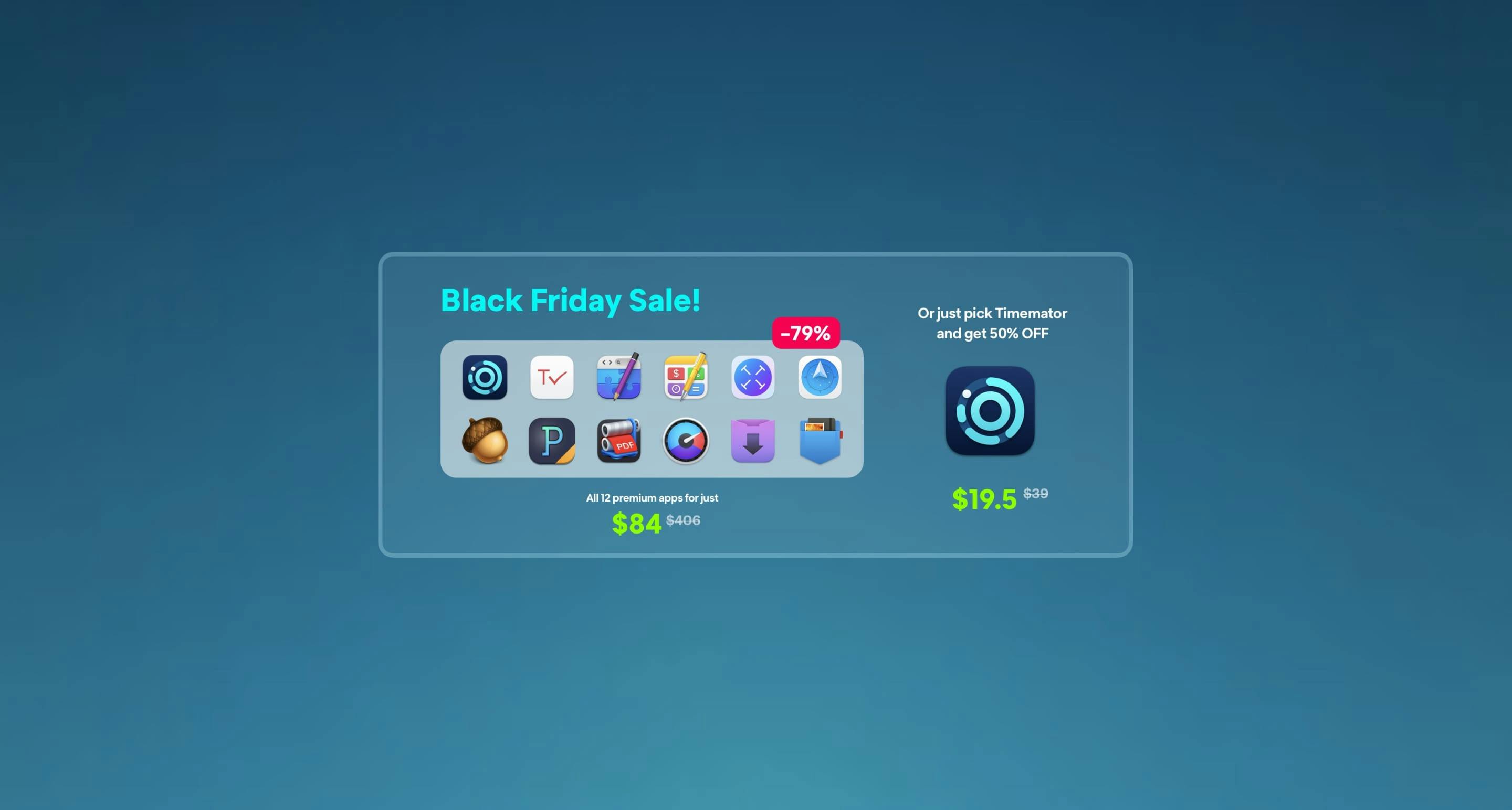
Lovely touch wrapping up their brand logos like parcels.
More Pricing Table Examples
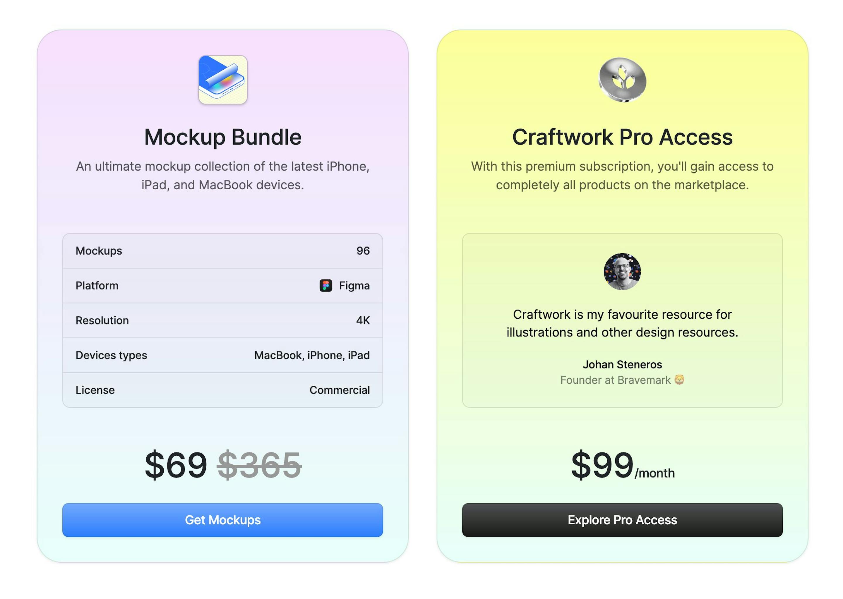
Nice touch adding a testimonial within the Pro tier.
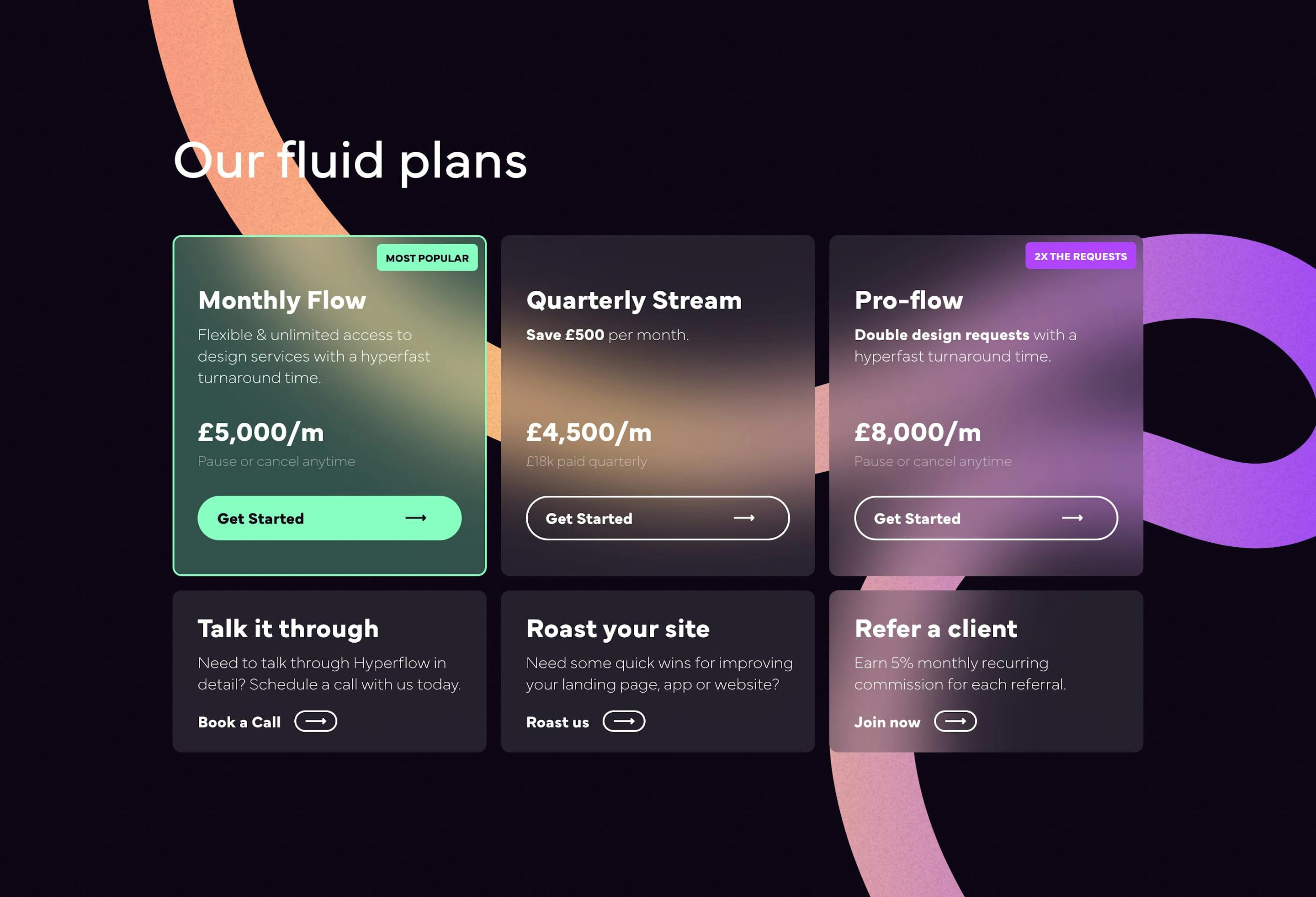
Good reference to clearly suggesting a pricing tier. Also note the book-a-call, quick critique and referral blocks integrated within the same table design.
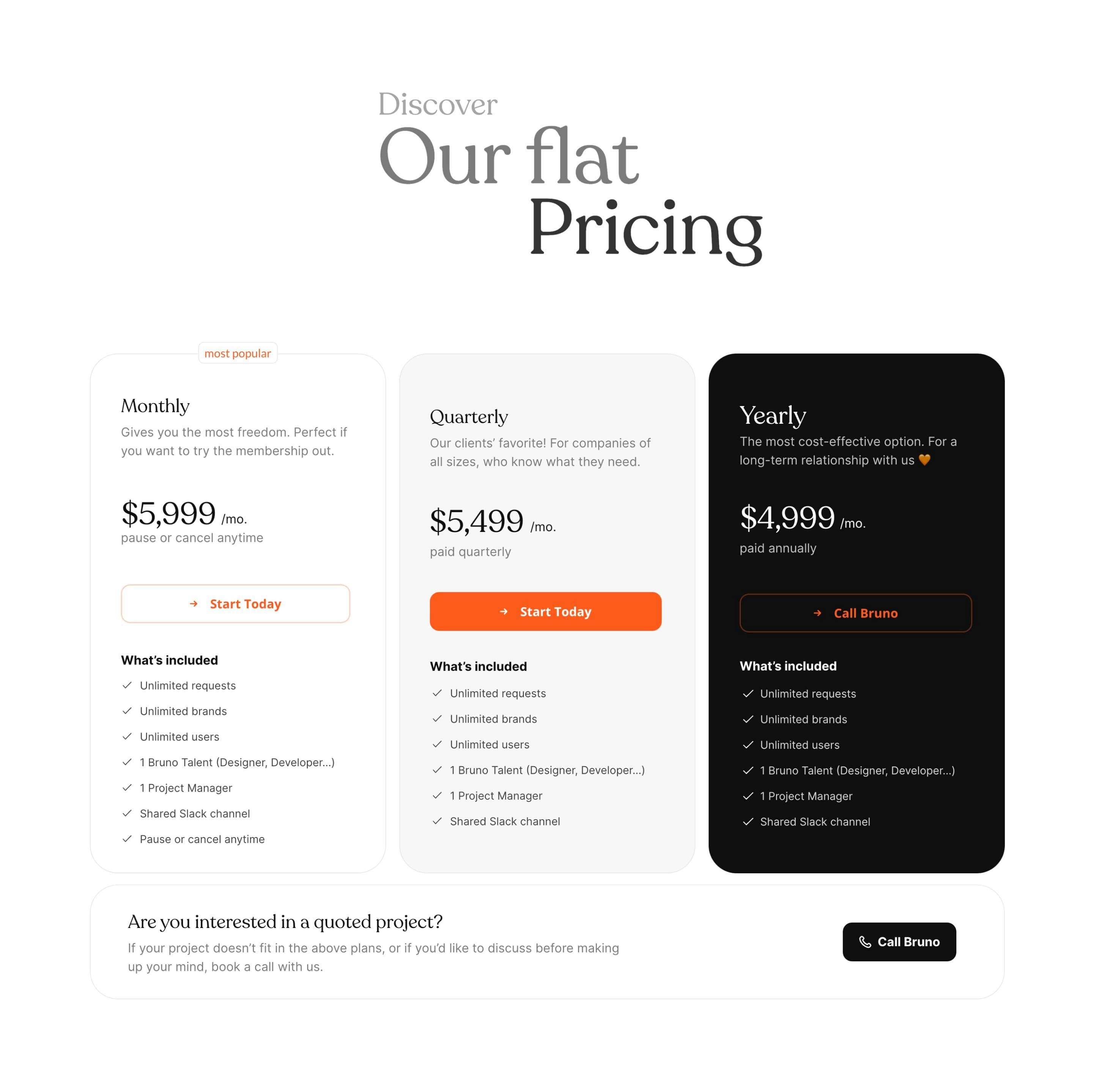
Classy move by Bruno adding a call us prompt if one of their pricing tiers doesn't match the potential customers needs.
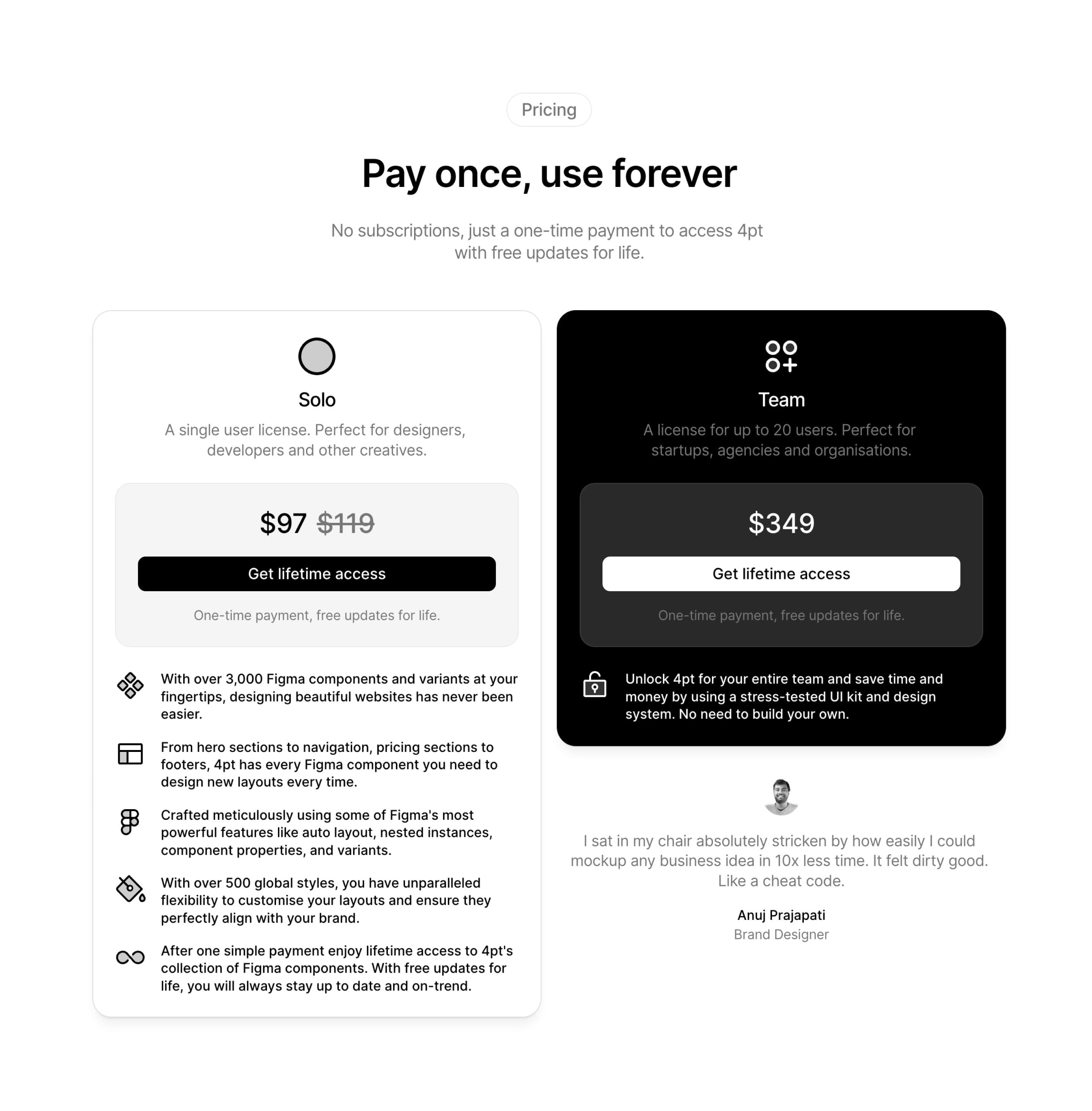
Lovely touch with the single circle above the solo tier and the 3 circles with a plus icon for the Team tier up to 20 users. Also handpicking a killer testimonial, about time-saving, alongside a pricing table is a solid play.
