Onemore
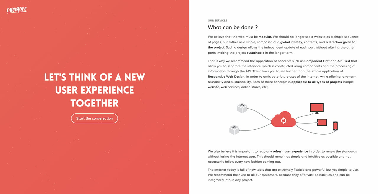
Author unknownSlick One Pager in a split screen layout for ‘Onemore’ – a User Experience focused agency. Quite a fun interactive molecule effect when hovering over the left panel. My favorite part is definitely the load transition of the unique contact form when you click the “start the conversation” button – also just love how the form field line subtly turns red if you try advance without entering in your info. Cheers for the detailed build notes…
This website has unfortunately been redesigned or gone offline, so I have removed the direct link to it. The screenshot below hopefully preserved enough of the design but if you are really keen to inspect further, try this Archive.org link. FYI: the site was first featured on 09 December 2014.
