Perconte
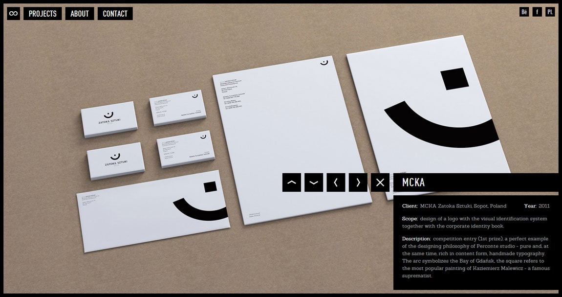
Author unknownA lot of companies get the full screen + keyboard navigation concept wrong, Perconte has got it spot on in a slick minimalistic way. Brilliant job with quality images too.
This website has unfortunately been redesigned or gone offline, so I have removed the direct link to it. The screenshot below hopefully preserved enough of the design but if you are really keen to inspect further, try this Archive.org link. FYI: the site was first featured on 12 October 2012.
