What’s Right for Children?
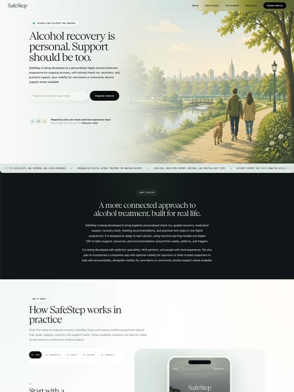
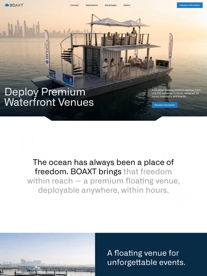
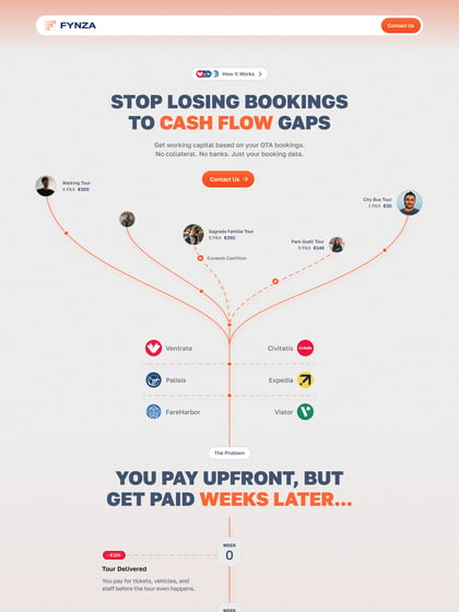
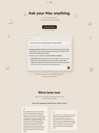
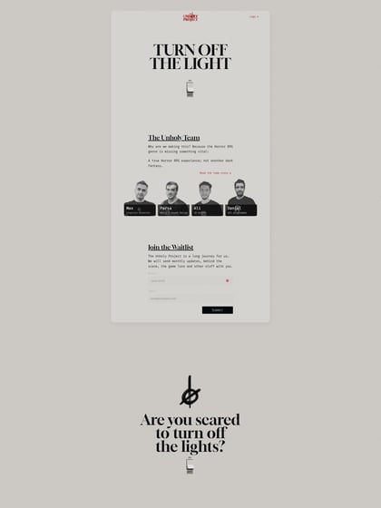
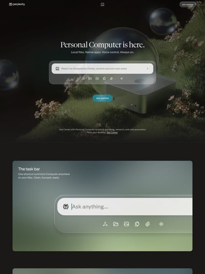
Author unknownResponsive One Page campaign to bring awareness to a health system designed for kids. One stand out feature is the infographic further down with a map that assembles as you switch between regions, very impressive.
This website has unfortunately been redesigned or gone offline, so I have removed the direct link to it. The screenshot below hopefully preserved enough of the design but if you are really keen to inspect further, try this Archive.org link. FYI: the site was first featured on 19 November 2013.

