Work & Co
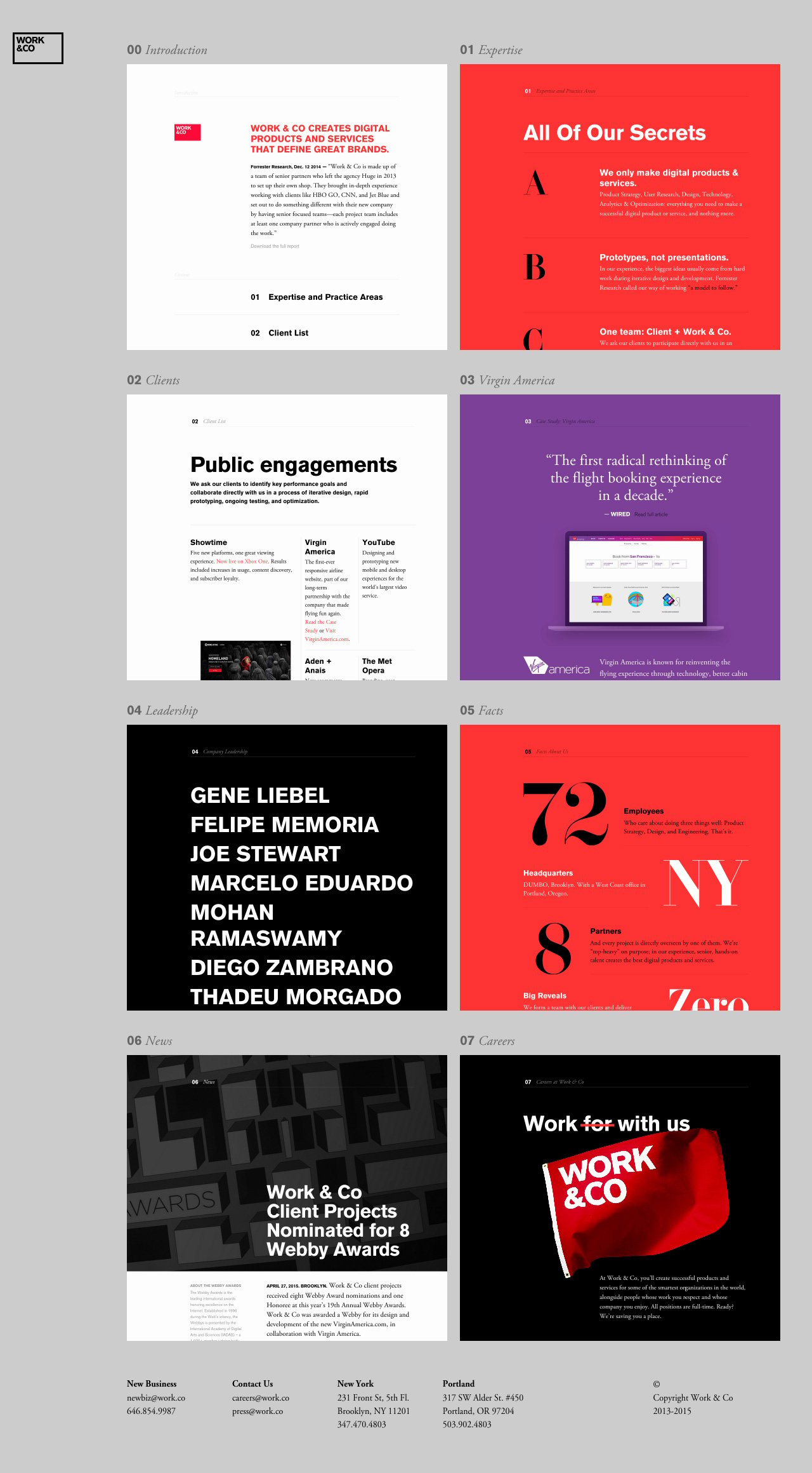
Author unknownMore than 5k One Pagers later it’s so refreshing to see something you’ve never seen before in One Page website design. ‘Work & Co’ have created a One Pager with the most unique navigation that I can only describe as retrieving pages/sections from a deeper layer. To see what I’m talking about, highlight any text within a page with your cursor – then click the red logo/menu icon. Yup, those thumbnails aren’t images. The One Pager also features lovely big typography and smooth transitions. Final shoutout to that awesome short domain name:)
This website has unfortunately been redesigned or gone offline, so I have removed the direct link to it. The screenshot below hopefully preserved enough of the design but if you are really keen to inspect further, try this Archive.org link. FYI: the site was first featured on 21 May 2015.
