ATL24
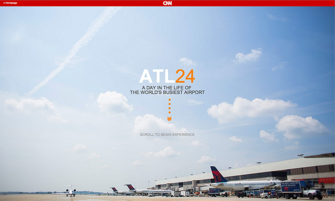
Author unknownA One Pager commissioned by CNN to storyboard what 24hrs in the world’s busiest airport would be like. I must admit I expected more from the design – that uses Arial as heading and body font – but the chronological menu is neat and the big images along with the stories are fascinating.
This website has unfortunately been redesigned or gone offline, so I have removed the direct link to it. The screenshot below hopefully preserved enough of the design but if you are really keen to inspect further, try this Archive.org link. FYI: the site was first featured on 22 November 2013.
