Visage
 Isaac T. Wooten
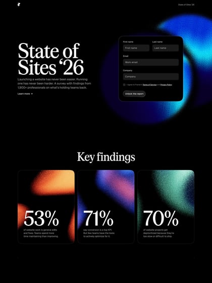
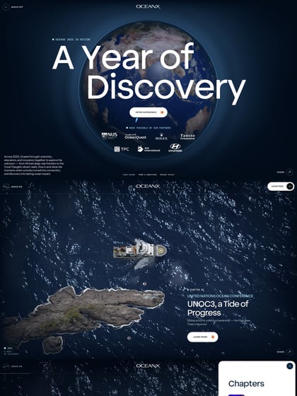
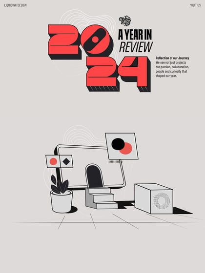
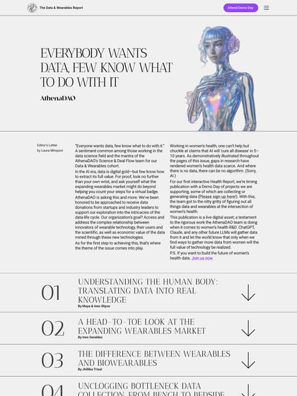
Beautifully designed responsive One Pager for Visage – a service that creates slick branded reports, also currently building a self-service application. You can see of the obvious Squarespace influence but really loving the color scheme and crisp font choice. Nice touch with the horizontal slider showcasing the app dashboard that really fills a large screen well. Top job! *update* Read our interview with Visage designer Isaac Wooten.
This website has unfortunately been redesigned or gone offline, so I have removed the direct link to it. The screenshot below hopefully preserved enough of the design but if you are really keen to inspect further, try this Archive.org link. FYI: the site was first featured on 19 March 2014.

