Traditionally Landing Pages demo their products with screenshots, videos or link out to an online demo.
These clever Landing Pages below put in the extra effort by demonstrating the actual product in-page, resulting in a spectacular first impression.
This round-up was such a blast for me and sums up why I’m so drawn to One Page websites. Hope this sparks off a few ideas for your next Landing Page!
ps. in-page demos is Hot Tip #70 out my 100 Landing Page Hot Tips Ebook.
1. Tailwind CSS
Tailwind CSS is a highly customizable, utility-first CSS framework. Their Landing Page brilliantly showcases how the smallest back-end class changes affect the front-end design.
2. Muzzle
Muzzle is a mac app to silence embarrassing notifications while screensharing. The Landing Page showcases (absolutely hilarious) notification examples. By far the funniest Landing Page I’ve reviewed since starting this site in 2008.
3. Cone
Cone is a color picker app for iPhone. The Landing Page features a minimal device with an animated picker identifying the colors within the actual page background image.
❤️ Enjoying the inspiration? Share this round-up on Twitter
4. Feedback Fish
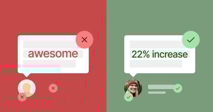
Feedback Fish helps you collect user-submitted issues and ideas via an embeddable widget. The Landing Page allows you to interact with the widget within the page. Note how the code is selectable too.
5. BlurHash
A BlurHash is a compact representation of a placeholder for an image. The Landing Page features an interactive demo showcasing how sample images look including an option to upload your own image in the page:
6. Flowkit
Flowkit helps create user flow diagrams in Figma, Sketch and Adobe XD. The Landing Page features an impressive demo section where you can interact with the animation and style settings.
7. Fontanello
Fontanello is a Chrome and Firefox browser extension that displays text attributes by right-clicking. The Landing Page features an interactive right-click demo, including Easter Eggs for copy, speech and print.
8. Pest Shop Boys
Pest Stop Boys is a UK-based pest control service. The Landing Page features a fun custom cursor revealing the deeper layer of bugs.
9. Trix
Trix is the WYSIWYG editor powering all textareas in Basecamp. The impressive rich text editor is conveniently integrated within the Landing Page so you can give it a spin before downloading.
10. Time Zone Converter
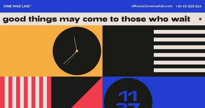
Time Zone Converter is a menubar app allowing you to scroll a timeline UI to determine differing times across the globe. The Landing Page features the exact same interactive UI allowing you to change times, drag up/down locations, delete them and brilliantly scrolls the browser background world map as you go.
11. Whimsical Mind Maps
Whimsical is a web app offering collaborative wireframes, flowcharts, sticky notes and mind maps. Their specific Mind Map Landing Page has the killer combo of a short explainer video followed by an interactive mind map demo.
12. Kukla kit
Kukla kit is a pack of 3D elements for Figma. The Landing Page features fun interactive hotspots that change the product demo colors.
13. Clover
Clover is an upcoming notebook app. To emphasize the app supports creative thinking, there is an interactive tab switching to a brainstorming view. Further down there is also an Easter Egg color picker that changes the Landing Page CTA button. Fun!
14. Tabbs
Tabbs is a better Google Chrome tab navigator. As you scroll, the browser centers focus, hints the shortcut keys, then zooms right into the extension demo while it starts searching the word Pro.
15. UXToolset
UXToolset is a Sketch and Figma component library for wireframes, diagrams and prototypes. The Landing Page switches the current site into wireframe mode, brilliantly showcasing the wireframing product you are about to purchase.
(website offline)
16. Windy
Windy is a browser extension that can transform any website HTML component into Tailwind CSS code. The Landing Page kicks off the inspector to demo how the extension produces code within the same page.
17. Standards
Standards is an upcoming service to help design brand guidelines. To back their pitch the logos + icons within the Landing Page are downloadable, the colors copy-to-clipboard and the primary brand typeface is editable.
How fun were these Landing Pages! Hope you enjoyed the round-up:)
Hope you found a few good refs in there. Remember I’m always looking to add more quality examples for our community so hit me up on the twitters or email if you stumble upon solid ones.
Much love,
Rob
Twitter: @robhope
Email: [email protected]
