There is something remarkable about a website with a strong, dark color scheme.
Dare I say the content "pops" a little more? I can’t help think an owner who carefully crafts a dark-schemed Landing Page cares for his product in a similar manner. It is, at the end the day, what stands between the visitor and the product. Alas, most play it safe with a monotonous, conventional scheme.
Here are my favorite dark schemes over the past few years – hope you get inspired!
1. Play
Beautifully designed One Pager teasing the upcoming mobile-first design tool, Play. The product demos with finger overlays are impressive and definitely set a precedent they mean what they say. [book-feature]
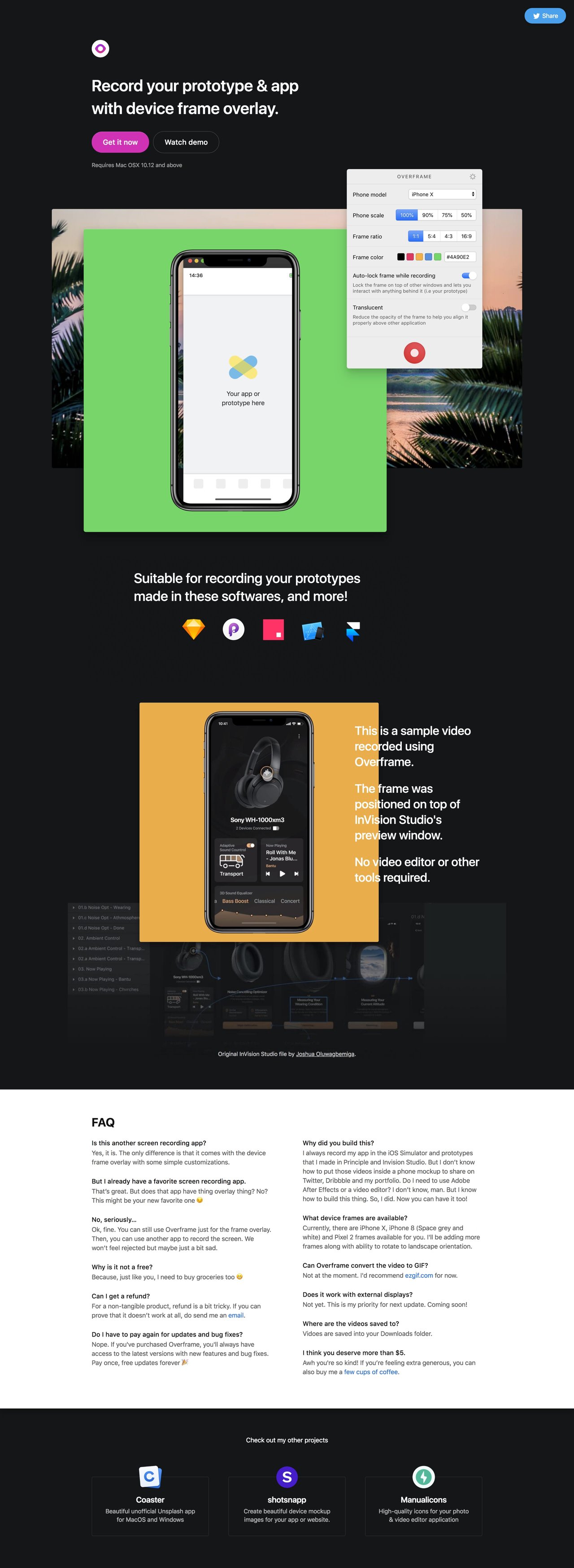
2. Overframe
Clean Landing Page for Overframe - a macOS app to help record a video of your prototype or app within a device frame overlay.
3. Destroyer LA
Stunning, parallax scrolling One Pager for Culver City restaurant, Destroyer LA. The layout and experience is truly unique. The long scrolling site features a hover-sensitive scattered food menu, beautiful date + time infographics, a Tumblr-integrated "stacked" image gallery and ends with an awesome, interactive game of Space Invaders - using the Destroyer LA branding.??
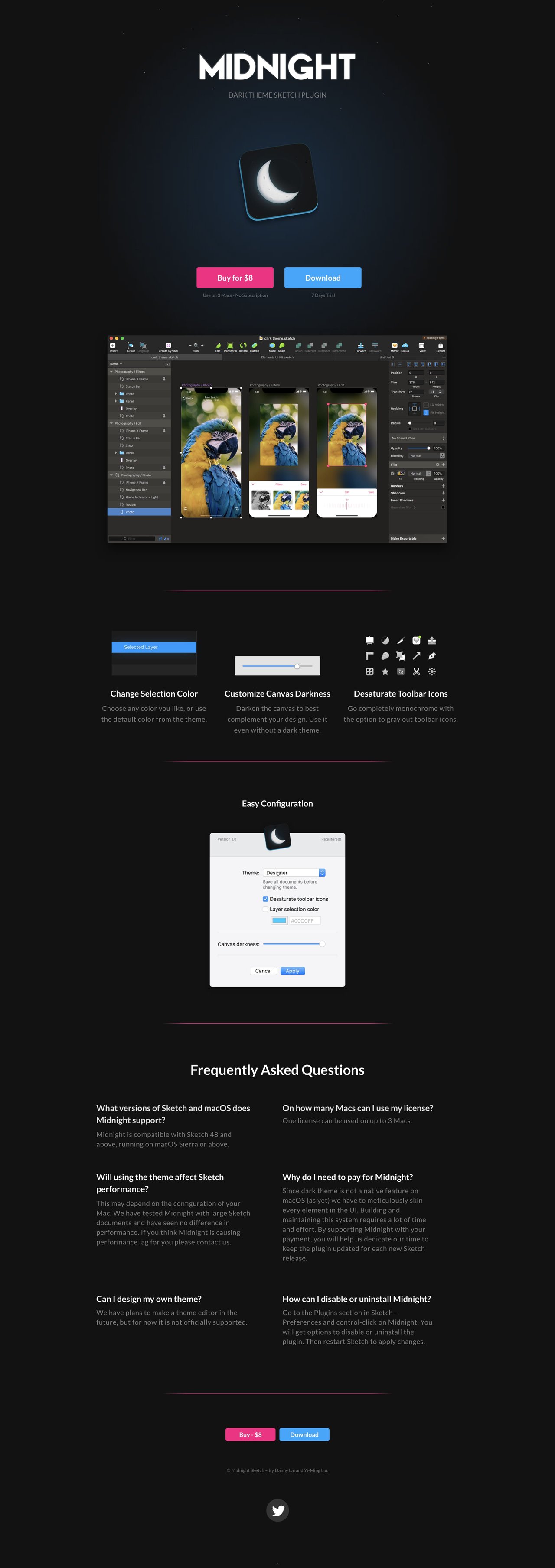
4. Midnight
Clean One Pager with great whitespace for Midnight - a dark theme plugin for Sketch built by Danny Lai and Yi-Ming Liu. [book-feature]
Enjoying the round-up? Get these round-ups in our Inspiration Newsletter 💌
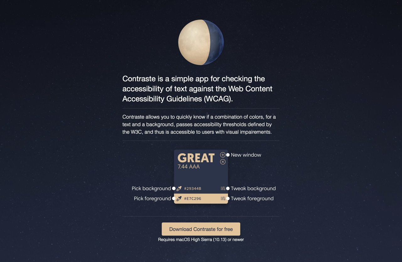
5. Contraste
Minimal One Pager for Contraste - a simple app for checking the accessibility of text against the Web Content Accessibility Guidelines (WCAG).
6. hourly
Long-scrolling One Pager with a unique, bold typographic style for hourly, an iOS app for time tracking.
7. CSSConf Argentina 2018
Dark-schemed One Pager for the upcoming CSSConf event in Argentina. Really like how they included parking, subway, train and bus routes to help get to the venue easier. [book-feature]
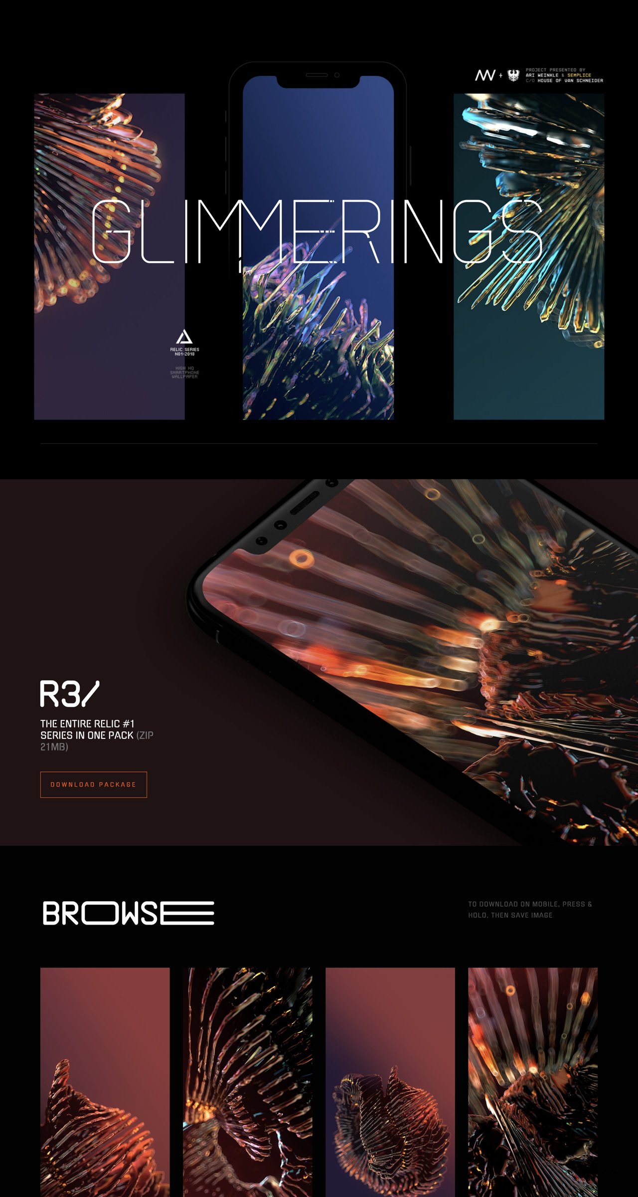
8. Glimmerings
Ari Weinkle together with Tobias van Schneider & the Semplice team have released this dark-schemed One Pager for Glimmerings - a place for sharing Ari's beautiful 3D art for you to use as a smartphone wallpaper. The first wallpaper series is called Relics and is completely free.
9. Andreas Gysin
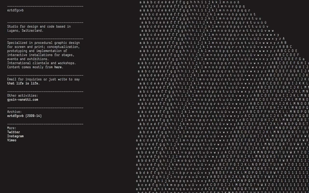
Incredibly unique One Pager for Swiss developer Andreas Gysin. What used to be his ASCII playground is now his minimal portfolio with cursor-sensitive interactions.
10. Bachoy
Impressive dark-schemed One Page portfolio for Ryan Magno. The Single Page website features loads of attention to detail including a command prompt style intro text, spotlight effect background, hover sensitive content items and changing backgrounds to match the current project you are browsing.
11. InVision Studio
Dazzling launching soon page with stunning animations as you scroll previewing InVision's new ’Studio’ product. Note the load animation of the BETA request form - gorgeous and of course not the only impressive element? (the legal links in the footer are within the One Page website rules but I'm allowing the contact link in this time, as it's in no obvious main navigation)
12. Cone
Excellent product demo interacting with the header background image in this Landing Page for the Cone color picker app. [book-feature]
13. City Lights
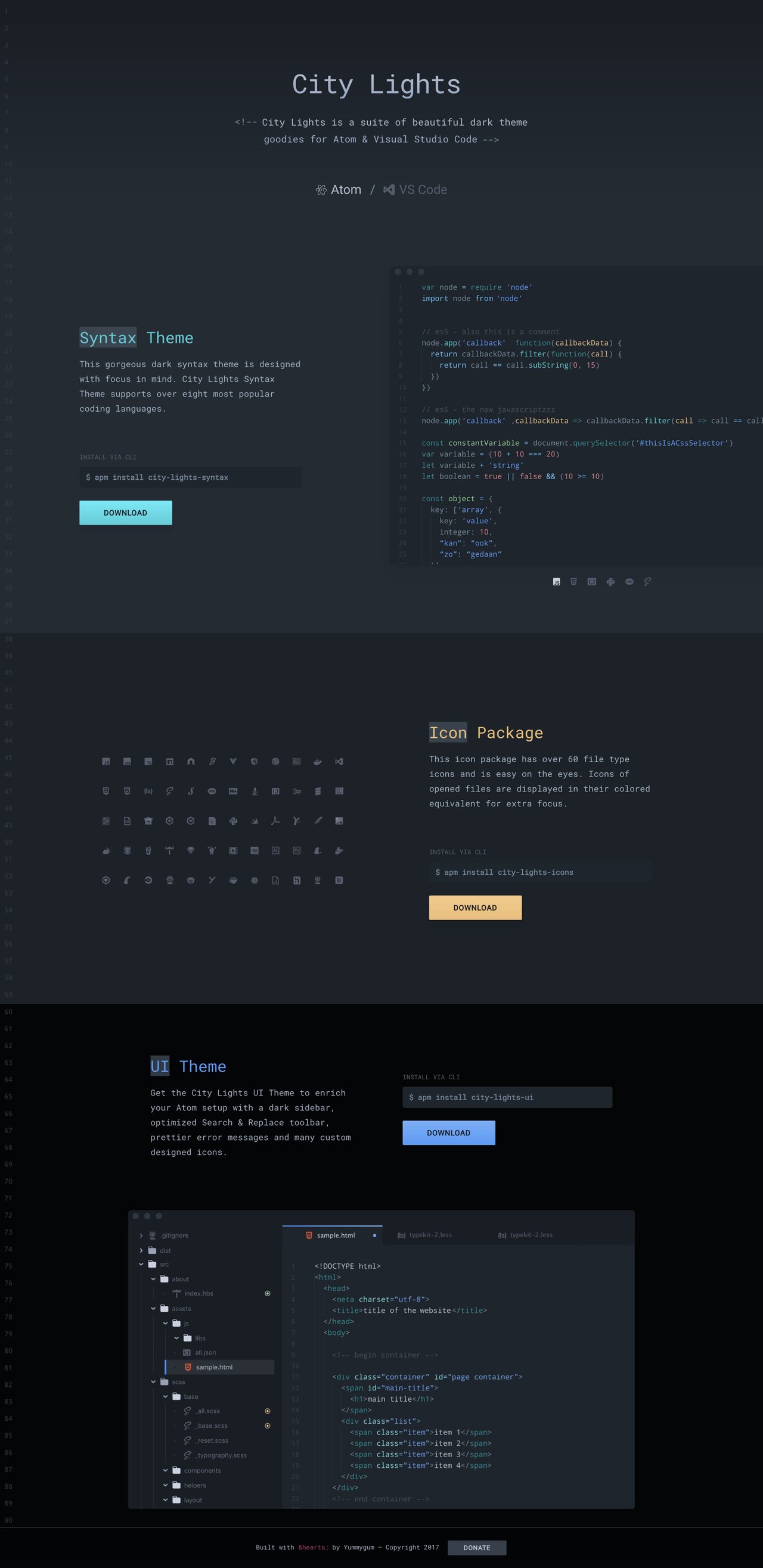
Lovely One Pager from the Yummygum team showcasing beautiful dark themes they designed for Atom & Visual Studio Code. Awesome added touches with the coding language preview switcher, the number line page edge and the random color icon bursts in the Icon Package section.
14. Michaël Villar
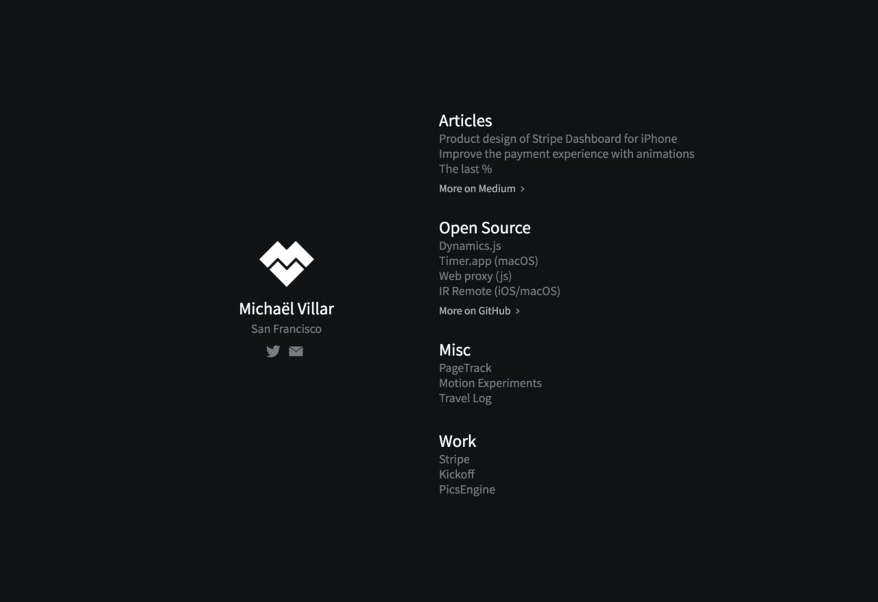
Awesome glitch effect load transition and content interactions in this minimal One Pager for designer, Michaël Villar.
15. The Future Of Mobility
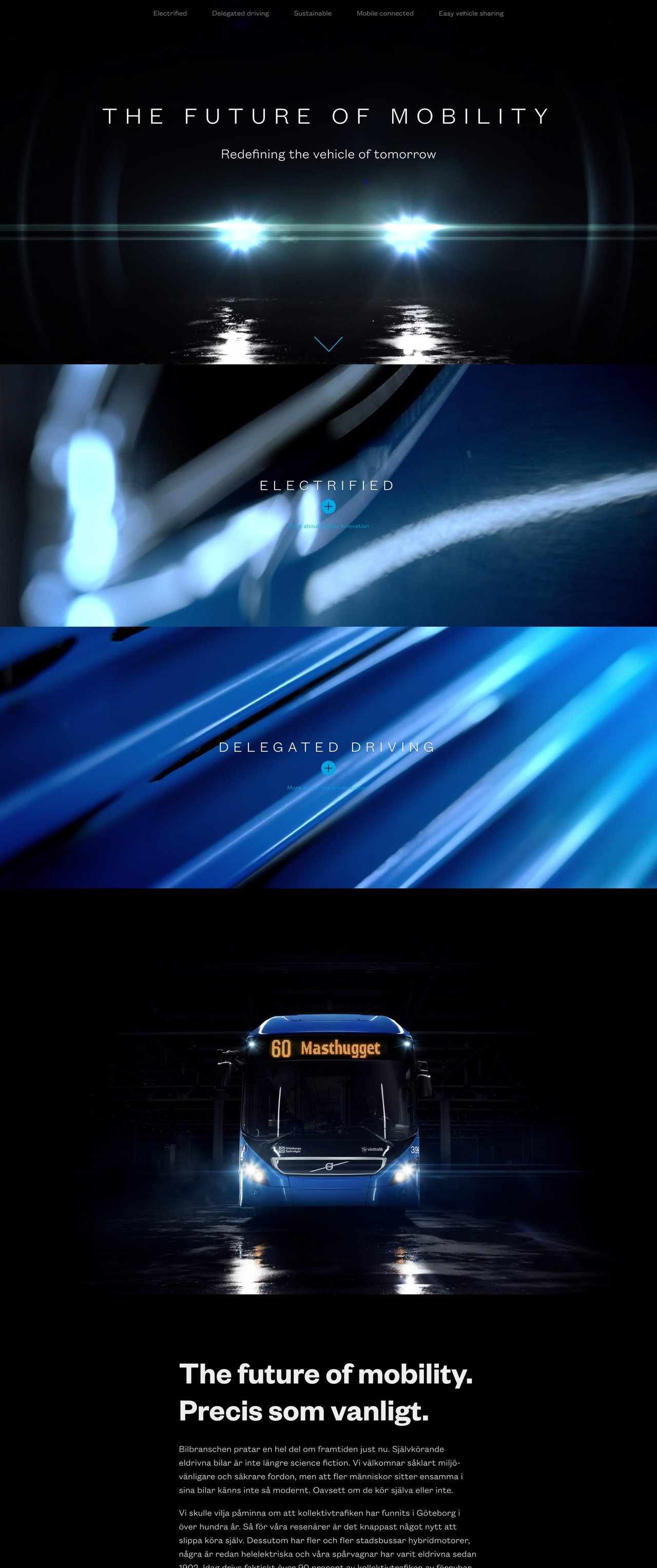
Good reference to a product reveal in this long scrolling One Pager for 'The Future Of Mobility'. Nice touch with the vehicle lights turning on as the page loads.
16. Katka
Slick case-study One Pager by designer Stas Babaev taking you through how he would design the perfect cycling app experience. The super long-scrolling site features lovely big typography, spacious arrangement of his ideas and a few neat animations as you browse.
17. Haptic
Beautifully designed One Pager (now built with Framer) for Haptic, a habit-tracking journal app. Easily the biggest device I've seen in a Landing Page and I love it. Make sure you scroll mid way for the device unpacking animation, wonderful. [book-feature]
18. Sublimio
Gorgeous section transitions and white smoke backgrounds in this One Page portfolio for Italian design studio, Sublimio.
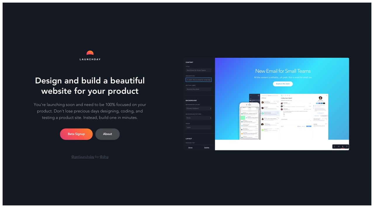
19. Launchday
Tidy little One Pager previewing a new product Landing Page builder called Launchday. I quite enjoy this minimal approach to announcing a new product - brief overview, Beta Signup button links to MailChimp, About button links to Medium (to also increase social engagement) and a very clear demo video. No need to scroll on this guy:) This website was featured in our 10 Quick Tips to tighten your Landing Page design article.
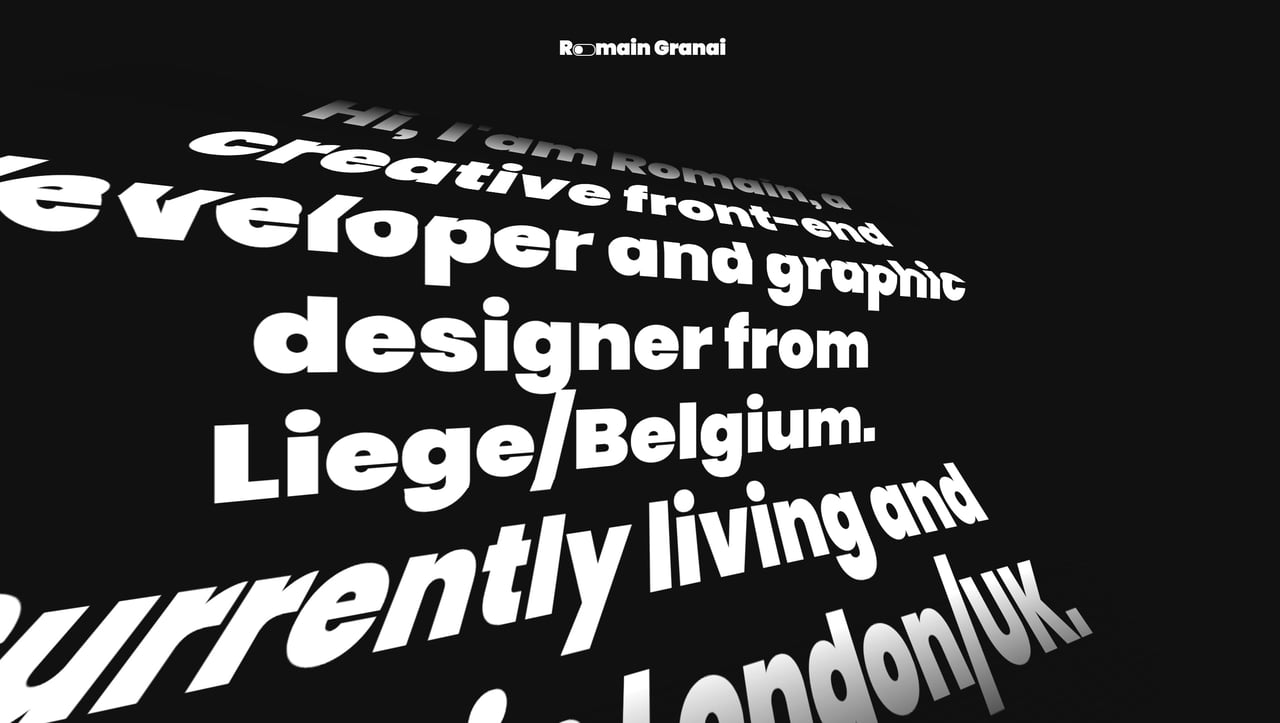
20. Romain Granai
Real unique One Pager for Romain Granai featuring big, hover-sensitive scrolling text. Neat touch as well with the scheme switcher within his logo.
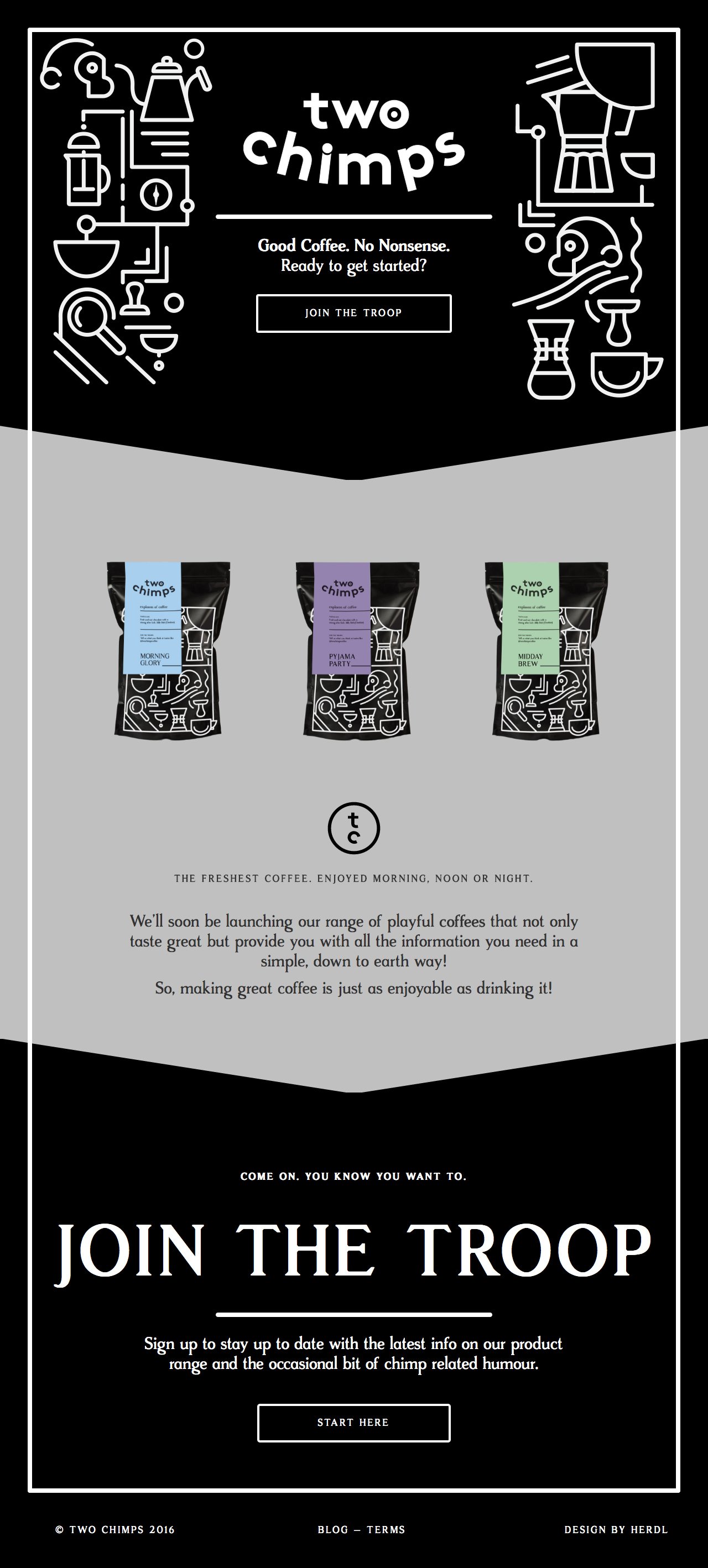
21. Two Chimps Coffee
Sweet SVG animations in this clean One Pager promoting the product range from 'Two Chimps Coffee'. Neat newsletter sign up solution in the footer and stoked to find out it's built with WordPress!
22. Tilda Zero Block
Beautiful spacious Landing Page for a new website builder called 'Zero Block'. The Singe Page website features a dark color scheme with a neat intro demonstration on how it works. Best of all this very Landing Page was made with the application itself. Boom! [book-feature]
23. Golden Thread Tarot
Lovely dark-schemed One Pager for a tarot-reading iPhone app called 'Golden Thread Tarot'. The Singe Page website features brilliant little icon animations and the responsive adaption is just superb.
24. KreativePro Masterclass
Now this is a beautifully designed Landing Page for an online course, wow! Each page element shines and what a lovely touch bringing the course certificate to life as you scroll. One can only assume the quality of the course will be top-draw based on their Landing Page design. Also great to see this built using Webflow!
25. Genesis
Remarkable One Page website (built with WordPress) packed with gorgeous illustrations and animations for Genesis, a vegan restaurant based in Shoreditch, London. As you scroll the website bursts to life with animated characters, plants and even some of the typography. A great reference on how to create an unforgettable first impression.
Which was your favorite? Here is the full archive of 900+ dark-schemed One Page websites if you’re after more inspiration.
Hope you found a few good refs in there. Remember I’m always looking to add more quality examples for our community so hit me up on the twitters or email if you stumble upon solid ones.
Much love,
Rob
Twitter: @robhope
Email: [email protected]

