I’m proud to say One Page Love features over 7000 websites now! Unfortunately, with the continuous push to increase quality, not all submissions get in. These 10 tips below form the most common website feedback I give users to help improve their Landing Page design:
ps. the awesome “Pencil Knot” cover illustration is by Karolis Strautniekas
Tip 1 – Keep Brand Capitalization Consistent
When a new user arrives at your Landing Page and you’ve got different case variations of your Brand Name it looks unprofessional and can even be confusing. I’d advise avoiding ALL CAPS but once you’ve chosen a case style, stick with it and ensure it’s consistent throughout your Landing Page.
- One Page Love (correct)
- Onepagelove
- ONEPAGELOVE
- onepagelove
- One Page love
- One-Page Love
- Onepage Love
Here are some popular ones:
- WordPress (1 word, 2 capital letters)
- MailChimp (1 word, 2 capital letters)
- Stack Overflow (2 words)
- Facebook (1 word)
Tip: Visit your live Landing Page, use your browser in-page search and try find all possible variations of your brand name.
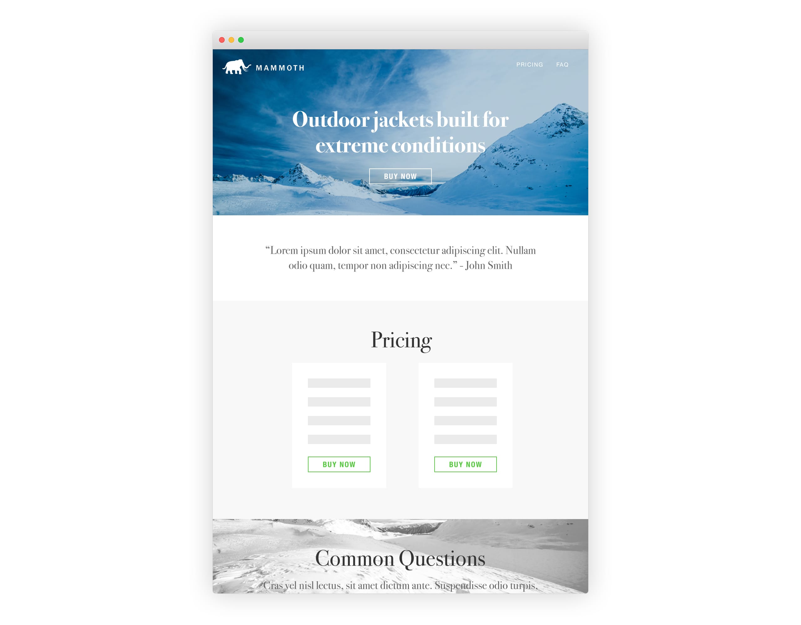
Video Reference: FieldGoal
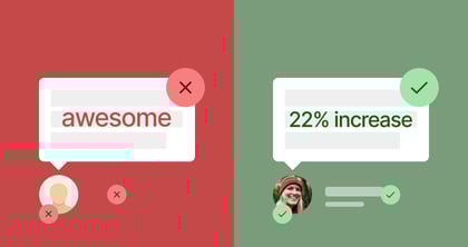
Tip 2 – Give those lonely orphans a family
This means bringing those floating last words in a paragraph back home by slightly reducing the paragraph font size or even better – boot out unnecessary adjectives like awesome or amazing. Same goes for your Brand Name, if it’s comprised of 3 words it must remain 3 words everywhere with no overflows.
Useful links:
Video Reference: The SEO Company Template
Tip 3 – Don’t neglect Retina optimization
If anything, you absolutely must have a Retina-optimized logo. A “pixelated” logo can negatively impact a first impression. Retina-optimization basically means offering double sized logos, screenshots and imagery for Retina-screened users. Same goes for your iconography, try use SVG format icons if possible.
Tip: Use ImageOptim for optimizing bigger, rich color images. It’s debatable what the ideal page load size is, but optimizing everything is always good practice.
Useful links:
- PNG to SVG resources – a link filled article on Stack Overflow
- IconFinder – tons of free vector social icons
- Ready-To-Use SVG icons – copy & paste resource
- Hero Patterns – repeatable SVG background patterns
- Textures.js – SVG patterns for data visualization (infographics)
Video Reference: SuperCrowd
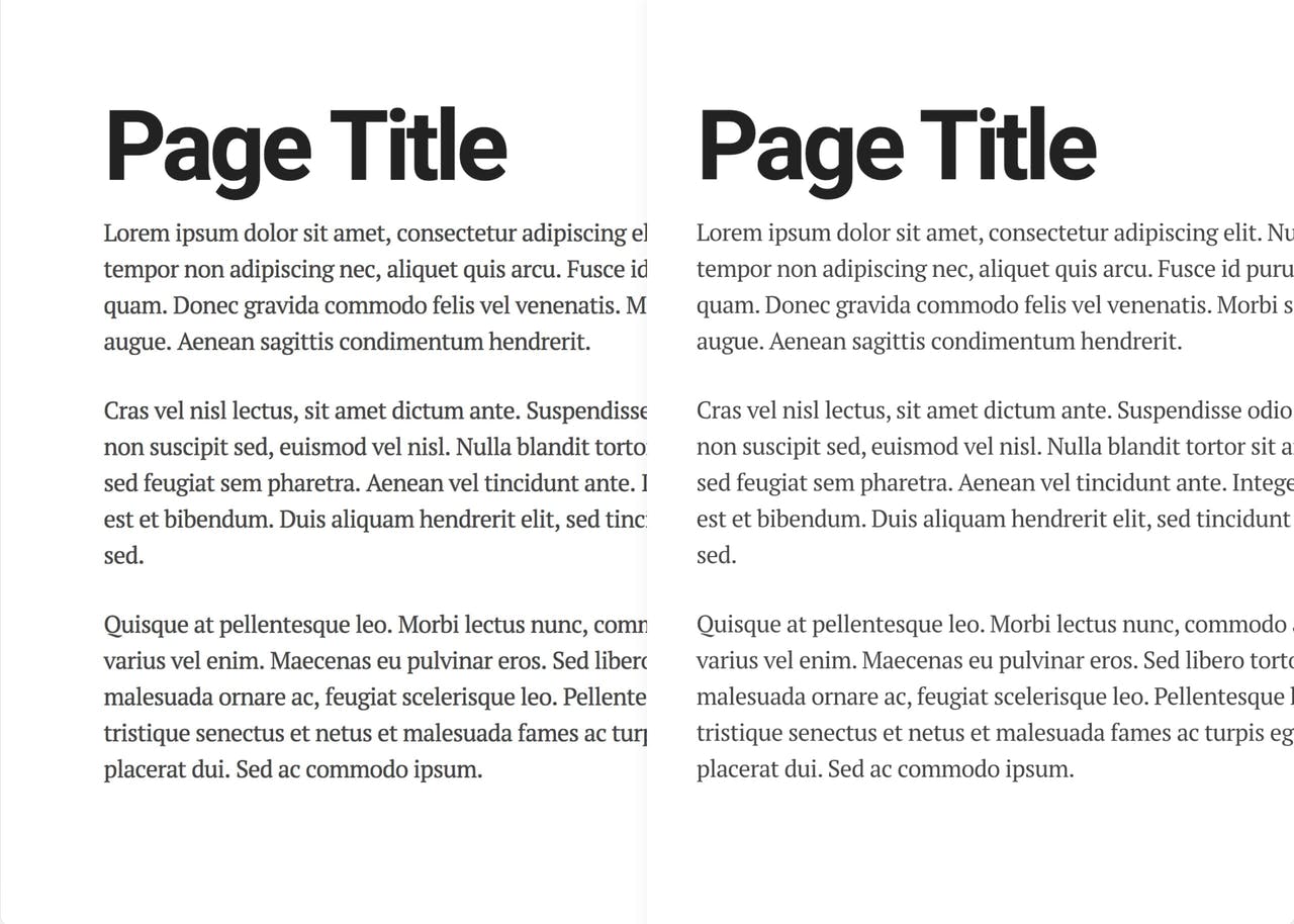
Tip 4 – Add Breathing Room
The majority of users are going to skim your content. If you bundle everything together they are going to skim even more. Whitespace is referred to as the breathing room for your content but also the breathing room for the user. This slows them down helps increase focus and in-turn increases conversions.
81 percent of people only skim the content they read online. Usability expert Jakob Nielsen reports the average user reads at most 20 to 28 percent of words during an average visit. (source)
Tip: If you’re questioning if you should increase padding, you should probably double it.
Tip: Increase padding but still stick to a grid.
Tip: Reverse engineer your padding allowances by working around the perfect line length (characters per line) based on your font size.
Useful links:
- Websites with good whitespace – for inspiration
- Golden Ratio Typography Calculator – optimize characters per line
- How to Tune Typography Based on Characters Per Line – by Personified
- 1200px Grid System – in PSD, AI & CSS
- All about Grid systems – by Rachel Shillcock
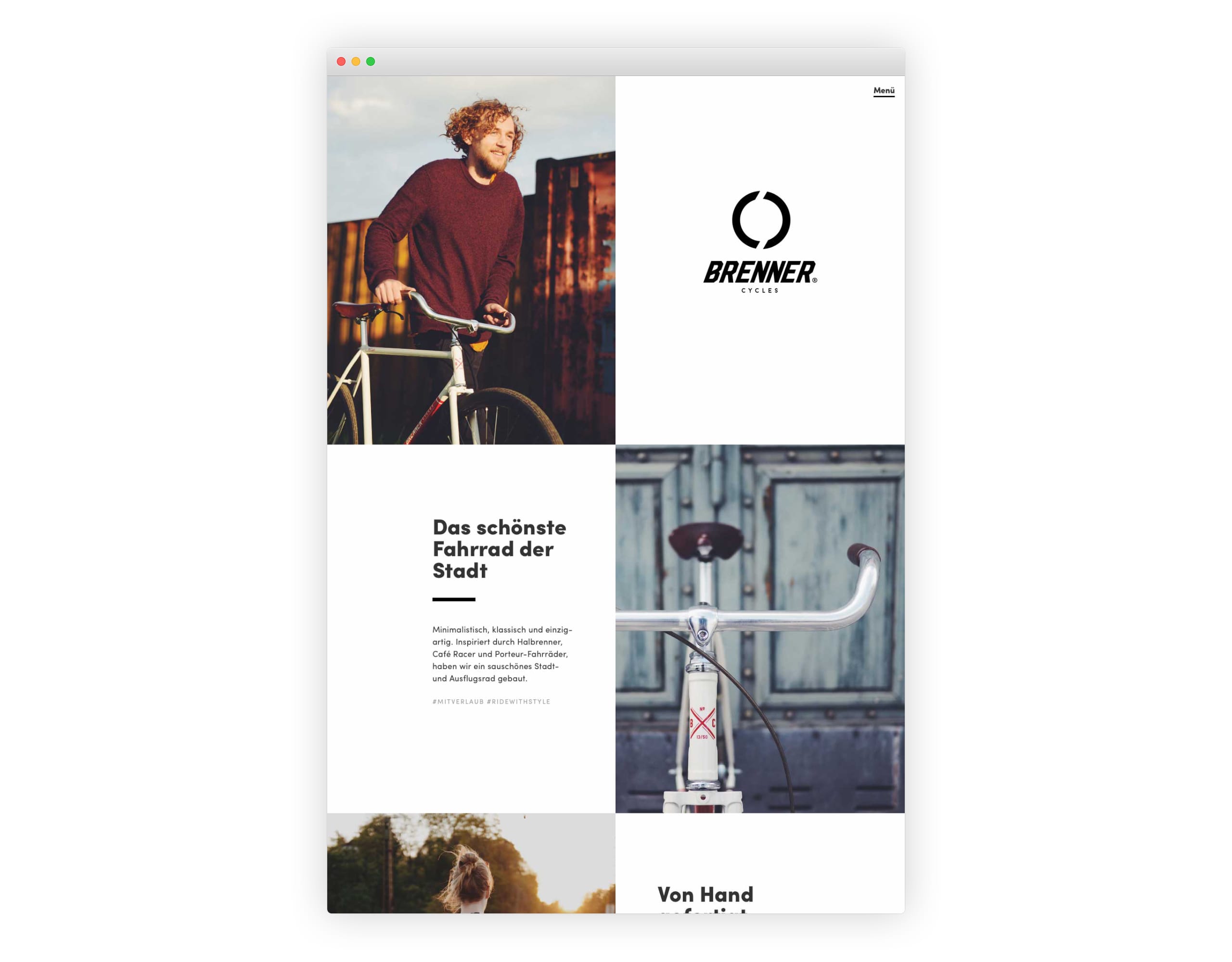
Video Reference: Park & Diamond and Brenner Cycles
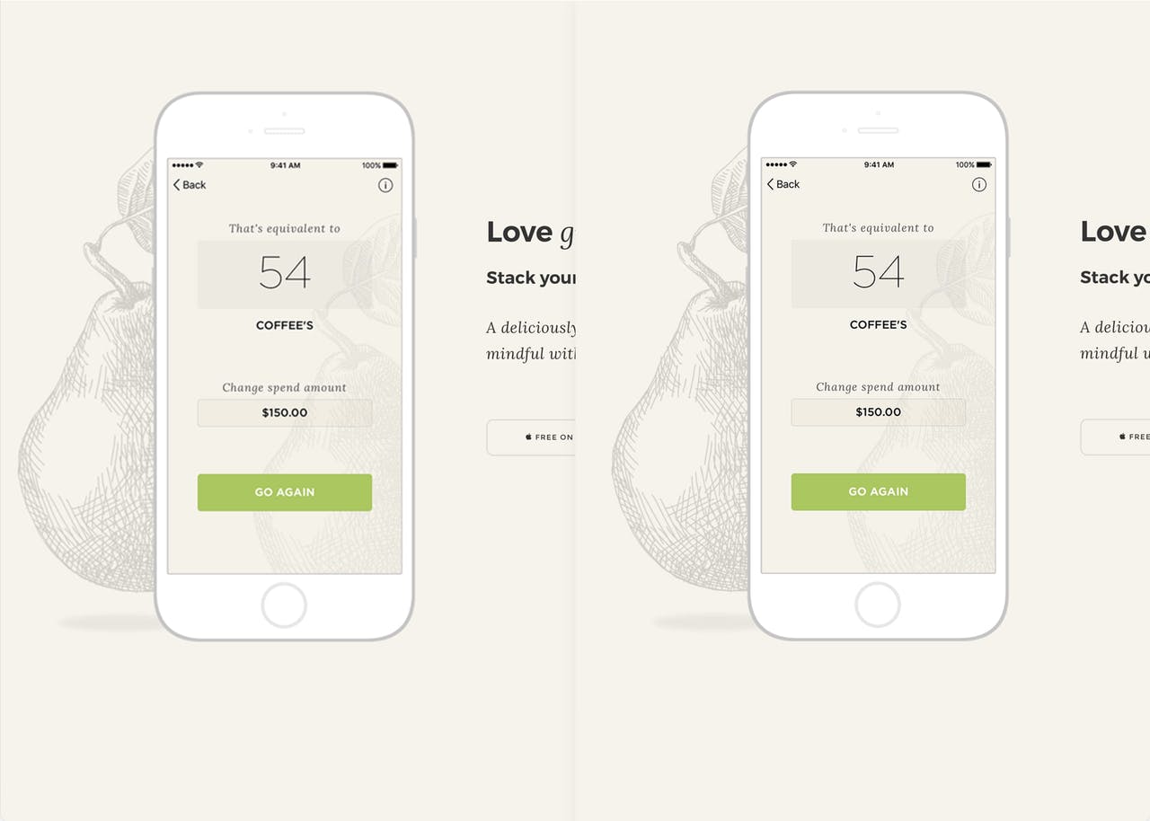
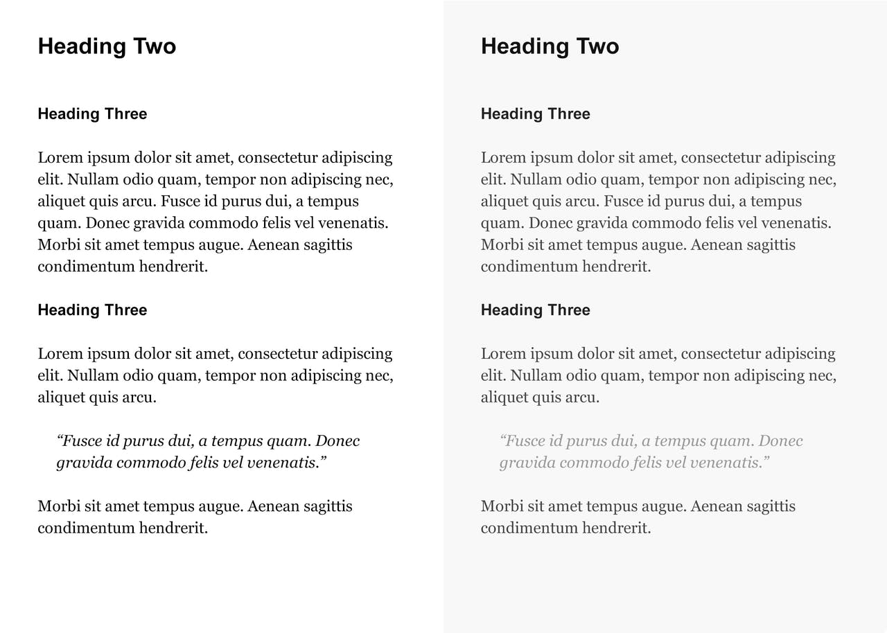
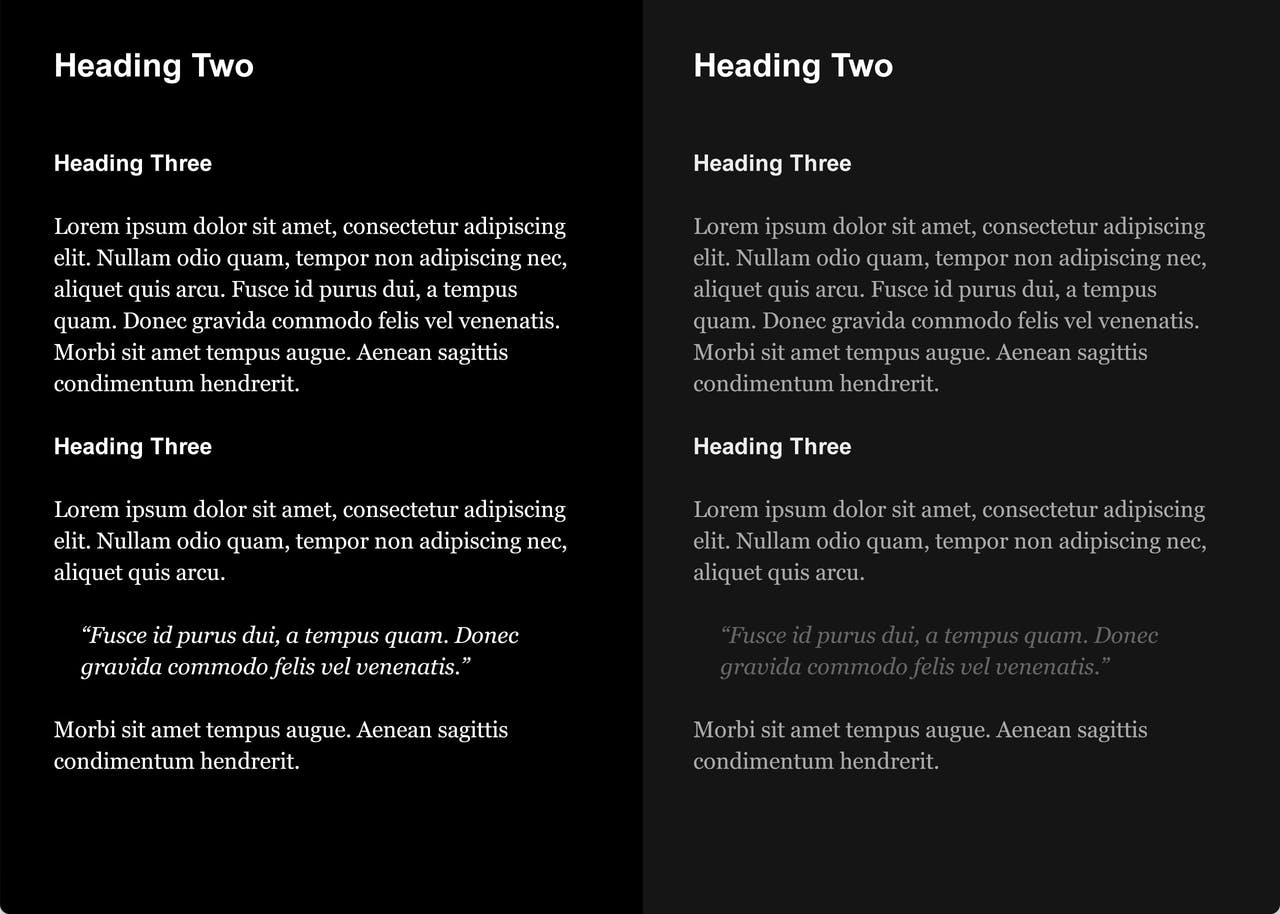
Tip 5 – Keep Spacing Consistent
We’ve just covered adding more padding but what really tightens a design is when this spacing is consistent. The same goes for over overlooked vertical spacing, keeping your section padding consistent throughout your long-scrolling Landing Page.
A good practice is spacing and sizing within ratios, for example, all section padding is 60px. all CTA buttons and small spaces are 30px and all small gaps are 15px.
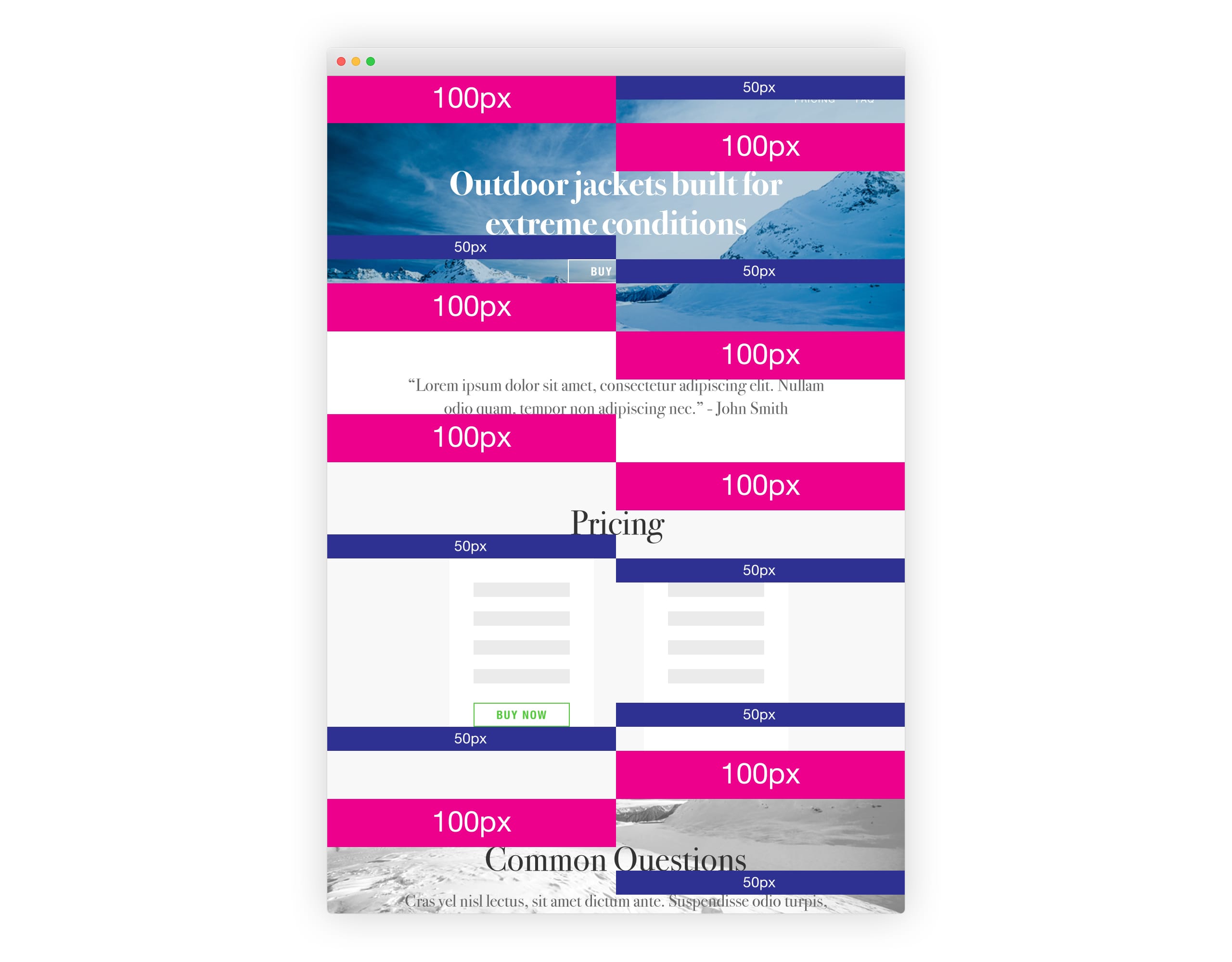
Tip: Keep spacing within consistent ratios. Example: if we set 30px button, then set section title bottom margins also at 30px and section diver spacing at 60px. Consistency is key.
Useful links:
- Intro to The 8-Point Grid System – by Elliot Dahl
- How to Create Vertical Rhythm and Harmony – by Carrie Cousins
- Designing Faster with a Baseline Grid – by Pierre Marly
- CSS Baseline: The Good, The Bad And The Ugly – by Espen Brunborg
- Basehold.it – JavaScript-free, baseline grid overlay for your designs
- Modular Scale – Size your type in a more meaningful way
- Type Scale – A visual calculator to test your type
Video Reference: Background Image
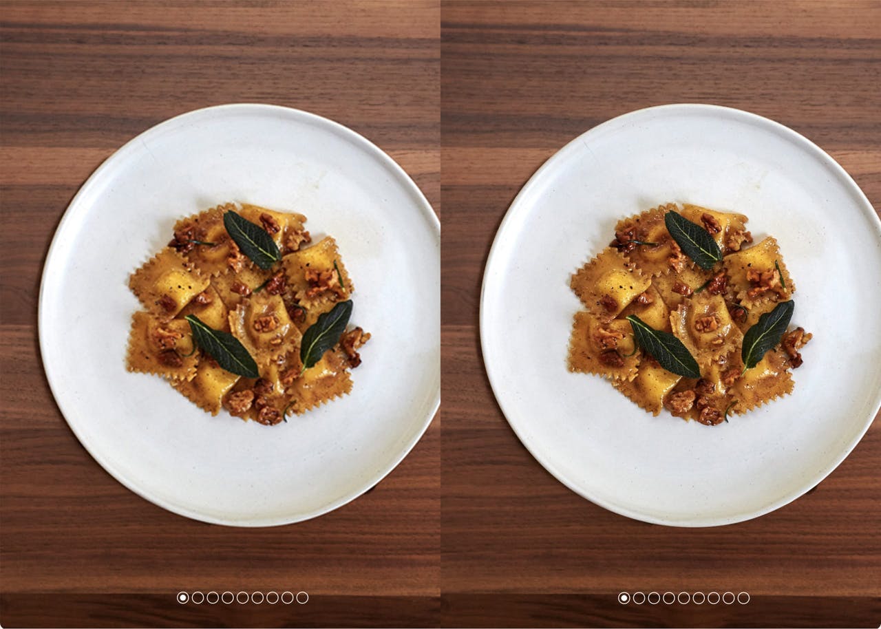
Tip 6 – Fewer images, better images
It can take one good image to completely change the emotion of your user. Same goes for one bad image – Good imagery builds trust and trust is the foundation of conversions. Spend the money. Get a photoshoot of your team, your product. your food. The ROI on a professional photoshoot is pretty much guaranteed. Now once you have a good selection, ask yourself if each image truly captures your story or compliments your brand. Eliminate everything non-essential.
“Simplicity means the achievement of maximum effect with minimum means.” ~ Dr. Koichi Kawanaite
Useful links:
- Unsplash – Free (do whatever you want) high-res photos
- Beautiful Team Images – for inspiration
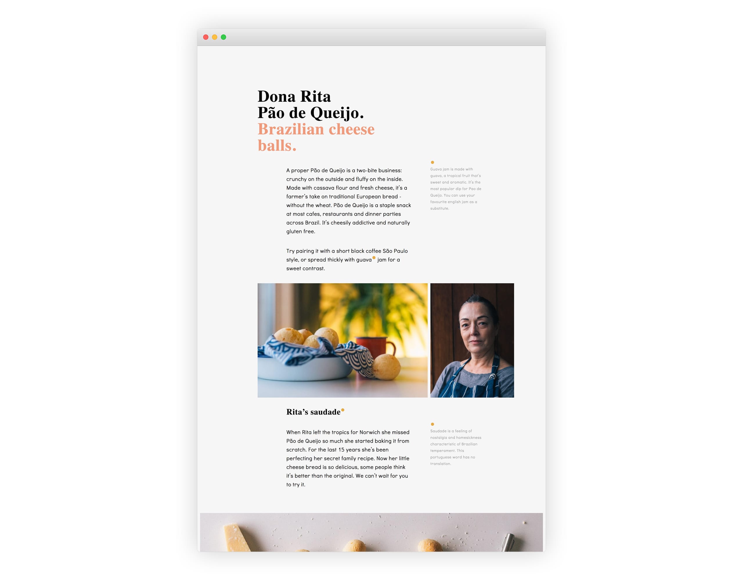
Video Reference: Dona Rita and Stock Image
Tip 7 – Fewer fonts, more weights
Too many fonts looks messy and also adds to Landing Page load time. Different weights within one font family can really strengthen the visual hierarchy of heading and paragraphs. Try stick to 2 or less families and even consider bringing in the users system font as the Sans-Serif typeface.
Useful links:
- Google Fonts – over 800 free web fonts
- Font Pair – help pairing Google Fonts
- Typekit – beautiful premium web fonts
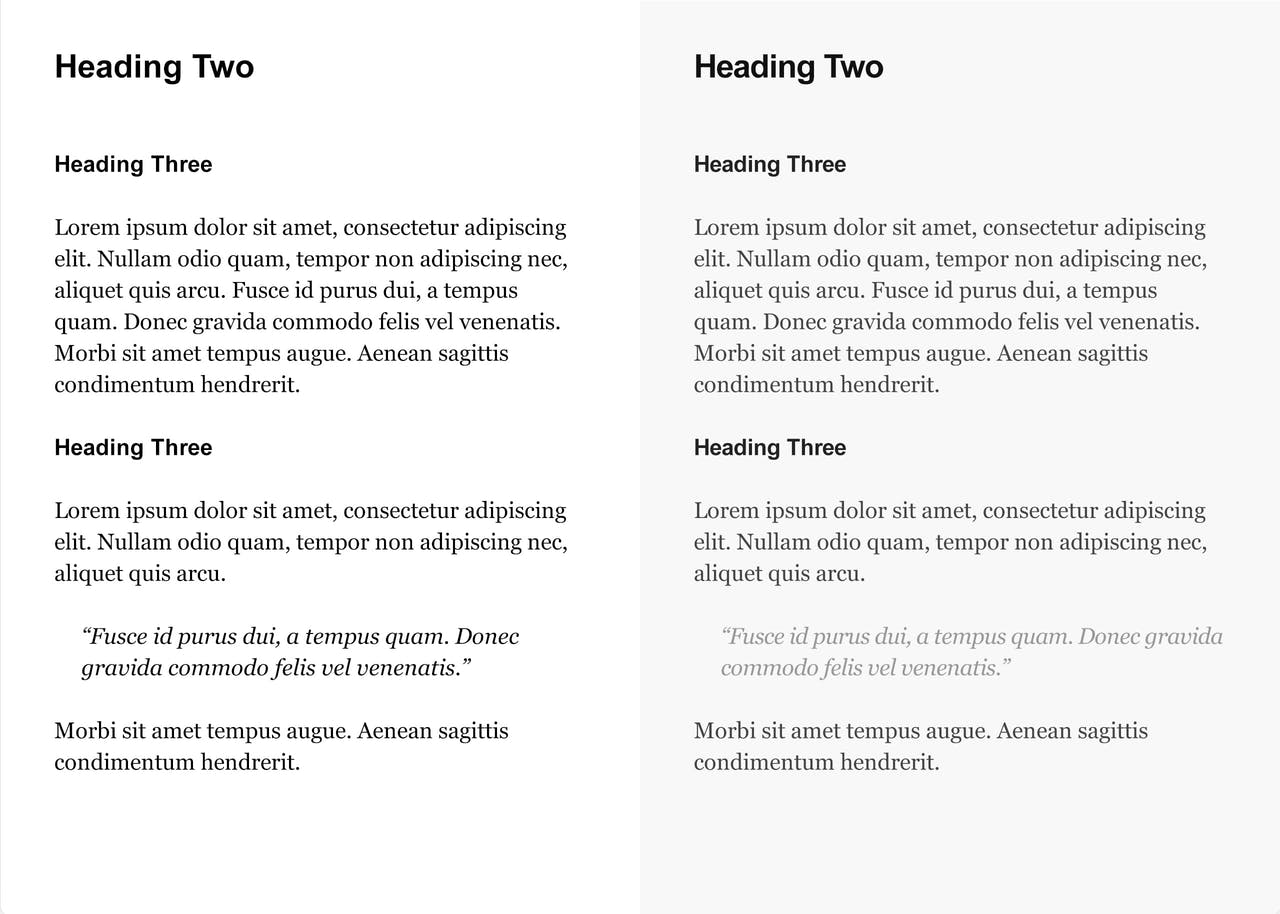
Tip 8 – More text color contrast
Avoid having pure black (`#000000`) text on a pure white (`#FFFFFF`) page background. Soften the blow with an off-white background and a subtle grey text hierarchy. Furthermore why not experiment with completely different color palettes within your Landing Page. A quality color scheme is instantly remarkable and can strengthen your branding.
Useful links:
- Contraste – checking the accessibility of web text
- Colorful websites – for inspiration
- Coolors – great color scheme generator
- ColourLovers – massive collection of color schemes
- Color Lisa – famous art color schemes
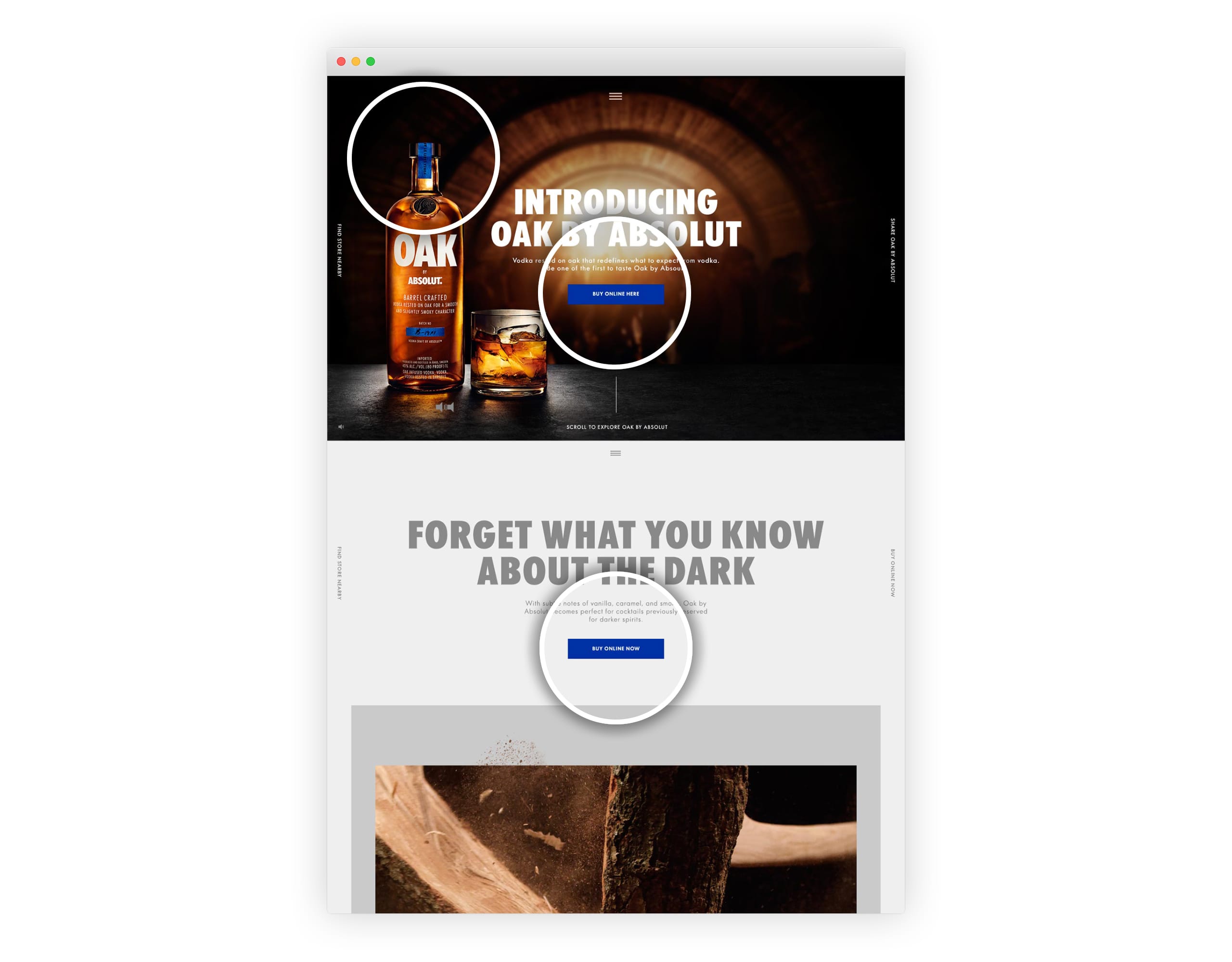
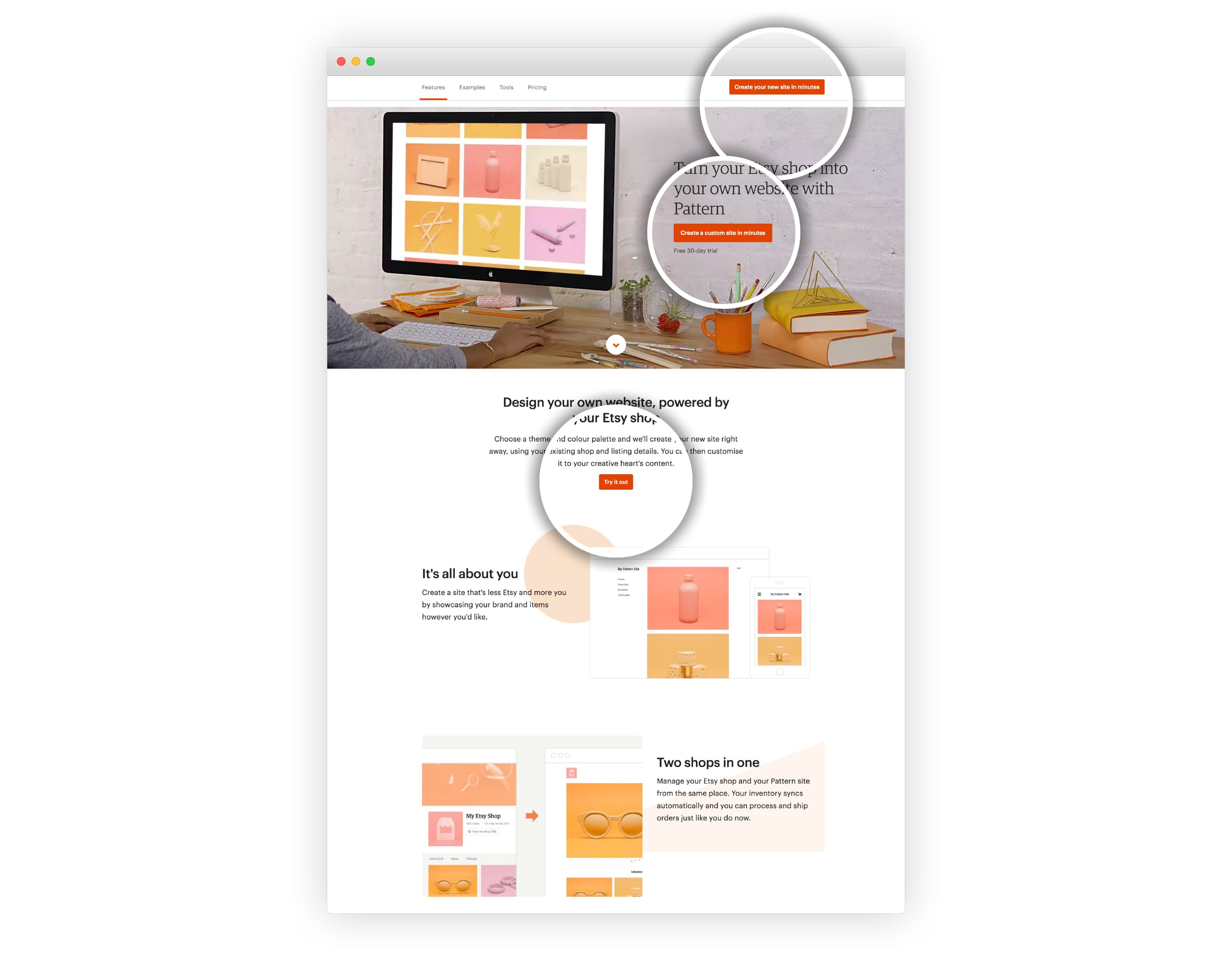
Tip 9 – Juice up those CTA buttons
Ideally your Landing Page is promoting one thing meaning you are after only one type of conversion. So all your CTA buttons should be consistently worded and color-schemed, It will remind the user what you want them to do as they scroll. It’s also good practice to choose a CTA button color that stands out within your scheme for example an bright orange button within a blue color scheme.
Useful links:
- 31 Call-to-Action examples you can’t help but click – by Brittany Leaning
Tip 10 – Polish with Text Kerning and Font Smoothing
It’s incredible how the smallest kerning tweaks can drastically improve a Landing Page design. Furthermore by adding just a few lines of CSS code you can really polish typography with a more elegant look.
Here is the code I use on most of my projects:
body {
    -webkit-font-smoothing: antialiased;
    -moz-osx-font-smoothing: grayscale;
    text-rendering: optimizeLegibility;
    -moz-font-feature-settings: "liga" on;
}
Useful Links:
- Font Smoothing Explained by Krzysztof Szafranek
- Font Smoothing in Webkit and Firefox by David Walsh
Bonus Tip – Declutter Throughout
Earlier we cut down on images but why stop there. We are not trying to convince the user with as much as possible, it’s as little as possible.
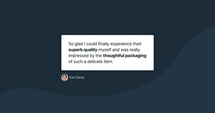
- 2 brilliant testimonials – not 8 average ones.
- 2 highlighted power features, with 4 smaller features below – not a grid of 12.
- Your 8 best wedding photographs – not the past 4 years of work.
Remember attention spans are diminishing online so we need to get to the point with our Landing Pages. No jargen. No verbose words. No pop-ups. Create the Landing Page you’d want to see when visitings for the first time.
Tip: Kill those social share icons, especially the embedded ones. If they are essential, hard code them.
Tip: Replace, don’t add. When you get new testimonials or images, try replace the old ones.
“The ability to simplify means to eliminate the unnecessary so that the necessary may speak.” ~ Hans Hofman
I hope you enjoyed these 10 quick tips to tighten your Landing Page design. What go-to tip you have did I leave out? If you enjoyed this roundup share it with a friend about to launch their next project:)
Much love,
Rob
Twitter: @robhope
Email: [email protected]