Judie & Z.
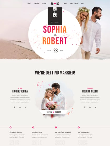
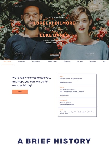
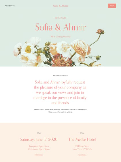
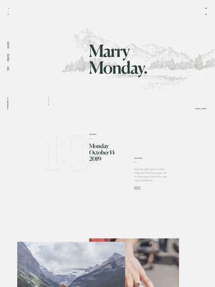
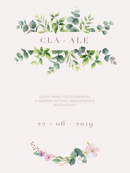
Author unknownSome great elements in this wedding One Pager for “Judie & Z”. Quite like this mix of font overlayed on the quality images – especially like that choice of the last image. Only crit is the cut off site on bigger monitors, so best viewed on your 1280px screens.
This website has unfortunately been redesigned or gone offline, so I have removed the direct link to it. The screenshot below hopefully preserved enough of the design but if you are really keen to inspect further, try this Archive.org link. FYI: the site was first featured on 02 July 2013.

