So your product or service is doing great and you have collected a bunch of customer testimonials for your Landing Pages. Wonderful but try to avoid these 3 common testimonial mistakes I encounter every day while auditing Landing Pages.
Watch my 3m53s video (or 60s Short) or read the article below:
🚫 Adding every testimonial
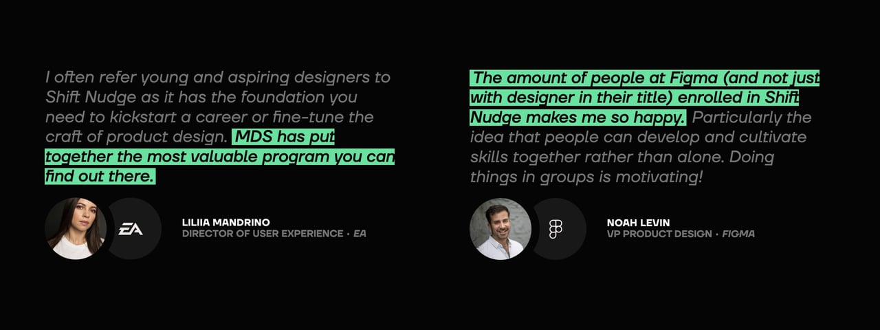
Not all testimonials are equal. Remove low value, generic statements like “I enjoyed the product” and rather extract the gems highlighting your features or answering potential doubts the visitor could have.
Compare: “This service was awesome” to “Impressive 48hr turnaround time”.
Compare: “My new favorite energy bar” to “The caffeine bar boosts me at least 10k”.
Bonus points if you can include any form of metrics. They are more meaningful to the Landing Page visitor as they highlight a measurable change.
🚫 Bunching them in a single page section
The strong testimonials will drown in the noise. We need to give them air.
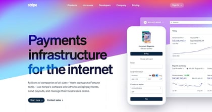
Start by positioning your best testimonial, ideally from someone your visitor recognises, right above the fold:
This social proof will reduce bounce rates and encourage your visitor to learn more by scrolling.
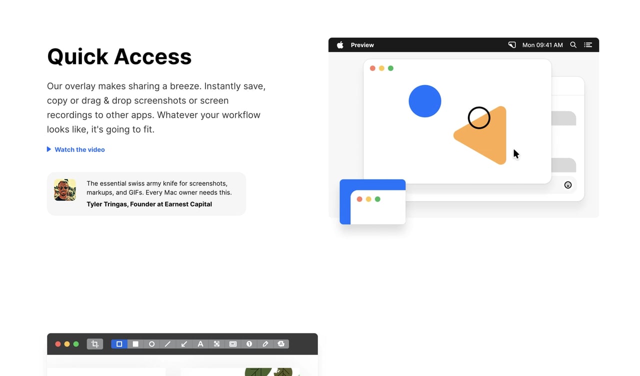
Now ID what features your remaining testimonials mention and pair those within the page.
Think how much more effective the testimonials will be, when a visitor is learning about a feature and someone backs it up right then and there.
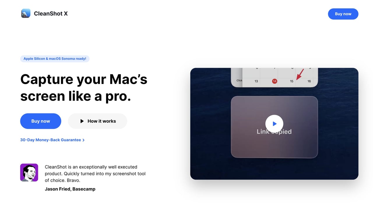
Here is screenshot tool CleanShot X talking about the ease of saving, copying, dragging, dropping, and then just below it a customer testimonial suggests the tool is like a Swiss Army Knife:
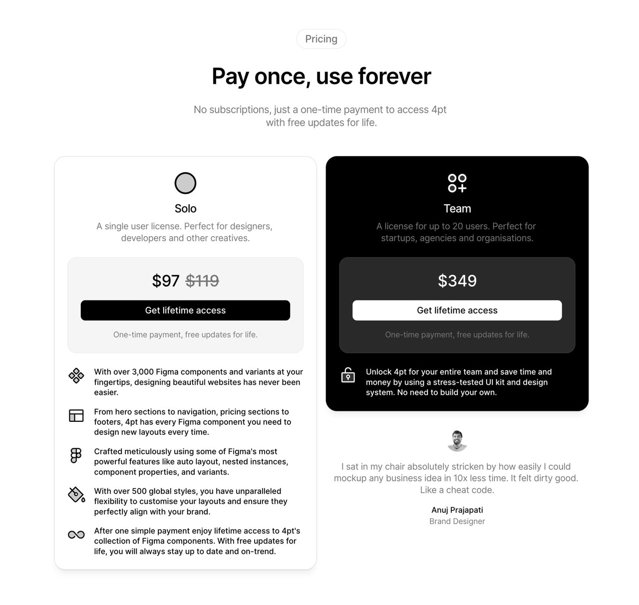
Then, any glowing testimonial about cost saving, value or time-saving can hang out at the pricing table as a confidence booster to use that credit card:
And finally, your remaining high-quality testimonials can sit within it’s own section but I’d argue your page probably doesn’t need it.
🚫 Not highlighting customer demographic below the testimonial
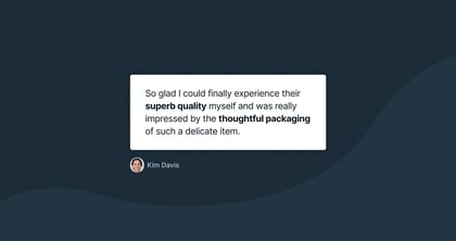
Try to handpick testimonials from a similar demographic as your Landing Page visitor. Include a friendly image of them and even their company logo if possible:
So if you are selling enterprise-level support software, it’s wise to curate testimonials from customers who work for enterprise-sized businesses.
This will give them confidence others previously made the weighted decision they are about to.
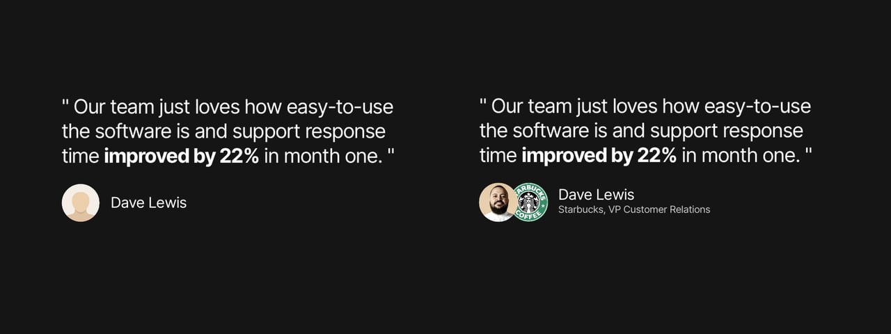
Based on what we’ve covered, this is a solid testimonial:
“Our team just loves how easy-to-use the software is and support response time improved by 22% in month one.”
Metrics, yes please!
Now compare this testimonial by a blank-avatar Dave Lewis or a friendly Dave Lewis who works at Starbucks as VP Customer Relations. A real person with a similar role as the Landing Page visitor:
Selling a baby carrier? let’s include a testimonial from a smiley “Sarah, mom of two”.
Servicing coffee machines? Let’s include the logo of the coffee chains you service.
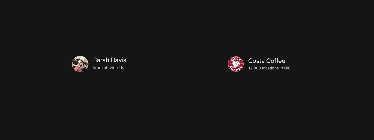
Remember reassuring for your Landing Page visitor to know, people… just like them… went all the way and are happy with the result.
I’m confident if you focus on these main 3 tips you will improve your Landing Page conversions.
Let me know if you have any testimonial tips to add or what other Landing Page content you’d love to see :)
Much love,
Rob
Twitter: @robhope
Email: [email protected]