Easily the most common question I get but unfortunately there is no single-task answer.
Easy right? Ha don’t fret, I appreciate actionable advice so this is going to be a practical 3-step guide with real examples for context.
And instead of saying “how I improve conversions”, let’s rephrase it to how can we deliver the best possible Landing Page our visitor would appreciate. Now that excites me…
Step 1: Lay your foundation with understanding
Here are the four questions I ask every client before performing my private Landing Page Audits. Alongside each question I’ll add a fictitious use-case example for better learning:
- Who is your target audience? eg. Advanced designers using Figma in their full time-job
- What problem do they have? eg. They are struggling to understand and integrate Figma’s new Auto-Layout function in their work
- How does your offering solve their problem? eg. My 30-minute ‘Master Auto-Layout’ video course teaches designers how to perfect Auto-Layout with basic to advanced use-cases
- What do you want the user to do when they arrive at your Landing Page? eg. Enroll for the course for $49 (this is your objective)
Before you move on to Step 2, let me run a few common mistakes I see Landing Page owners make and maybe we’ll pick something up…
💬 Is your audience too broad?
Let’s use the above use-case to define the target audience:
🚫 Designers
🚫 Advanced designers
🚫 Advanced designers using Figma
✅ Advanced designers using Figma in their full time-job
Drilling down to full time-job uncovers they have the budget and needs to speed up their workflow for a paid output. This can affect copy and imagery.
💬 Do you have multiple use-cases?
If so, this could call for either product/service refinement (pick one) or spinning up separate Landing Pages. These additional Landing Pages would promote your product/service using an alternative narrative to a different audience. Example for a baby carrier:
- A comfortable baby carrier for new moms needing to multi-task (the marketing narrative could be targeting work-from-home moms)
- A lightweight baby carrier for moms with back pains (the marketing narrative could be targeting moms with back pains)
Remember the more relatable a Landing Page feels, the more likely they presume the offering was destined for them. And the more likely they will give it a go.
💬 Can you explain your solution in one sentence?
The more time you spend refining your answer here, the better. Ask your friends, colleagues and customers what they think your offering solves. If their answer is slightly different than your answer, your Landing Page copy could be misleading.
Step 2: Step into their shoes to construct your page
Now you know your audience and what their problem is but are you looking at your Landing Page with their first-time eyes?
Step intro their shoes. Probably a tad frustrated and on a mission to solve their problem. Auto-Layout is hard! Babies are heavy!
Now what would they need to see and read to be persuaded to act?
Implement that. Nothing more. Nothing less.
To help guide you a bit, let’s imagine the initial page load to a first time visitor and what is going through their head:
- What exactly does this do? – does the introduction explain the product before scrolling?
- Can I see a few examples? – more product angles, chapter previews, image gallery, explainer videos, in-page demos
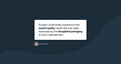
- Who else is using this thing? – testimonials, customer ratings, press logos, any form of social proof
- How much does it cost? – pricing tables, discounts
- If I don’t like it can I get my money back? – refund policy
- What about when….. ? – faqs
- Can I ask a question quick? – Support email address, phone number, corner chat
Now you’ve got all the content in place, but:
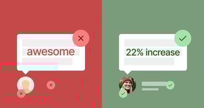
- Does that testimonial add value to your visitor? Does it highlight a product feature or answer a potential doubt your visitor may have? No, remove it.
- That 7th image doesn’t compliment your offering, remove it.
- That FAQ is post-sale, not pre-sale, remove it.
- “Multi Level Trajectory” sounds ridiculous, remove it.
Step 3: Optimize delivery
Your Landing Page is now refined to all the vital ingredient the first-time visitor needs to make an informed decision. But…
- It’s loading slowly because of 16mb of images – drop them all into ImageOptim then reupload
- It’s loading slowly because of your unsused scripts and plugins – use Pingdom website speed test to inspect behind-the-scenes, this will form your new to-do-list
- It’s not legible on mobile – decrease your font size on smaller screens, especially section headings – inspect how Google sees your mobile version
- The navigation scrolls to the wrong section
- The chatbot is covering the pricing table
Attention spans have never been lower online. Speed and legibility optimization are crucial to your Landing Page visitor sticking around to truly understand your solution.
Bonus Step: Filter in the right people
A Landing Page is where a user “lands up” after marketing efforts.
If 3 out of every 100 visitors buy an Ebook, the Landing Page conversion rate is 3%. If 3 buy out 1000, that’s 0.3%.
That means 997 out 1000 people arriving at a Landing Page didn’t feel your offering would solve their problem.
If you are sitting with a low success rate but confident you have thoroughly implemented steps 1-3, perhaps your marketing is misleading and you are sending the wrong people to your Landing Page.
Go find your people.
Much love,
Rob
Twitter: @robhope
Email: [email protected]