This article was derived from my WordCamp Europe 2019 talk (embedded below) about Landing Page conversions.
We start by trying to understand what our user is thinking and anticipate what they are expecting to see in our Landing Page – resulting in improved conversions.
And for fun, in the light of the event being held in Germany, I decided to adapt my talk into a tale about Yannick from the quaint town of Witzenhausen 🇩🇪 – hope you enjoy the story!
Firstly, what (exactly) is a Landing Page?
A Landing Page is the webpage where your user lands up after your marketing efforts. eg. CocaCola have an Instagram Story promotion saying “Swipe Up to stand a chance to win a trip of a life time”. You swipe up and land up on the competition Landing Page, not the website home page.
It’s also worth noting a good Landing Page has only one objective – in this case inputting your email, hitting the enter button and BAM – that’s what we refer to as a conversion.
See the beauty of a Landing Page is the effectiveness of getting your visitor to do one thing. Ok, let’s get going…
A conversion tale from Witzenhausen.?
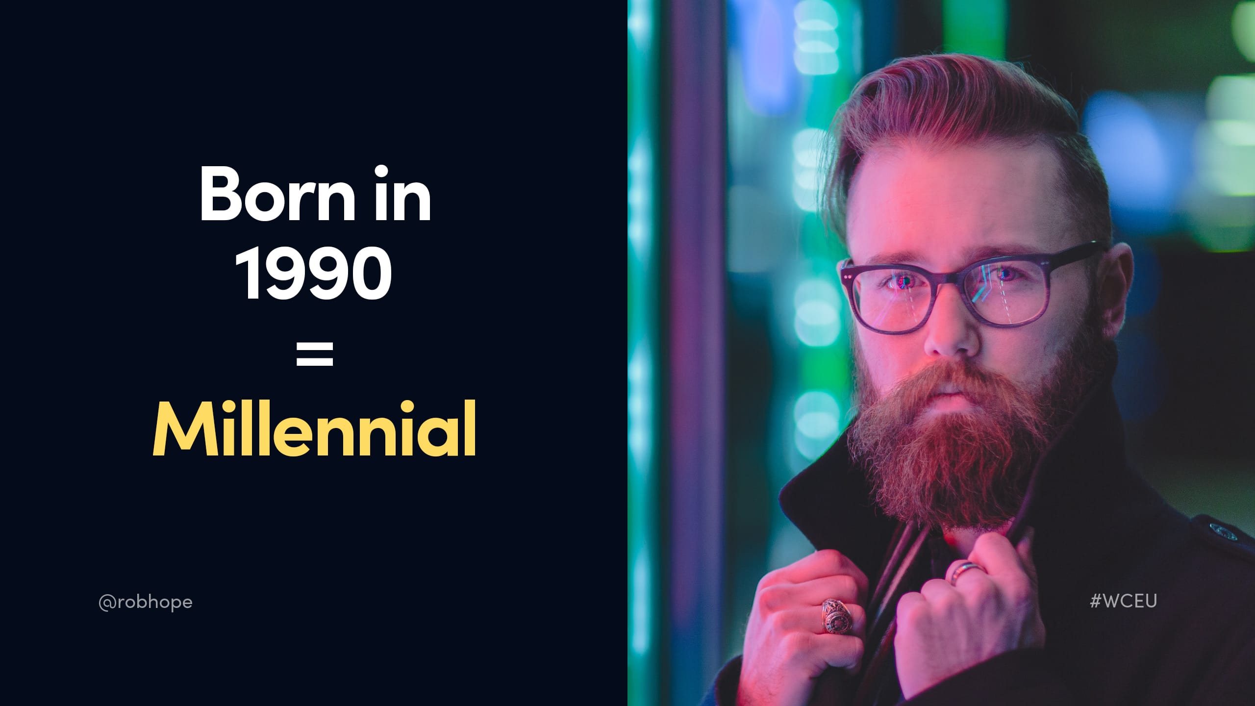
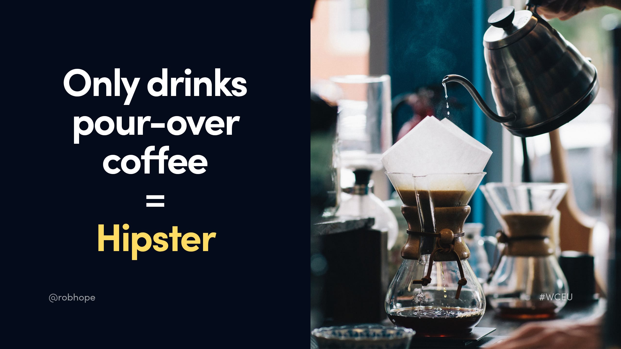
Meet Yannick. Yannick is a millennial hipster.
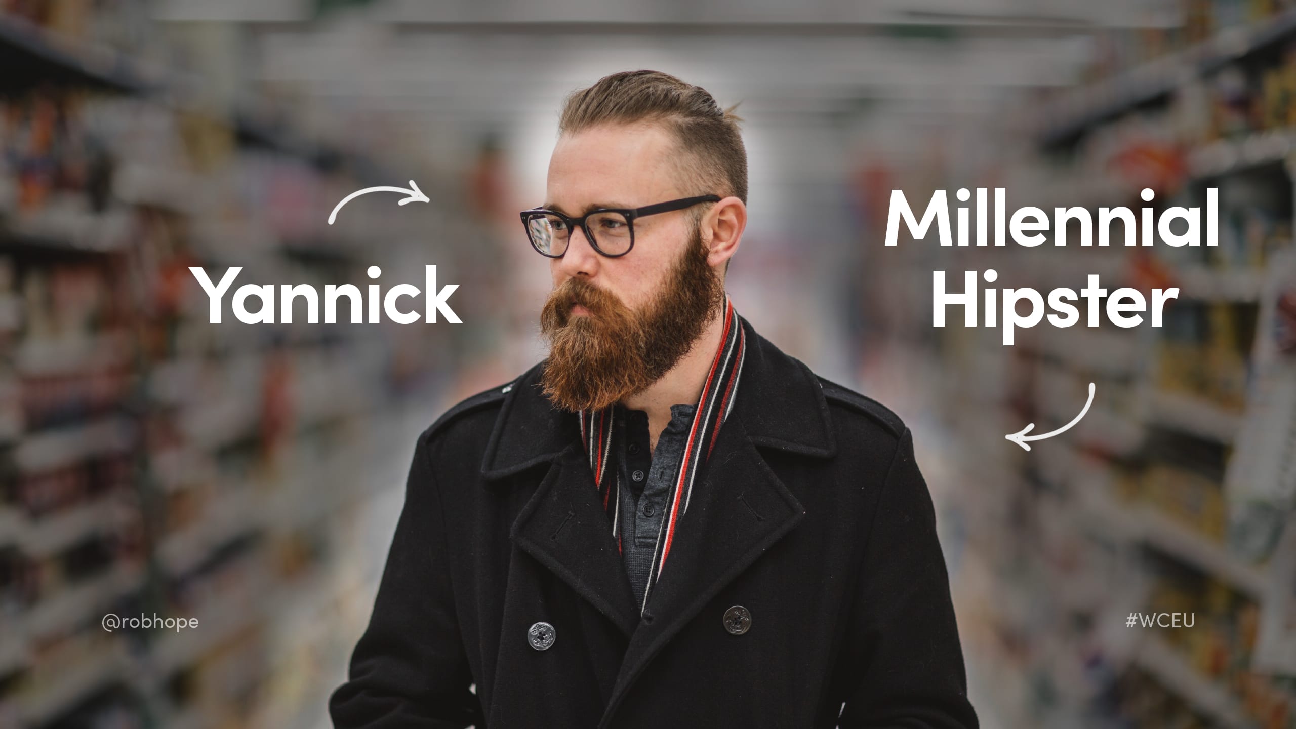
How do we know Yannick is a millennial? Well, he’s born in 1990.
How do we know Yannick is a hipster? No, it’s not his gorgeous beard. It’s because he only drinks pour-over coffee. According to Yannick, all other coffee is scheisse.
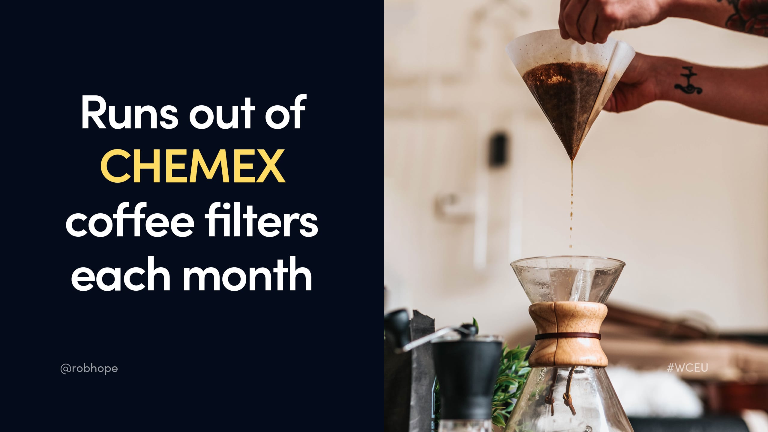
But it’s not all good times for 29 year old Yannick. Each month he runs out of his beloved Chemex Coffee Filters.
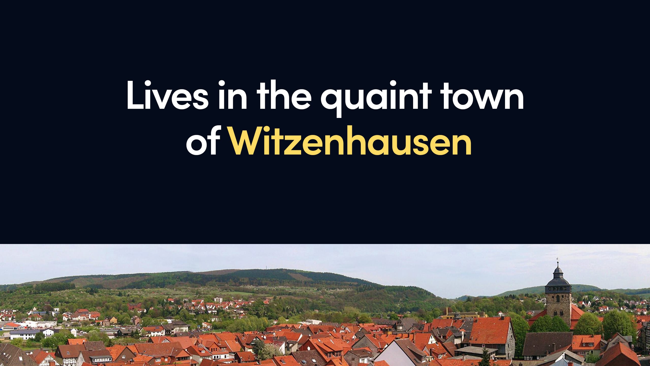
And because he lives on a sunny hill in the quaint town of Witzenhausen (about 115km from nearest city Hanover) he has no easy access to replenish the coffee filters when they run out.
I know what you are thinking? Why not just use normal coffee filters? Did I not mention Yannick is a millennial…
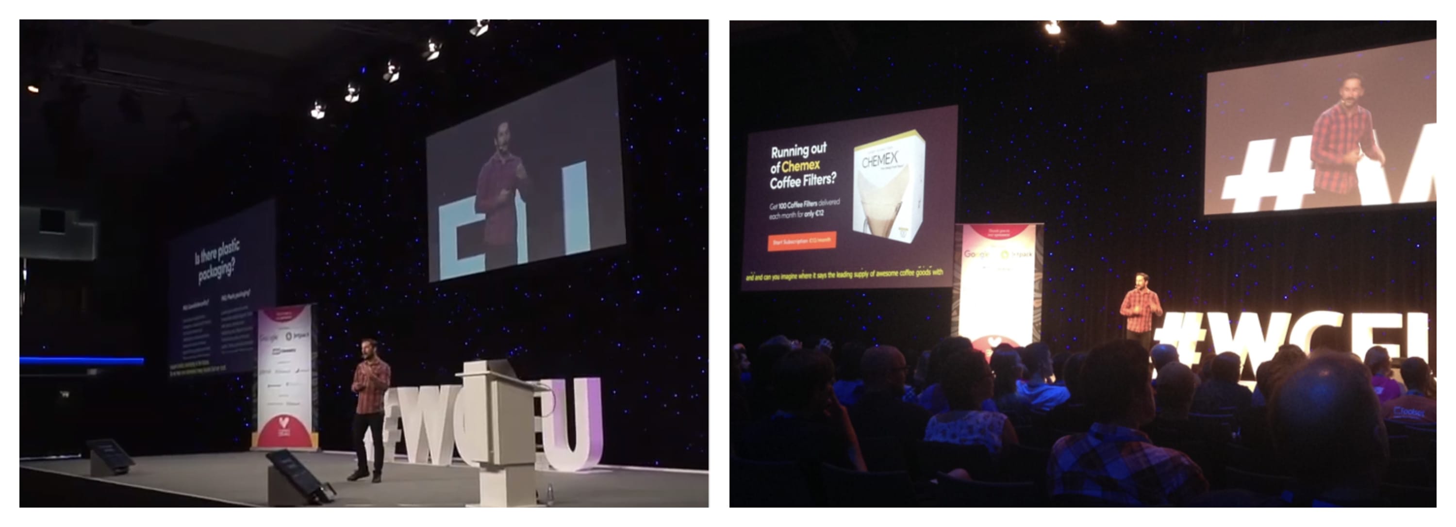
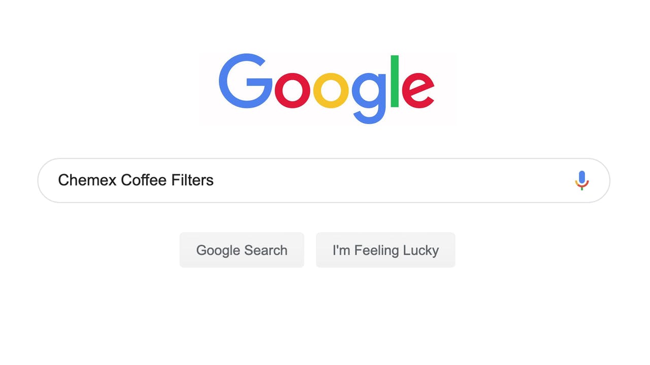
So like any young and ambitious millennial would do when they run out coffee filters – he hops online to order some right? Pah! Nope. He heads to Twitter and Tweets:

THEN he heads over to Google and searches:
…and because our marketing team is on the ball, we have a Google Ads campaign running excluding major German cities saying:
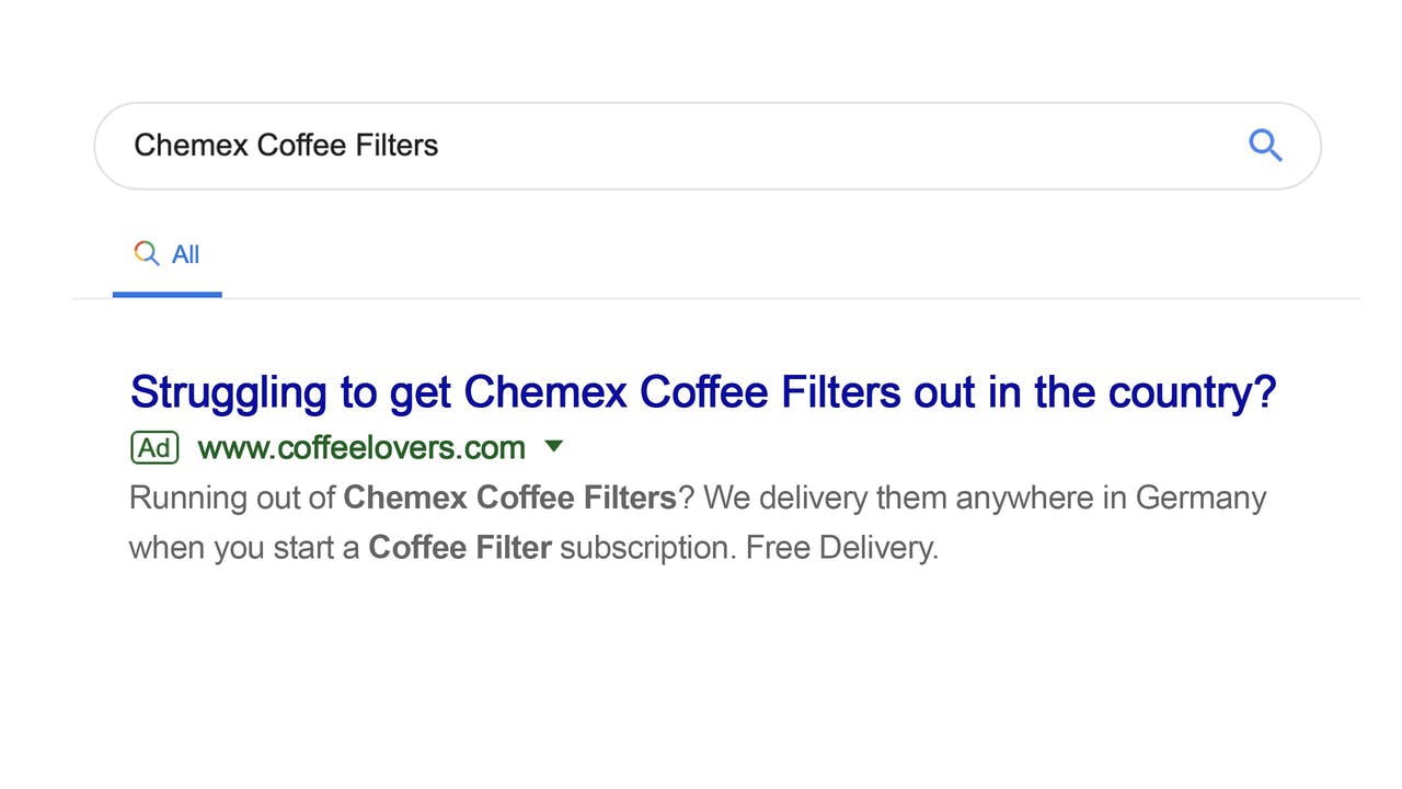
Yannick thinks. Woah… that’s me.. I’m in the country! So he clicks the relevant ad… arriving at our Landing Page.
Setting the Objective
Now remember what I said before, a good Landing Page has only one objective and in this case, for Yannick to subscribe to get delivered monthly coffee filters aka a conversion.
Before we dive into the Landing Page construction, let’s step back quick. I could list 50 things to do and not to do but there is really one fundamental question to ask at this point: What exactly would Yannick want to read for him to be persuaded to enter in his Credit Card details and start a coffee filter subscription with us?
Let’s go. We always start with…
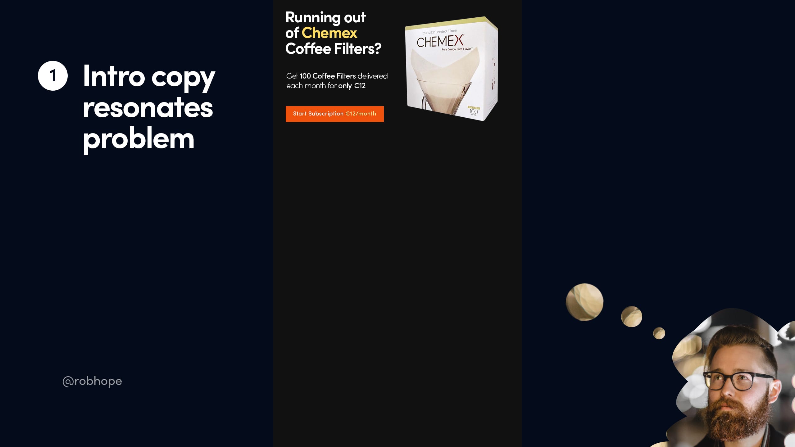
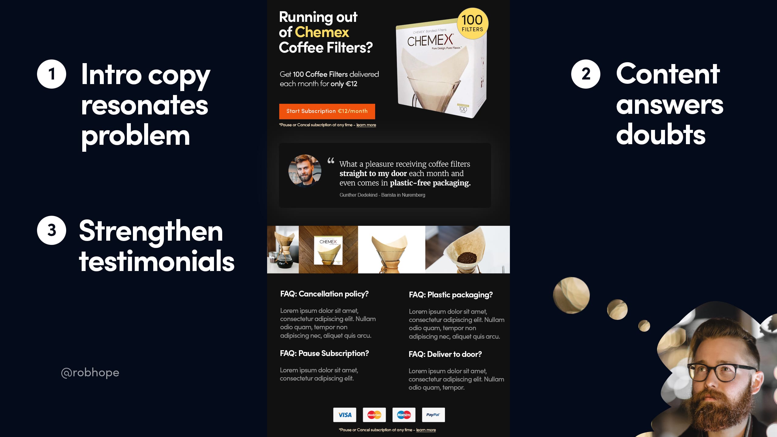
1. Intro copy must resonate with the user problem
Not many of you know but I’ve reviewed over 7000 Landing Pages over the past 10 years and you’ll be blown away at what I see each day. Can you image the conversion difference between Yannick arriving at a Landing Page that begins with:
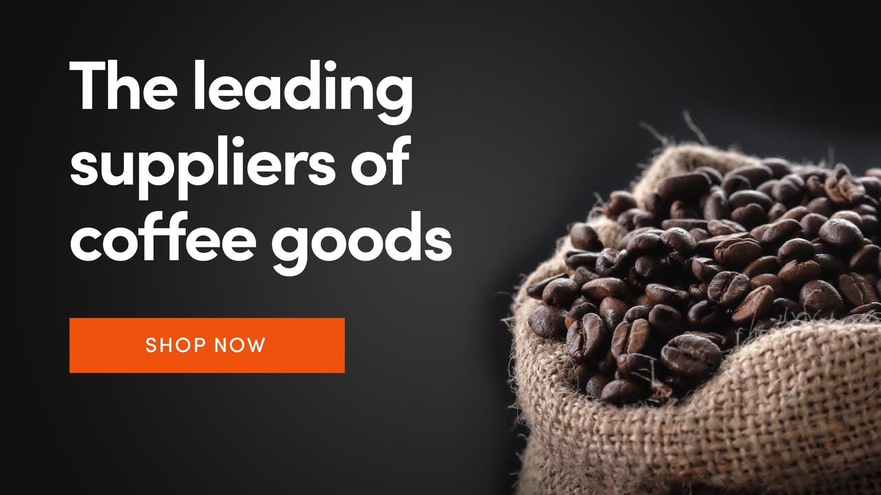
and this:
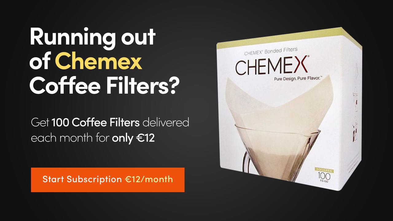
… with an image of the actual Chemex Coffee Filters and an actionable CTA subscription button?
Yannick is thinking woah, das ist wunderbar! (and begins reaching for the credit card in his pocket)
But of course intro copy plus an alongside image is generally not enough to get a conversion in 2019. Yannick of course has questions.
Second step…
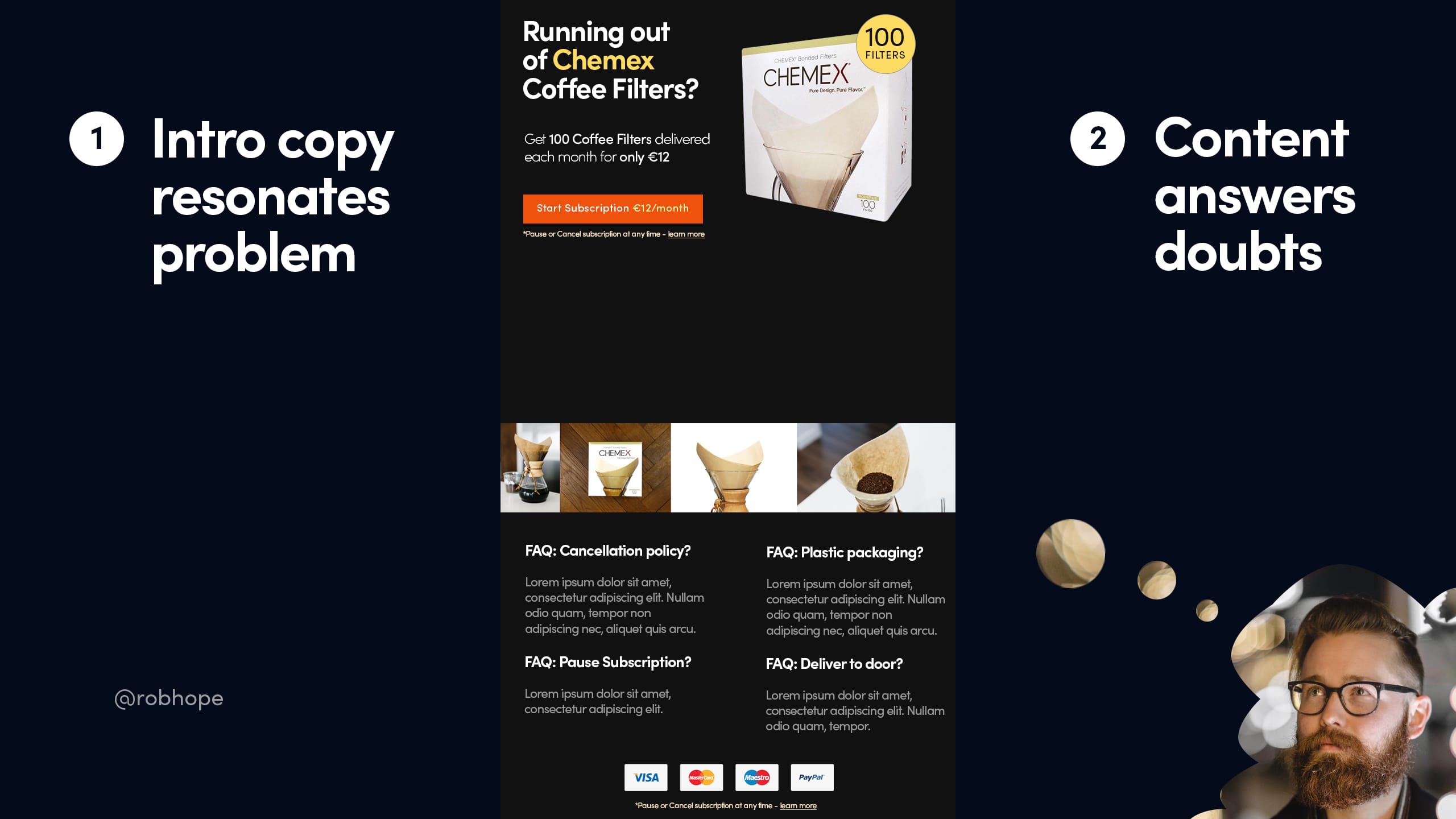
2. All content must answer doubts
What would Yannick, the 29 year old German man with the gorgeous beard, be thinking at this point? Let’s brainstorm a few…
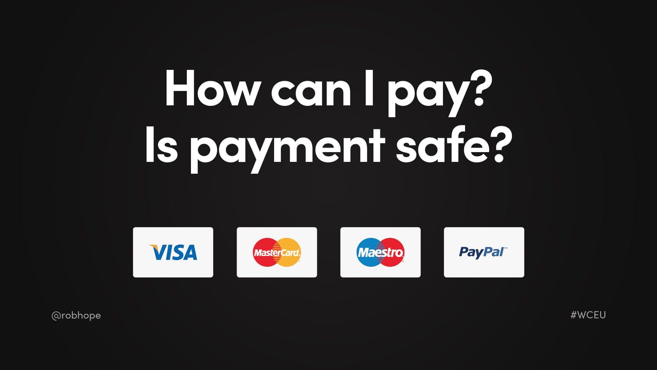
How can I pay? Is Payment safe? So we add credit card logos in the footer:
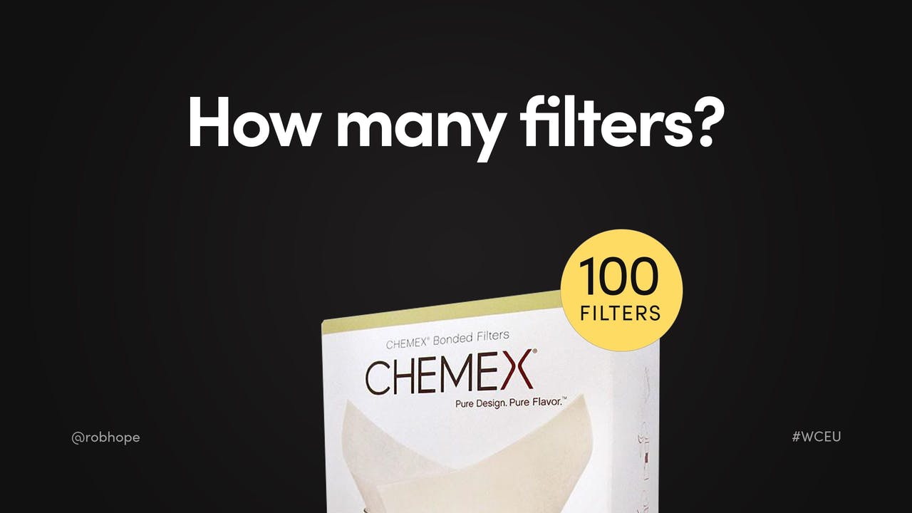
How many filters are there? We already included the amount in the intro copy subtext but we understand Yannick is in a rush and probably skims content – as do 90% of the others. So we paste a badge on the intro product image with an amount, clear as day:
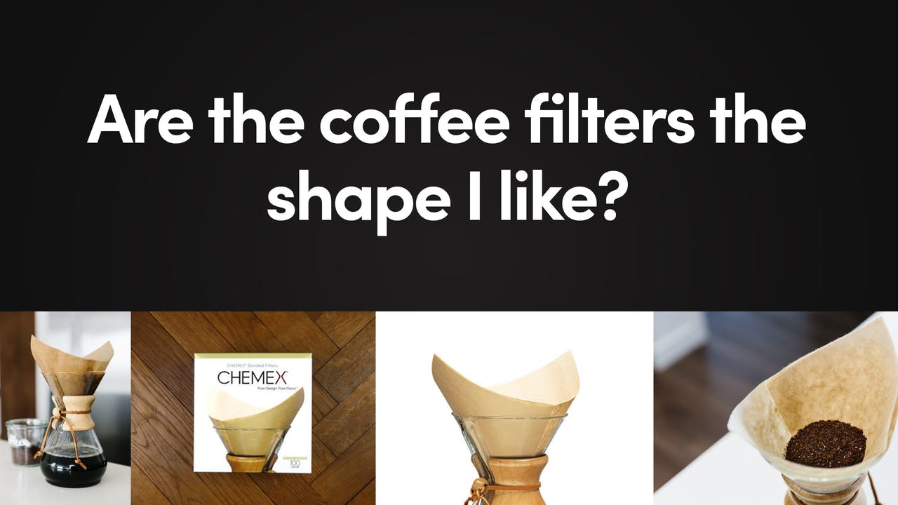
Are the filters the shape I like? We add a minimal but clear strip of images:
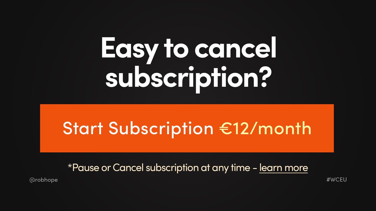
Is it easy to cancel subscription? We add the subscription policy right under the subscription CTA button as well as under the credit card logos. Those are probably 2 areas of our Landing Page that Yannick would think about it:
He might want a little more detail on this as subscription cancellations are known to be sticky – so let’s add a Learn More link (seen above) that smooth scrolls to our Landing Page FAQ section:
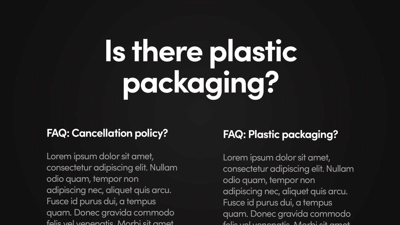
In that FAQ section we also add more information about plastic packaging as ya know… what about the baby Turtles!
Step three…
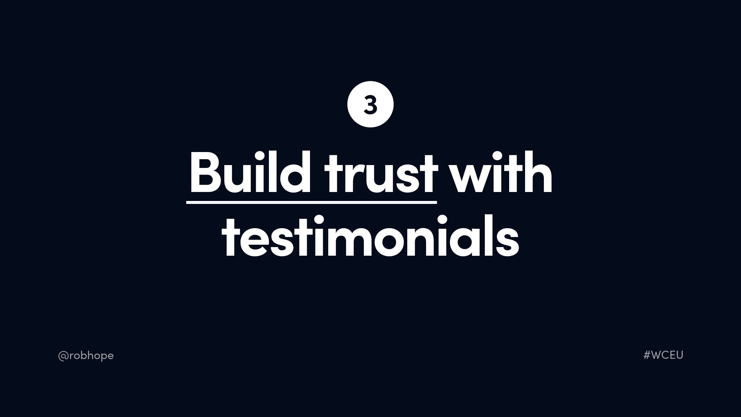
3. Build trust with Testimonials
Don’t underestimate the power of a great testimonial from an opinion leader.
Let’s quickly step to the side and imagine you are designer looking for icons. You arrive at a Landing Page for ZenIcons. In the middle of the icon previews is a testimonial from a Product Designer from Spotify saying these are my go-to icons for all my personal side projects:
Bang – they must be quality. Where do I pay?
Stepping back to Yannick – what would his ideal testimonial look like?
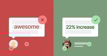
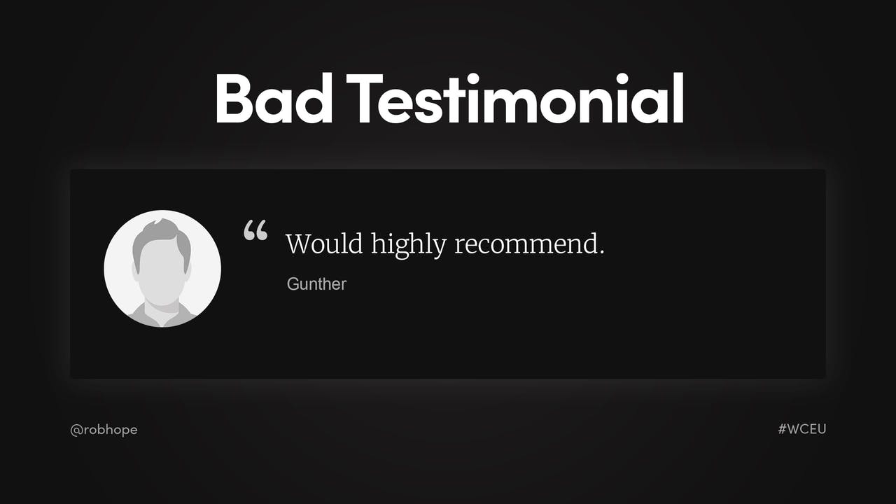
A bad testimonial looks like this, anonymous with little value:
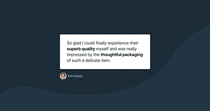
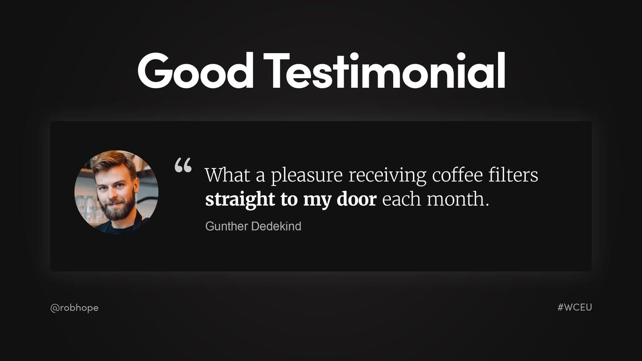
A good testimonial is by a real person highlighting a product or service feature. Here is another bearded dude in a coffee shop talking about the subscription:
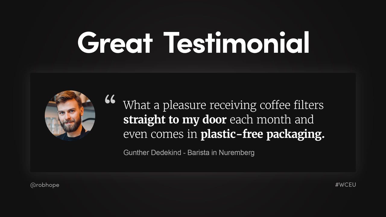
A great testimonial is by a real, relative person or opinion leader highlighting a feature but also answering a doubt. Here is a Barista from the small town of Nuremberg talking about the subscription but also how much he appreciates the non-plastic packaging. Because, you know, the turtles:
Yannick is besides himself and almost ready to pull the trigger but its 2019 and attention spans are like dust (he’s actually wanting to check if anyone liked his Tweet earlier).
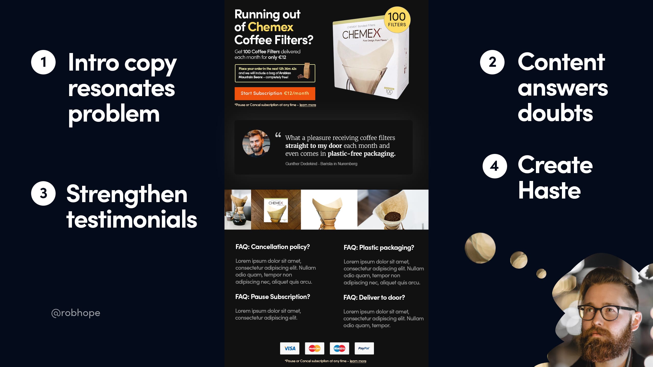
Step four, last step..
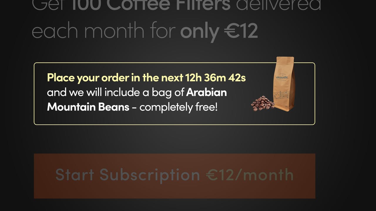
4. Create haste
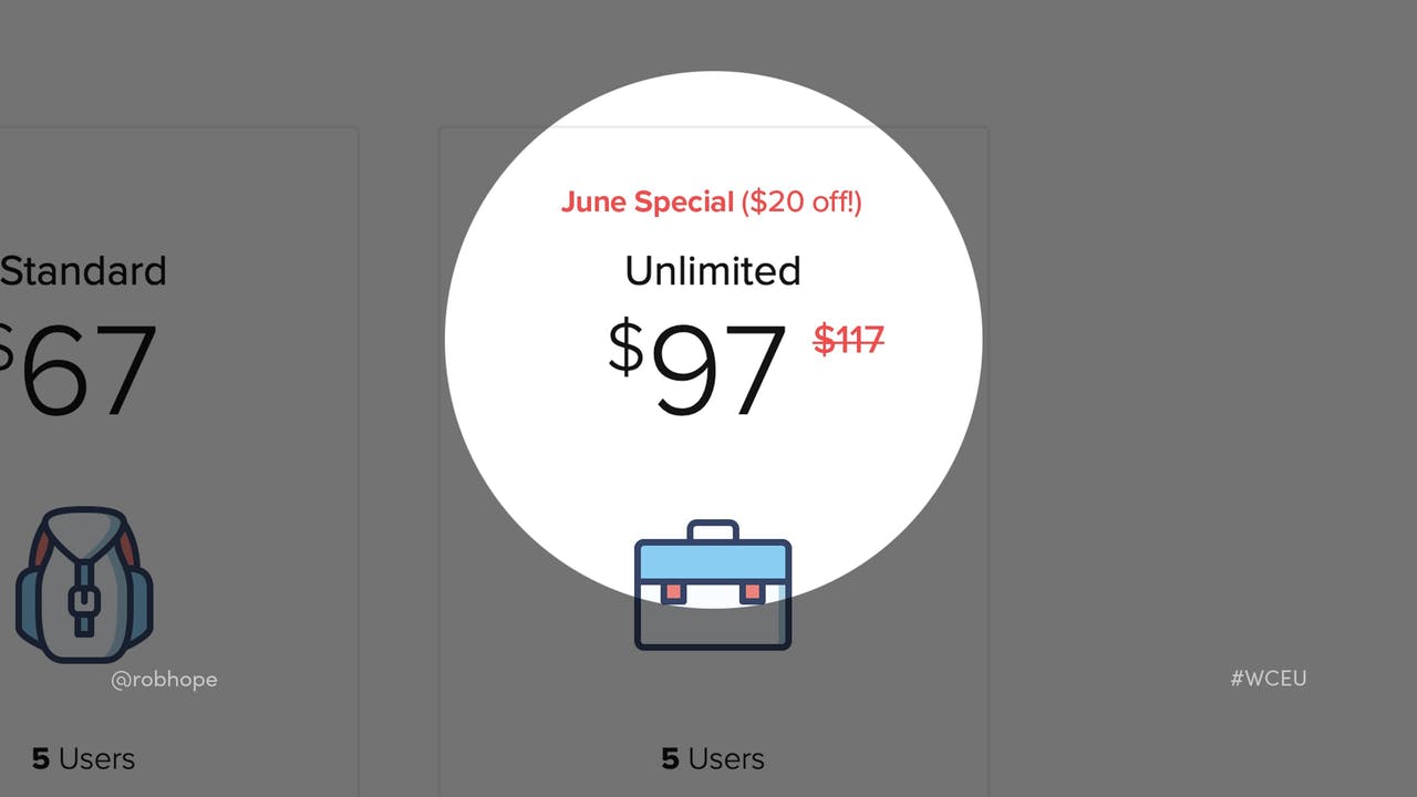
We’ve answered all the potential doubts but the most difficult one to combat is if they can get the same product or service cheaper somewhere else. So we increase the perceived value and put a limit on it. Here are some examples.
Add a discount in your pricing table, only valid for that month:
Add a limited stock quantity under the purchase CTA button:

And in Yannick’s case, we’ve added a countdown timer right on top of the CTA button, offering a free bag of Arabian mountain beans if he subscribes in the next 12 hours:
Yannicks heard those Arabian beans are legit and doesn’t want to miss out on this time-sensitive opportunity! So along with all the relative content and answered doubts, he whips out his credit card and bam we have a subscription conversion.
Let’s quickly recap
We took the time to understand our user and created intro copy that resonated with the user problem and offered a solution right away:
All our content was crafted based on potential doubts:
We built trust with great testimonials by real people:
… and lastly boosted the conversion with a little bit of strategic haste:
Note how there is no newsletter sign up, no advertising, no links to other website pages and no other products for sale. By anticipating what our user would like to see in our Landing Page, we have minimized the content, to maximize the conversion.
Hope you enjoyed the article!
“By anticipating what our user would like to see in our Landing Page, we have minimized the content, to maximize the conversion.”
Much love,
Rob
Twitter: @robhope
Email: [email protected]