There is no question Squarespace has the best designed templates of all online website builders. With our niche being One Page websites, a common question I get asked: I want to use Squarespace but where do I start?
I’ve spent some time curating their impressive collection of 65 pre-designed templates down to 8 templates which are your best starting points to build a One Page website online.
Each template has noteworthy points including (no audio) video previews so you can experience them a bit more:)
One Page Love Exclusive Coupon
Yay! Squarespace has been kind enough to give One Page Love readers the exclusive coupon OPL10 for 10% Off* your first website or domain purchase. (There is a free 14-day trial with no credit card needed, so you can try risk-free.)
Please note: this article is based on the Squarespace 7.0 platform.
The new Squarespace 7.1 platform features an improved user interface, so the screenshots might differ but the majority of the content is still relevant. Squarespace 7.1 offers a much more flexible way to build websites, regardless of which template you start with. Squarespace 7.1 templates also support all features and style options including an unlimited number of page sections.
Review Index:
- Sonora – Landing Page, event, parallax scrolling
- Flatiron – portfolio, AJAX loading, case-study
- Ishimoto – photography, minimal, horizontal slider
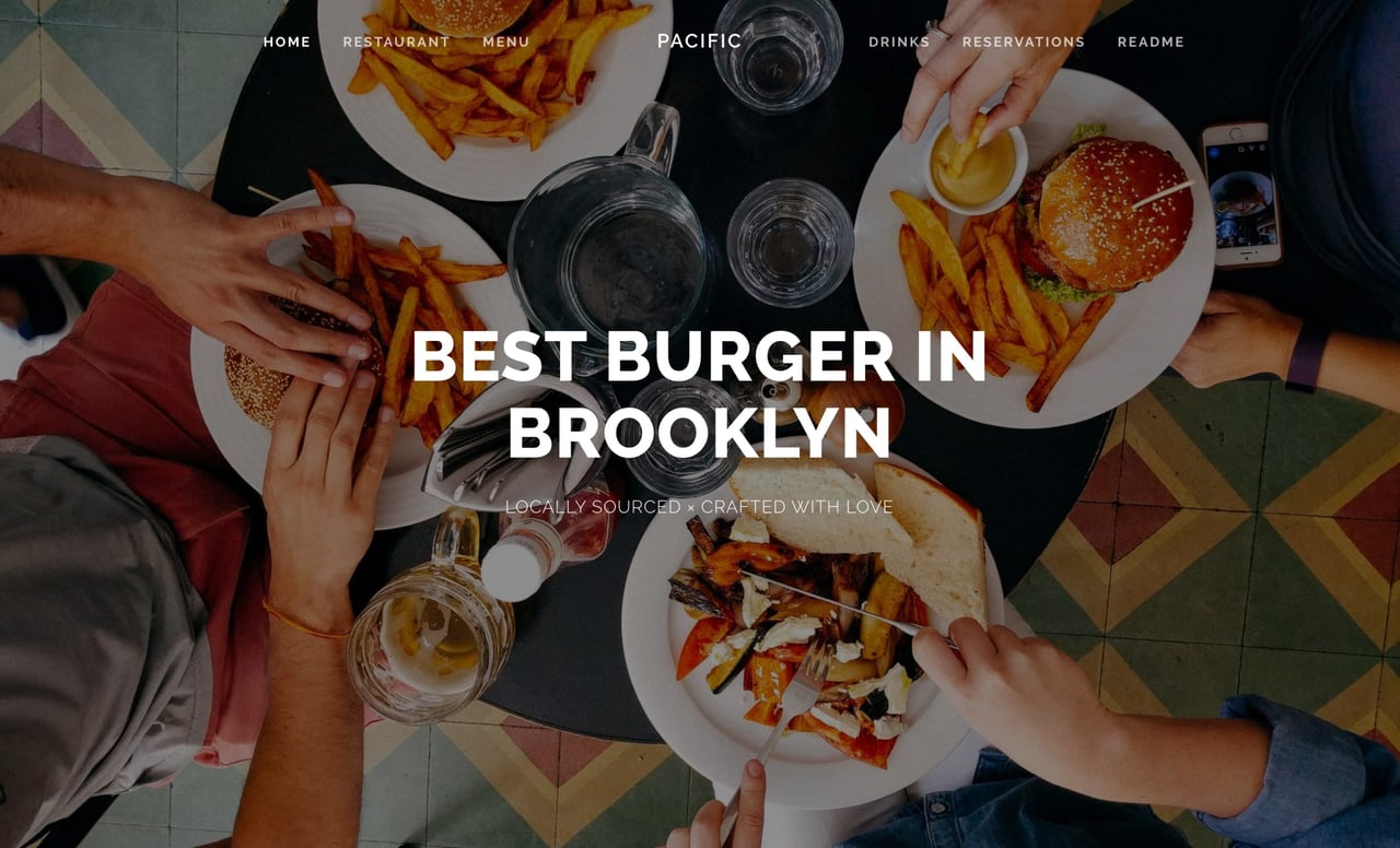
- Pacific – multi-use, restaurant, long page, sticky header
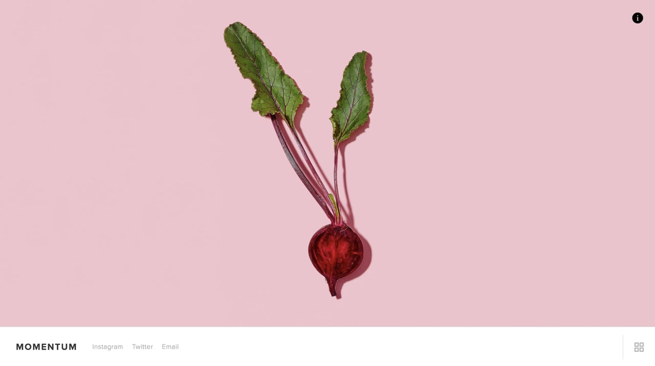
- Momentum – photography, portfolio, horizontal slider
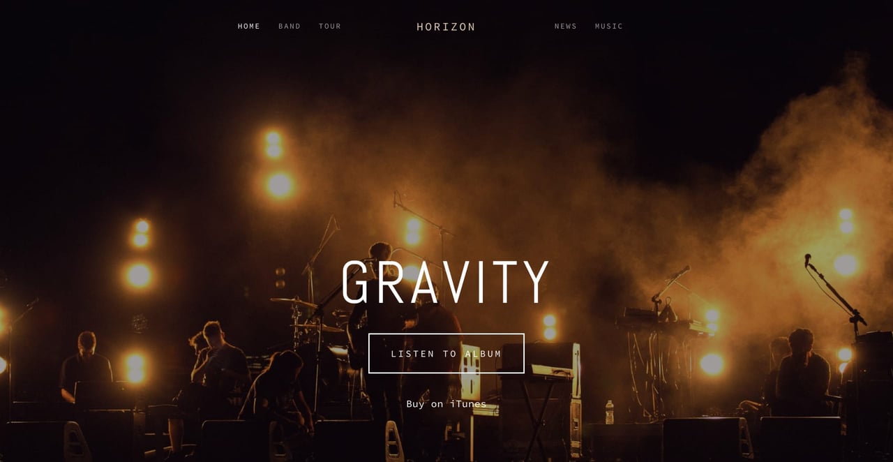
- Horizon – artist, musician, long page
- Rover – multi-use, Landing Page, service
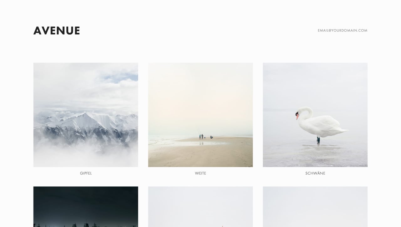
- Avenue – portfolio, grid, AJAX loading
Sonora (Landing Page, event, parallax scrolling)
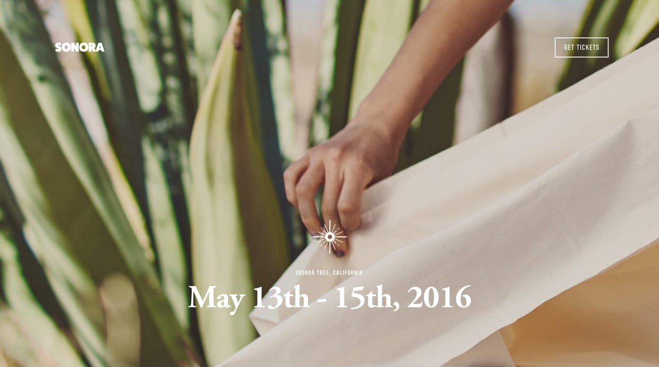
Sonora is a gorgeous long scrolling template with fancy Parallax Scrolling effects and stunning typography. The template can be used for any Landing Page really but this demo is geared to kick-start your event.
Features include lovely big imagery (with parallax effects), spacious typography, more image gallery grids, event information, Google Maps integration and testimonials.
With Sonora’s full-screen 3D scrolling effects and customizable gallery layouts, you can do more than share your event—you can put it on the map.
Sonora Video Preview:
Note the parallax scrolling effect – this is how the foreground text moves faster than the (slower) background images as you scroll down.
Suggested Customizations:
I removed the header page navigation items (top right) and replaced with a clear Buy Tickets button. Further down in the divider section with the clothing rail I added a big call-to-action button promoting Buy Weekend Tickets $199.
Flatiron (portfolio, AJAX loading, case-study)
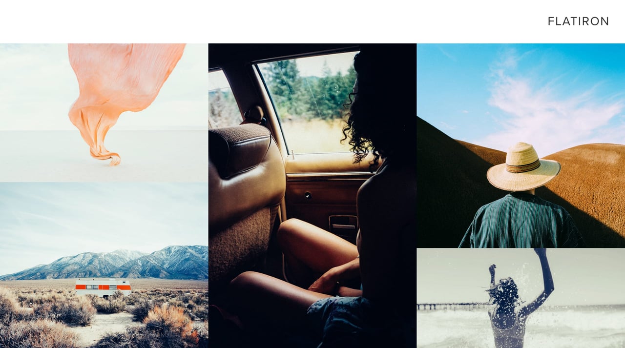
Flatiron is a unique portfolio template that loads projects with AJAX. This means loading content within the page without actually reloading your browser tab.
The template supports multiple images per project including text. This can act like a case study portfolio if needed.
Like the iconic Manhattan building, Flatiron is unconventional. With a portfolio experience that supports multiple portfolio projects side by side, Flatiron is popular with art directors, illustrators, and photographers.
Flatiron Video Preview:
Note how the mixed grid of project thumbnails are below each project. In other words the project you select loads at the top of the page. Also notice the neat arrows to browse easily between all projects.
Suggested Customizations:
I removed the top-left page navigation items as they weren’t needed. I also added my email address in the footer that appears if you move your cursor away from the browser.
Ishimoto (photography, minimal, horizontal slider)
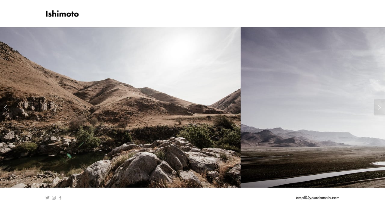
Ishimoto is a minimal One Page template showcasing imagery in a horizontal scrolling strip.
The different between Ishimoto and Momentum (further down) is there is no additional description on each photograph. Your visitor simply scrolls uninterrupted and let’s the images do the talking.
A one-of-a-kind template with a one-of-a-kind name. Ishimoto is a portfolio template with an innovative, horizontal gallery slider that makes it preferred among photographers, artists, and restaurants.
Ishimoto Video Preview:
Note how you can click the images or the arrows to navigation. Also notice how well the template accommodates imagery with different widths, something a lot of other photography templates struggle with.
Suggested Customizations:
I simply removed the page navigation top right and added my email bottom right. A perfectly minimal photography portfolio.
Pacific (multi-use, restaurant, long page, sticky header)
Pacific is a solid, striking Landing Page template suited for just about any industry.
The imagery and design fills a big resolution so well and adapts down to mobile gracefully.
Perfect for agencies, restaurants, bands, wedding sites, and more. Pacific allows you to create long scrolling pages with background images and beautiful full-width galleries or albums.
Pacific Video Preview:
Note how a sticky header navigation appears once you’ve scrolled down a bit. This allows your visitor to easily smooth scroll between sections.
Suggested Customizations:
None. Pacific is One Page out the box and easy to use. I used Unsplash images for this custom demo.
Momentum (photography, portfolio, horizontal slider)
Momentum is a unique One Page template showcasing full-screen imagery in a slick horizontal scrolling slider.
The difference between Momentum and Ishimoto (further up) is each photograph can include a text overview to give context to the work.
Momentum is a beautiful template built especially for photographers and designers who need full-screens, high resolutions, and the ability to show work in a slideshow interface.
Momentum Video Preview:
Note the slick slider transitions and the unique off-canvas animation when you click the info icon.
Suggested Customizations:
I replaced page navigation items (next to the footer logo) with my social media accounts and email address. Perfectly sufficient for my needs.
Horizon (artist, musician, long page)
Horizon is a gorgeous long scrolling template perfect for any artist, musician or band to promote their new material and tours.
Features include big image backgrounds, spacious intro announcement, band members, tour dates, blog feed, Twitter feed, a stunning media player and ends with a row of social icons.
When you put on a show, you put it all on stage. Designed to be a One Page website experience for bands with a gigantic presence, Horizon lets your content take center stage like never before.
Horizon Video Preview:
Note how a sticky header navigation appears once you’ve scrolled down a bit. This allows your fans to easily skip to sections they want to see faster.
Suggested Customizations:
I removed a few navigation items to keep the template One Page and relevant to the scrolling sections within the long page. I used Unsplash images for this custom demo.
Rover (multi-use, Landing Page, service)
Rover is a stunning Landing Page template that tells a story while you scroll.
Features include lovely whitespace, stylish typography, services, big imagery, rates table, clients and contact form.
The difference between Rover and Sonora (further up) is that Rover has no fancy parallax effects but includes a pricing table.
Showcase your professional services with Rover. Its spacious layout and neat typography give any amount of text an organized, elegant look. And its long-scroll Landing Page is perfect for mobile.
Rover Video Preview:
Note the gorgeous whitespace and big imagery as you scroll.
Suggested Customizations:
I removed the top navigation in the header as you can simply scroll to all the sections.
Avenue (portfolio, grid, AJAX loading)
Avenue is a minimal portfolio template that showcases your work in a clean grid layout.
Features include AJAX loading portfolio items that supports multiple images per project including text.
The difference between Avenue and Flatiron (further up) is that Avenue has a more structured, grid approach vs the more arty scattered display of imagery in Flatiron.
A classic template with a timeless look, Avenue’s clean, straight lines and adaptive grid-based layout are especially popular with photographers, illustrators and designers.
Avenue Video Preview:
Note how the project you select loads at the top of the page followed by the grid of thumbnails. This allows you to easily browse more projects instead of scrolling up after each read.
Suggested Customizations:
I added my email address in the top-right header area.
FAQ: What are the benefits of using Squarespace?
Squarespace is a leading online website builder. What sets them apart is their superior level of design and award-winning customer support team available 24/7. Other main benefits are:
- No Website Hosting Needed - their platform is fast and secure.
- Online Content Management - all edits are done within your browser, no software needed.
- Easily Drag and Drop Images - unlimited galleries with unlimited bandwidth.
- Free Domain Name - when registering for your first website, if you pay annually (renews at standard rate).
- Beautifully Responsive - all templates work for all devices, so you only have to design your website once. Test and preview how your website will appear on a range of screen sizes.
- Blog Sections - can easily be added for content marketing and to share your journey.
- Commerce Solutions - are an upgrade away if you want to start selling products.
- Email Marketing - gather email addresses, send marketing emails and analyze the reader email activity.
- Member Areas - create private website sections only accessible to signed-up or paying members.
- Scheduling - add an online scheduler to your site to diversify your revenue with professional services or classes.
That’s a wrap! Don’t forget your 10% Off coupon*: OPL10
That’s a wrap! Don’t forget your 10% Off coupon: OPL10
I hope you found value in the article, props to Squarespace for creating a platform where we can create beautiful Singe Page websites, easily. I’m working on a follow up article (+/- 2 weeks) on how to create a long-scrolling Landing Page from scratch with Squarespace.
* The OPL10 coupon offer only applies to first payment of subscription on Squarespace, does not apply to future recurring payments or monthly plans, and may not be combined with any other offer codes or discounts.
Much love,
Rob
Twitter: @robhope
Email: [email protected]




![How to create a free link in Bio Site in minutes [video]](https://assets.onepagelove.com/cdn-cgi/image/width=420,height=222,fit=cover,gravity=top,format=jpg,quality=85/wp-content/uploads/2022/07/sqsp-thumb.jpg)
