← All typefaces
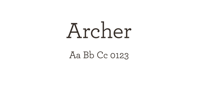
Archer
Archer brings ball terminals to a geometric slab-serif structure, including unusually prominent examples in its capitals. Developed for Martha Stewart Living, it had to accommodate recipes, lists, charts and other detailed editorial material. Its typewriter influences give the family an approachable character without turning it into a monospace.
- Style
- Serif
- Designer / foundry
- Monotype ↗