Cirro
 Studio Otto
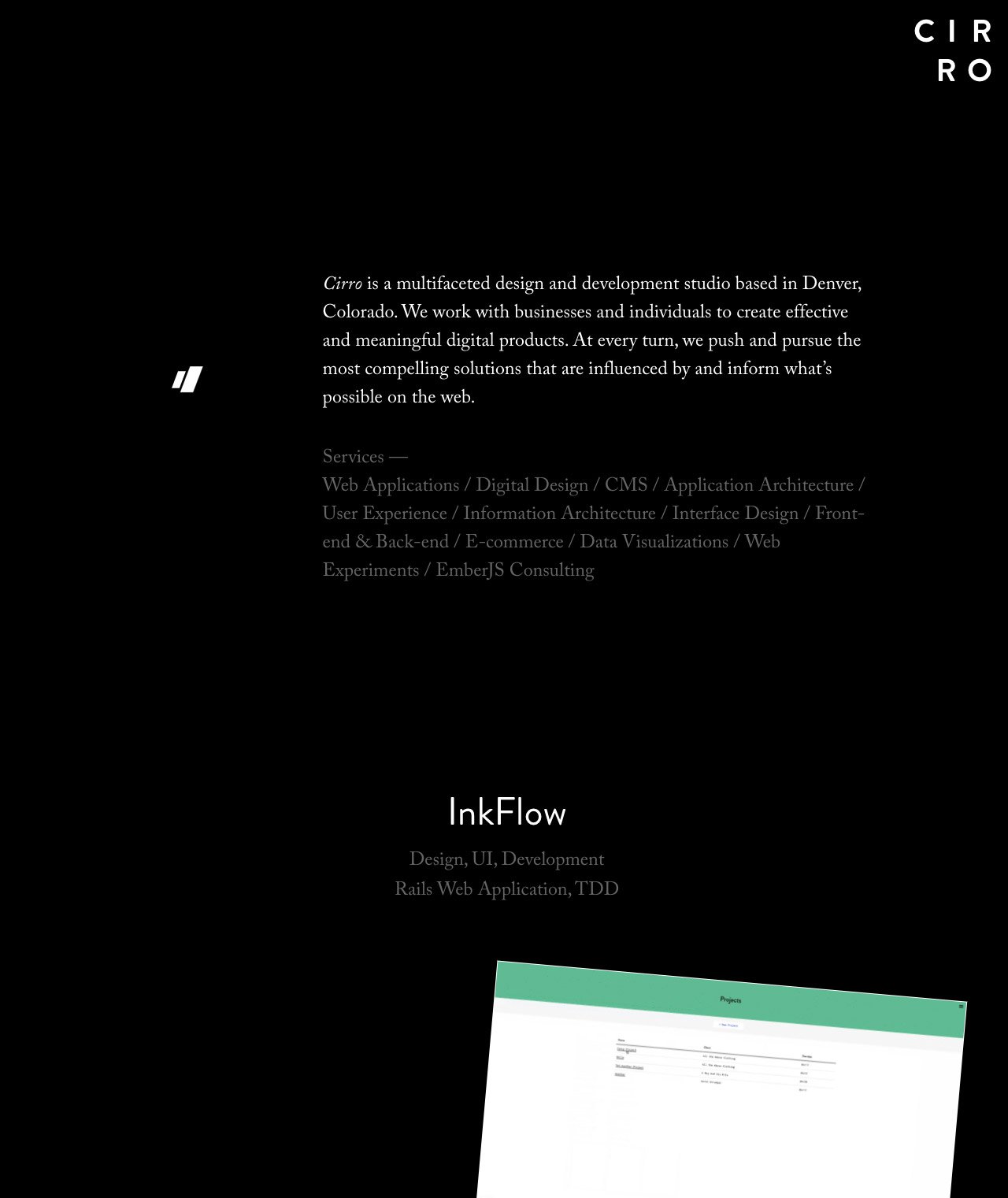
Minimal One Pager with a dark color scheme for Denver-based digital agency, ‘Cirro’. As you scroll the screenshots scroll up while the project description stays centered in your window. Also if you take a closer look the screenshots are actually moving interaction demos.
This website has unfortunately been redesigned or gone offline, so I have removed the direct link to it. The screenshot below hopefully preserved enough of the design but if you are really keen to inspect further, try this Archive.org link. FYI: the site was first featured on 19 May 2015.
Features
Product DemoWhitespace
