What it means
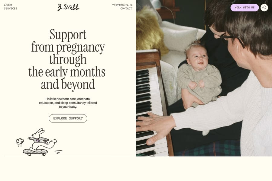
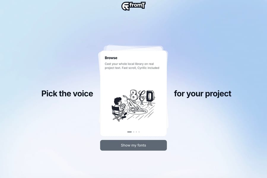
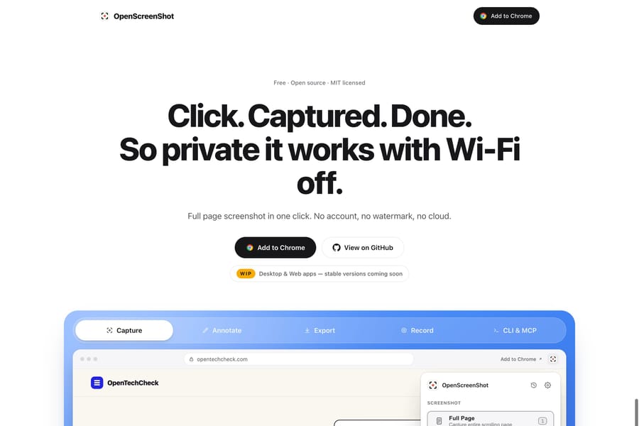
Size, contrast, position, grouping and whitespace all contribute. A strong hierarchy can direct attention from the main message to evidence and then to an action without making every part equally prominent. Typography is one part of this broader system, alongside images, controls and layout.
Use it in practice
Identify the one thing a visitor should notice first in each section. Test by scanning the page quickly and checking whether that priority survives.
Watch out for
A collection of individually striking components can still make a confusing page. Reserve the strongest emphasis for a limited number of elements.


