What it means
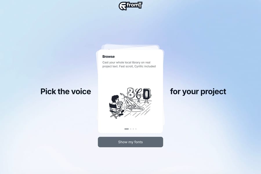
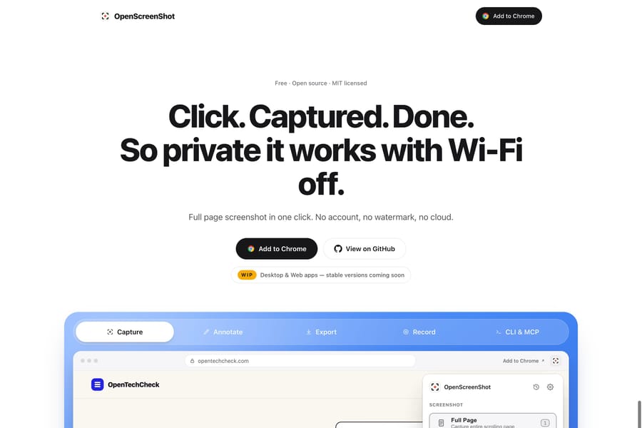
A reader should be able to distinguish the main message, section headings, body copy and supporting labels without studying the page. Bigger is only one signal. A quieter label placed near a bold heading can be clearer than several competing large statements.
Use it in practice
Assign a role to each text style and repeat it consistently. Scan the page quickly to see whether the intended order is apparent.
Watch out for
If every phrase is bold or oversized, emphasis stops helping. Keep visual levels aligned with meaningful heading structure.