P. Studio
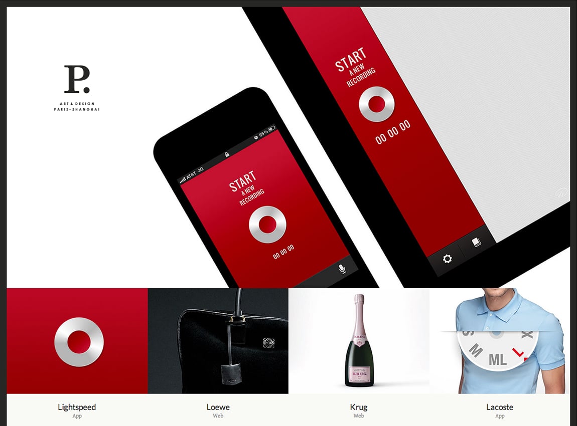
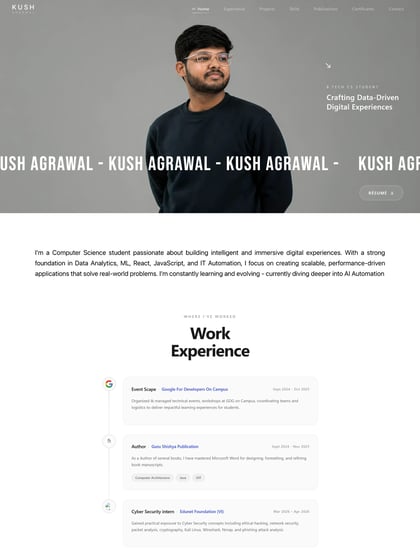
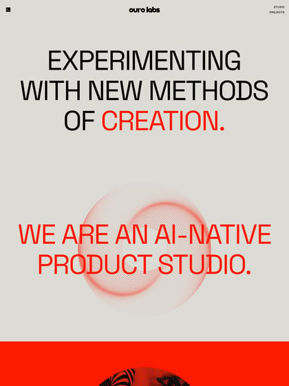
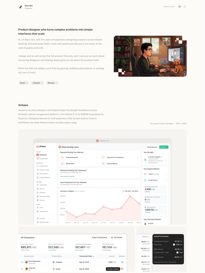
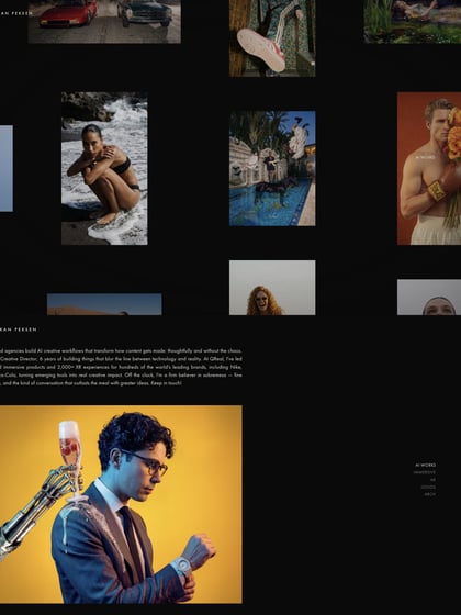
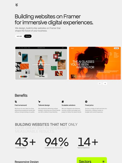
Author unknownAs nice as the big full screen vertical slideshow is (especially with subtle logo placement), I feel its frustrating when it pushes the project thumbs down while a user is reading them. The AJAX loading portfolio items are awesome though and the arrow UX whilst in project view is great – clean and spacious.
This website has unfortunately been redesigned or gone offline, so I have removed the direct link to it. The screenshot below hopefully preserved enough of the design but if you are really keen to inspect further, try this Archive.org link. FYI: the site was first featured on 25 June 2013.
