Panik
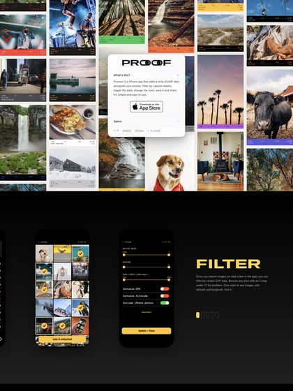
Author unknownWould have been good if the bottom icons where sticky to the website footer but a decent Landing Page for an iPhone app.
This website has unfortunately been redesigned or gone offline, so I have removed the direct link to it. The screenshot below hopefully preserved enough of the design but if you are really keen to inspect further, try this Archive.org link. FYI: the site was first featured on 03 March 2013.
