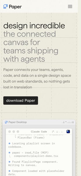
 Mobile hero view
Exciting modular design in this One Pager taking early access requests for Paper, while also announcing their seed round. The page design fills a large screen really well too.
 Mobile hero view
Exciting modular design in this One Pager taking early access requests for Paper, while also announcing their seed round. The page design fills a large screen really well too.