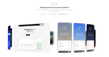
Quartz Studio
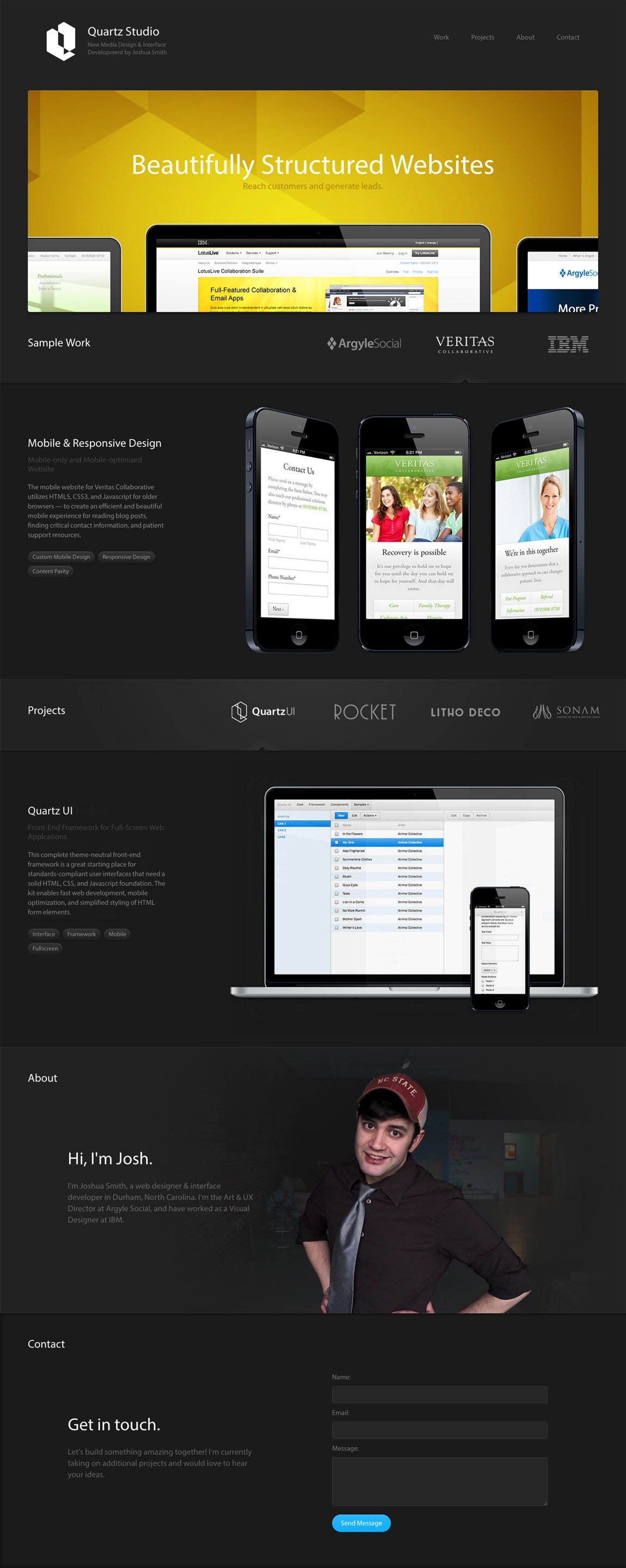
Author unknownI’m feeling the ‘sample work’ section and ‘projects’ section browsing is a tad confusing, maybe different background colors could separate the two better. But a good job on the responsive adaption and some good work by Joshua too!
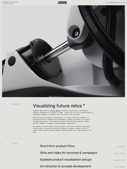
This website has unfortunately been redesigned or gone offline, so I have removed the direct link to it. The screenshot below hopefully preserved enough of the design but if you are really keen to inspect further, try this Archive.org link. FYI: the site was first featured on 05 March 2013.
