Sete Três
 Guilherme Pangnotta
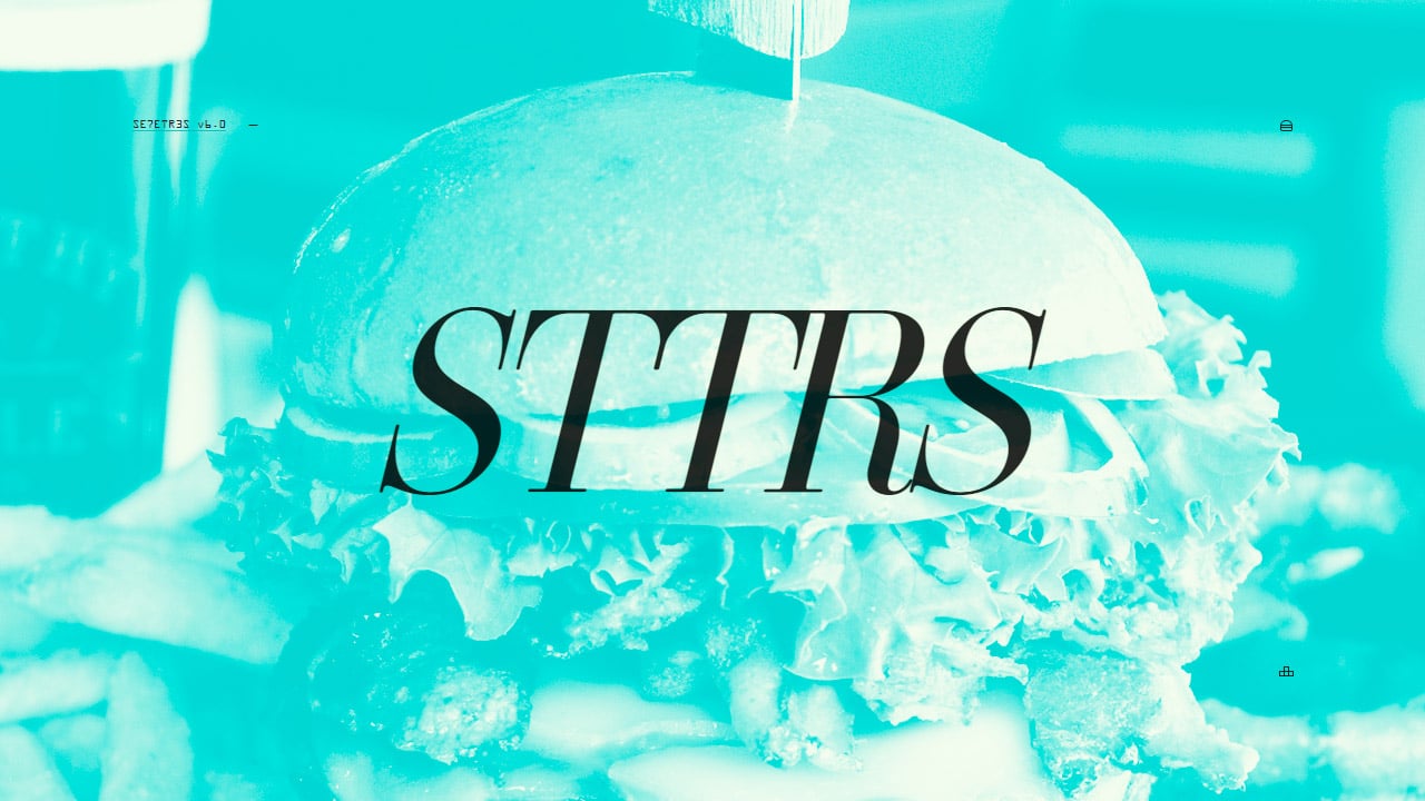
Beautifully minimal One Page portfolio for Brazilian dev/designer, ‘Guilherme Pangnotta’. There are lovely little touches throughout his site, my favorite being the baby hamburger icon instead of the traditional “hamburger” navigation menu icon. Also dig how clicking the site name slides out all the previous versions of the site linked on subdomains.
This website has unfortunately been redesigned or gone offline, so I have removed the direct link to it. The screenshot below hopefully preserved enough of the design but if you are really keen to inspect further, try this Archive.org link. FYI: the site was first featured on 21 July 2015.
