Shokunin
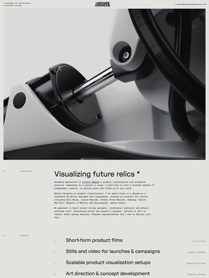
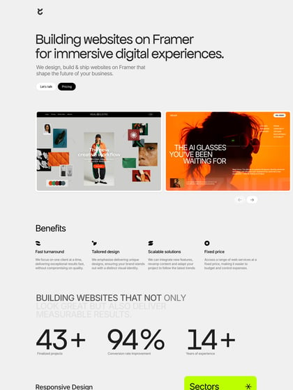
Author unknownSushi restaurant themed One Page portfolio for Dutch digital agency, Shokunin. The illustrations are simply awesome and the tone + branding of the restaurant angle is super consistent throughout the long page. Lovely subtle integration of the language switcher in the header and a great touch with the illustrated services menu. The responsive adaption gets a small crit but a few minor tweaks will tighten that up quick quick. A stellar One Pager to kick off the week!
This website has unfortunately been redesigned or gone offline, so I have removed the direct link to it. The screenshot below hopefully preserved enough of the design but if you are really keen to inspect further, try this Archive.org link. FYI: the site was first featured on 14 April 2014.

