After your strategic marketing campaigns and social media efforts, one of the tried-and-tested methods to capture those potential leads is through a quality website Landing Page.
This Landing Page can act as your Home Page promoting your only service or you could have multiple website Landing Pages, each offering a different service.
In this tutorial we are going to create a Landing Page for a Wedding Photography business focused on a conversion (ie. a potential client contacting you).
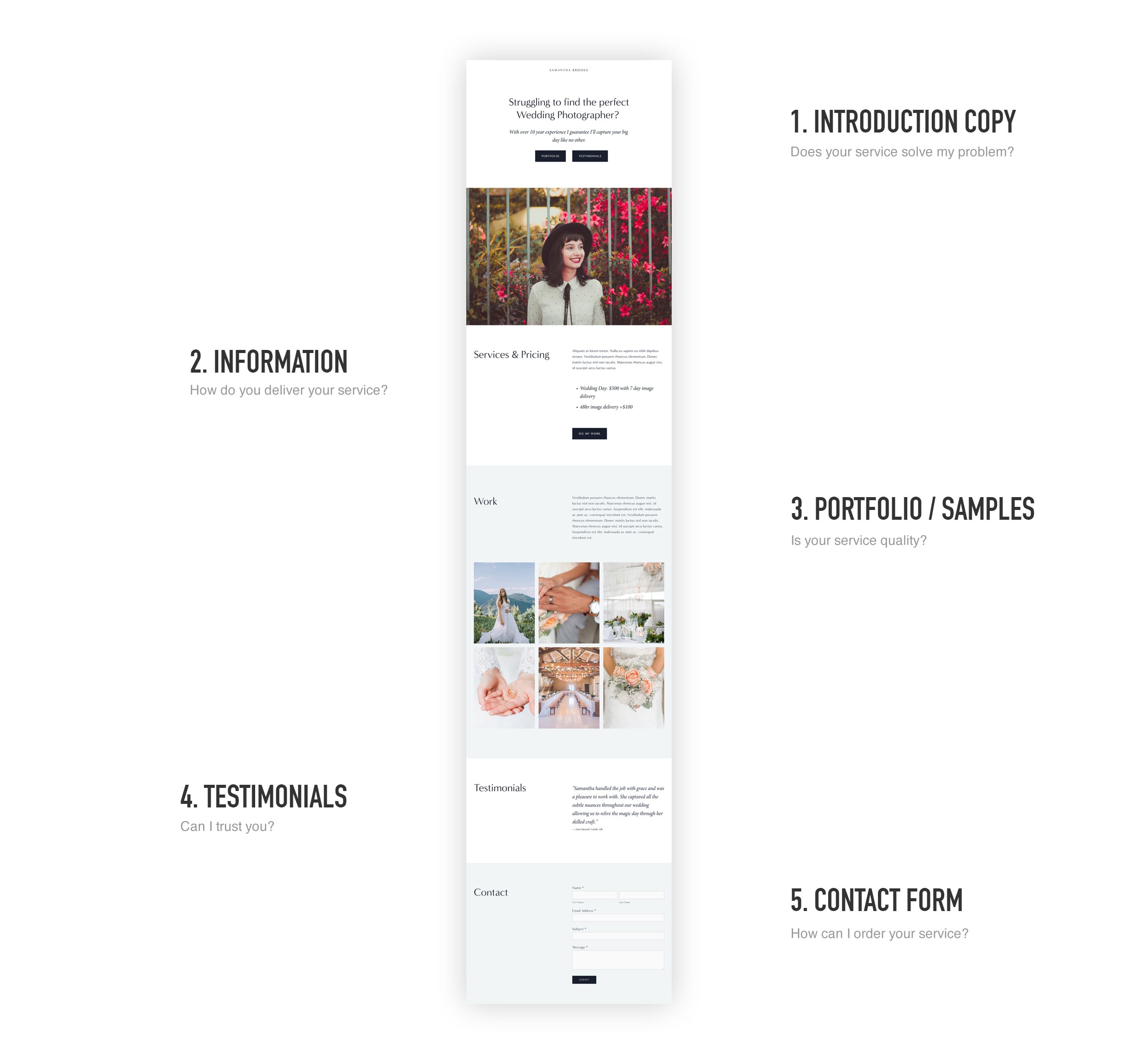
To help construct this Landing Page, we ultimately need to answer these 5 common questions a potential client could ask:
- Does your service solve my problem?
- How do you deliver your service?
- Is your service quality?
- Can I trust you?
- How can I order your service?
Let’s now visualize what sections would answer those client questions:
One Page Love Exclusive Coupon
Yay! Squarespace has been kind enough to give One Page Love readers the exclusive coupon OPL10 for 10% Off* your first website or domain purchase. (There is a free 14-day trial with no credit card needed, so you can try risk-free.)
Please note: this article is based on the Squarespace 7.0 platform.
The new Squarespace 7.1 platform features an improved user interface, so the screenshots might differ but the majority of the content is still relevant. Squarespace 7.1 offers a much more flexible way to build websites, regardless of which template you start with. Squarespace 7.1 templates also support all features and style options including an unlimited number of page sections.
Understanding Index Blocks
To achieve a long-scrolling Landing Page layout we need to utilize Squarespace’s Index Blocks (a stacked content area with sections below each other). In this tutorial I am adapting the Sofia Template into a long-scrolling Landing Page for our service. The template comes baked with an Index Block – so an easy starting point. Sofia also features a clean long-scrolling layout with great whitespace.
How to insert an Index Blocks
There are tons of Squarespace templates with Index Blocks set as the home page (see list) but if yours does not, insert a new one using the main navigation:
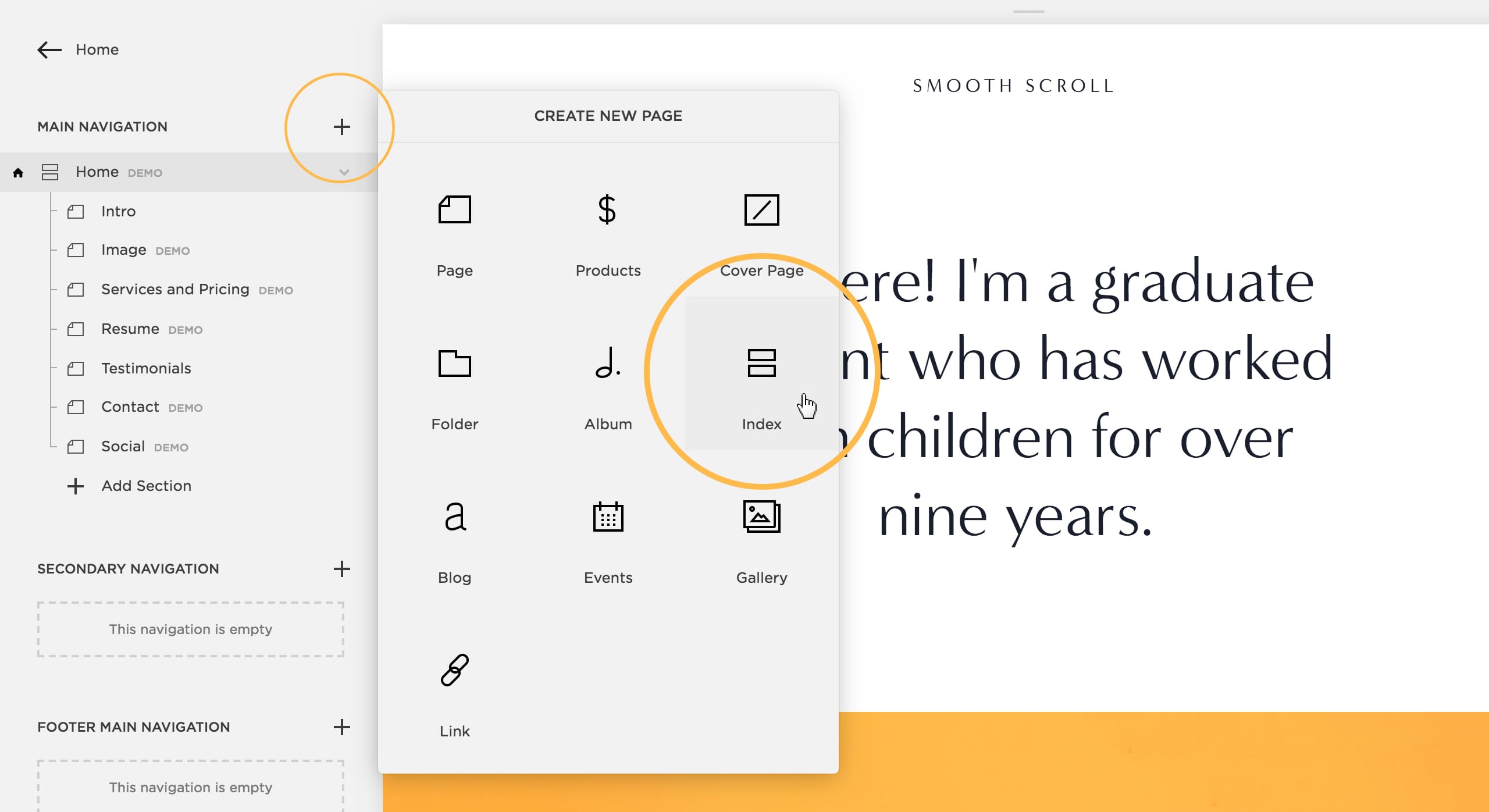
Then simply continue inserting your sections below each other within your Index Block:
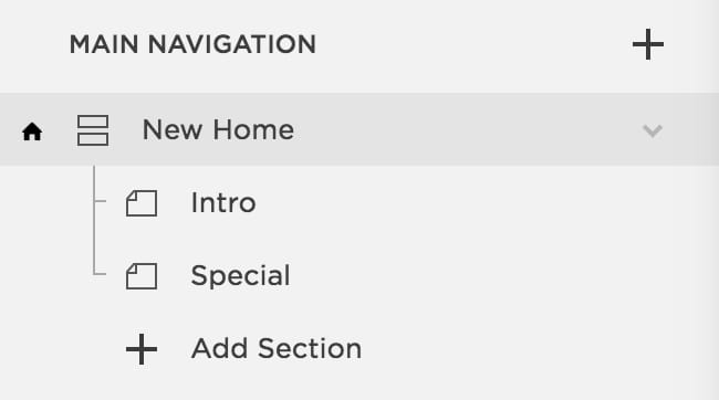
How to edit content within an Index Block
Each section within an Index Block is essentially a blank area for content, where a template would have pre-designed these area with placeholder content. You can edit content by:
- Hovering over Index Block sections until the section options appear top left, then click edit
- Now you can hover your cursor within the content area, then select edit on the types content you want to edit
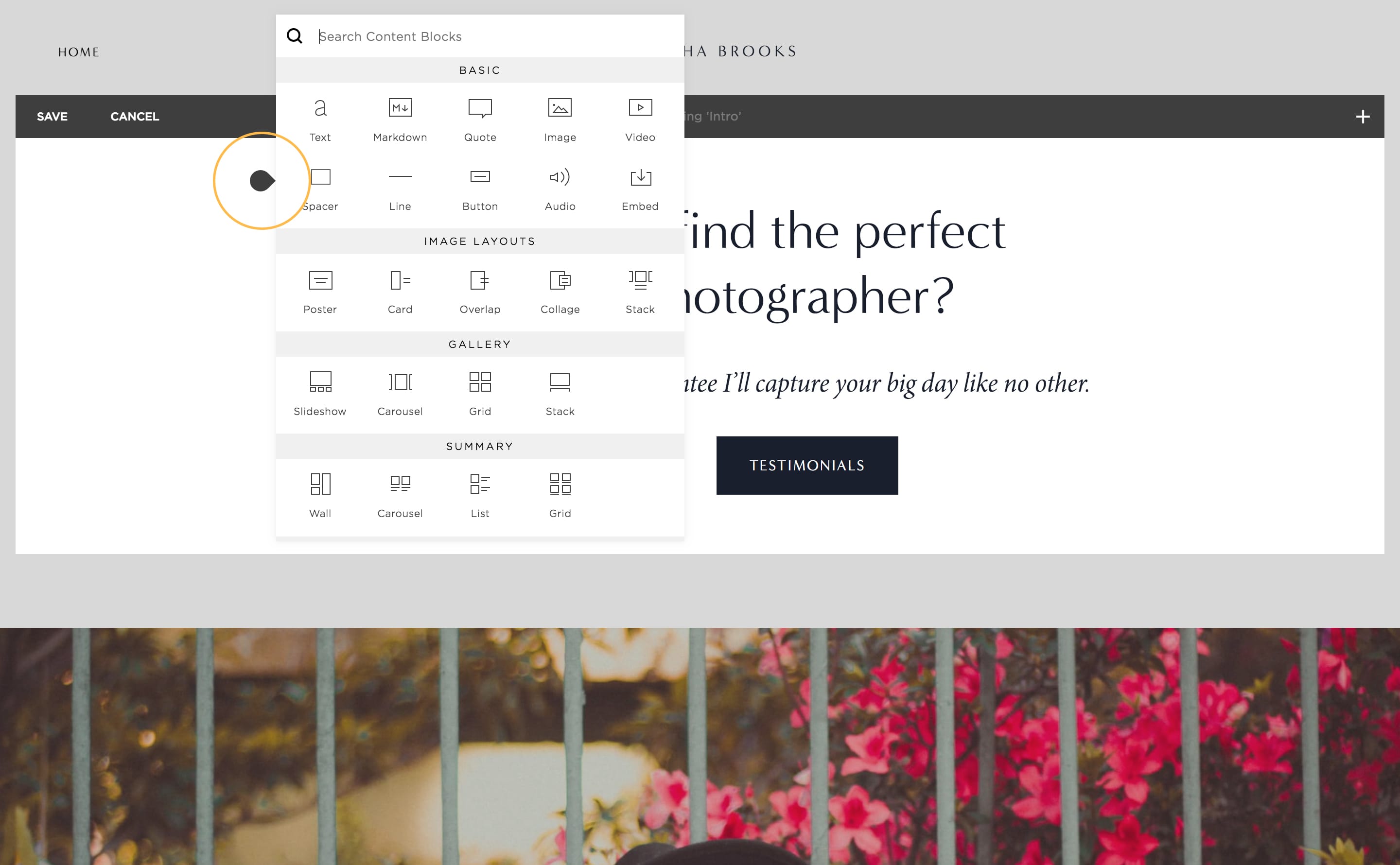
- To add new content, hover your cursor around content areas, where you will be prompted to insert new content blocks with a dark insert icon. See the dark insert icon highlighted yellow here:
What sections should I use for my Landing Page?
Earlier we visualized 5 sections for introduction, information, portfolio/gallery, testimonials and contact. With conversions in mind, lets relook each question, what content we need and why:
1. Does your service solve my problem?
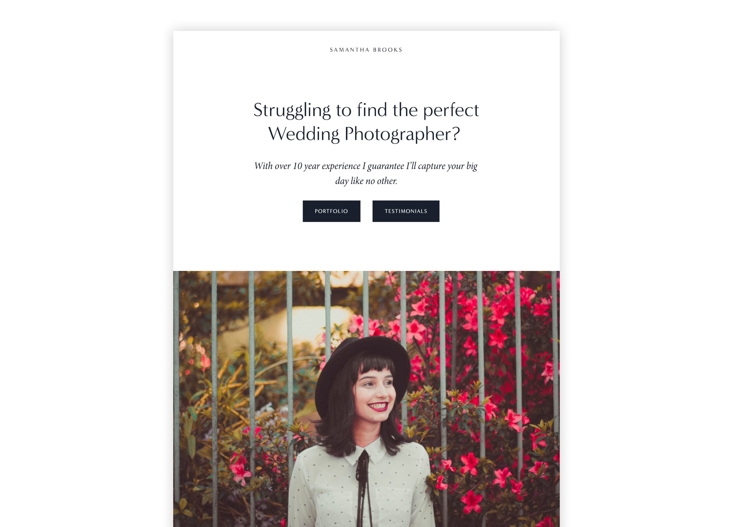
When a user arrives at your Landing Page we want the introduction copy to identify with their problem.
Someone wanting a photographer for a wedding is probably stressed about finding the right photographer. The day is precious and needs to be captured properly. I’ve answered all immediate concerns with the intro copy followed with an overview covering experience:
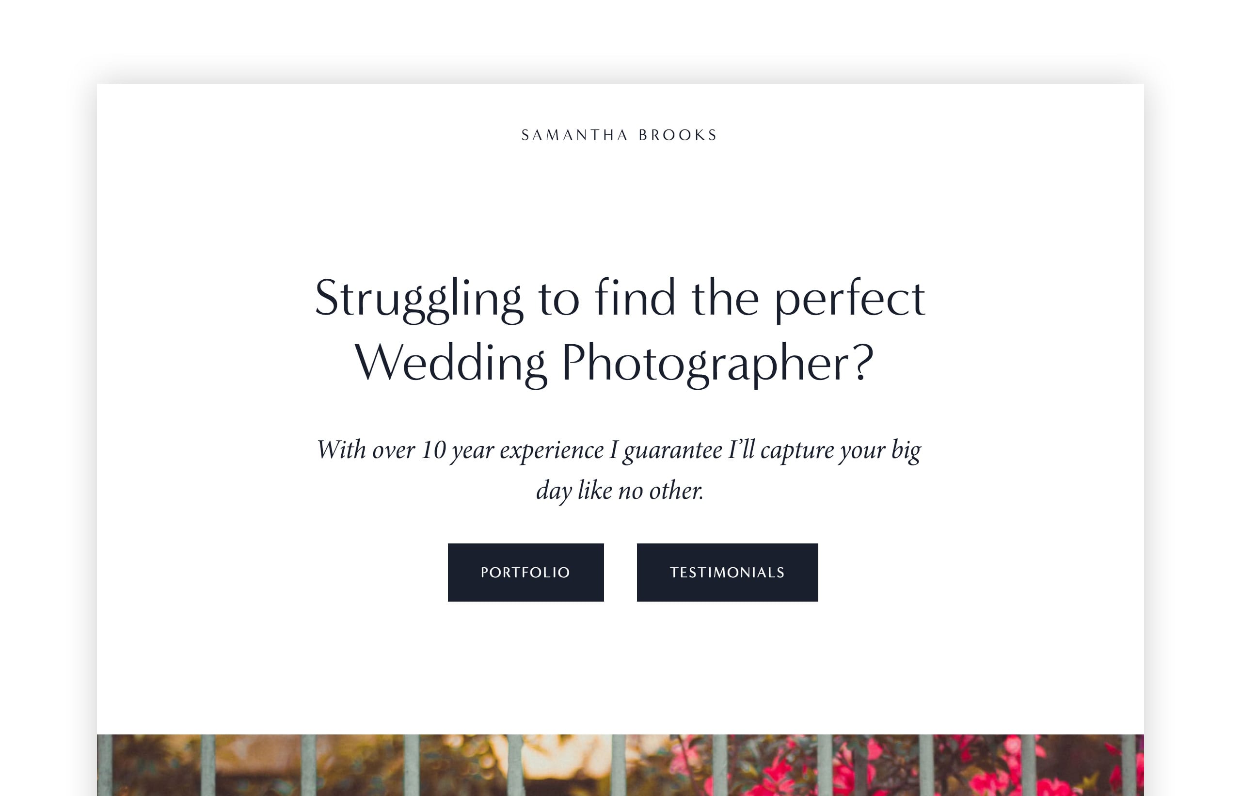
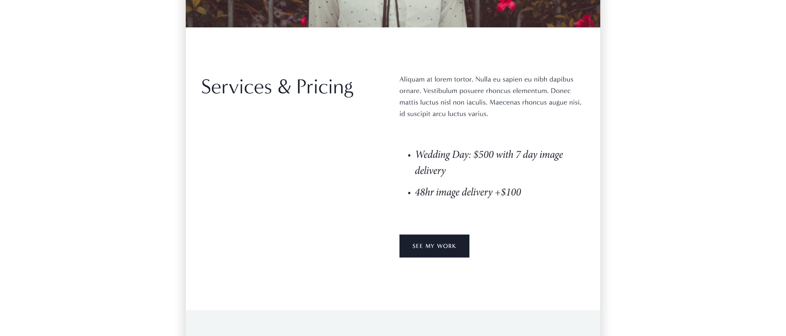
2. How do you deliver your service?
Don’t get too wordy here, a simple overview will do and they can request more information. Beneath the overview is a clear day-rate and also information on expedited delivery (probably a FAQ).
3. Is your service quality?
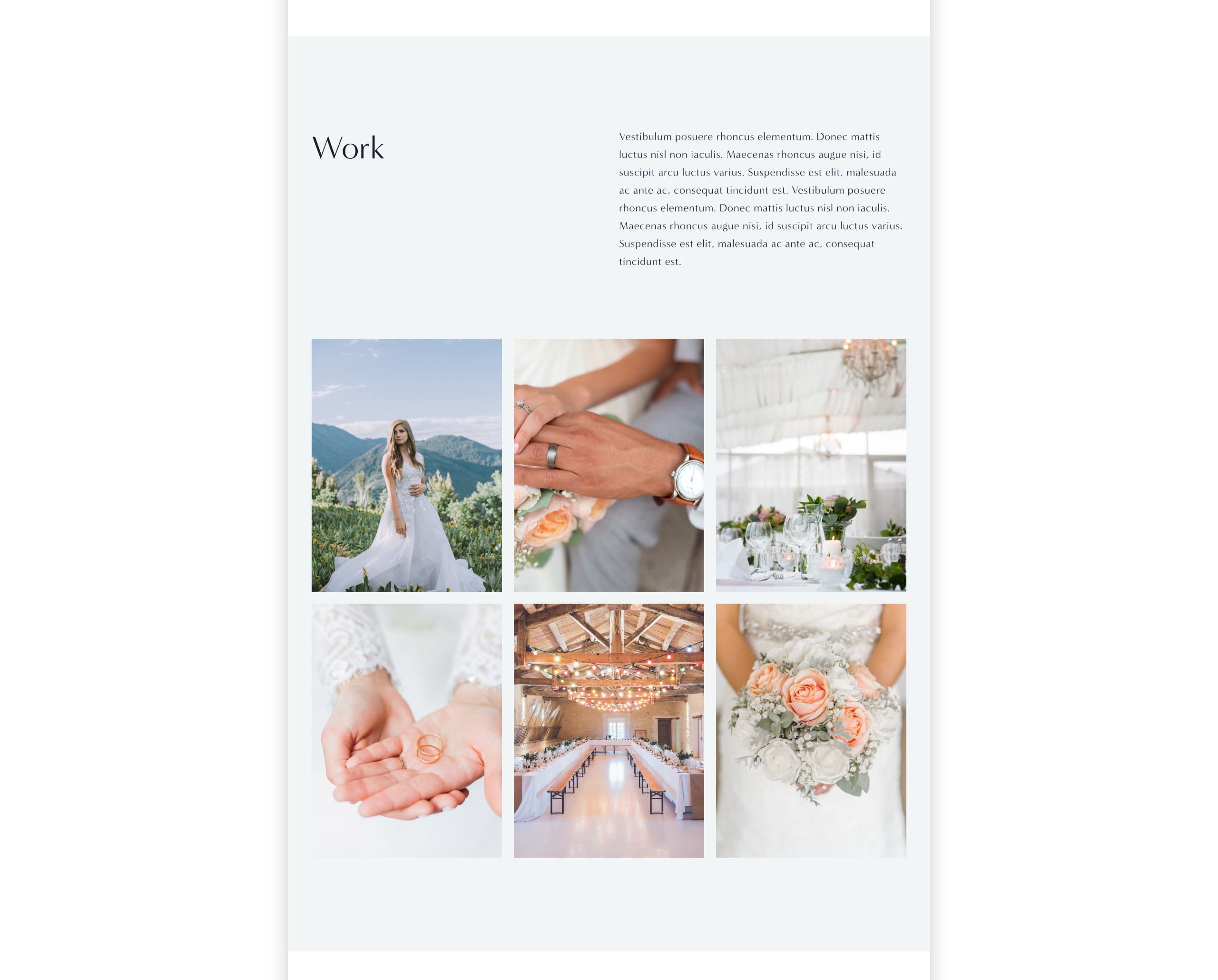
Here we want to showcase our talents with quality, Retina-optimized images. A grid of your 6 best photos is a lot more effective than your last 4 years of work (probably including a few average quality images). Squarespace have a convenient Gallery section block with several layout options. Demo’d here is the simple 3 column-grid:
4. Can I trust you?
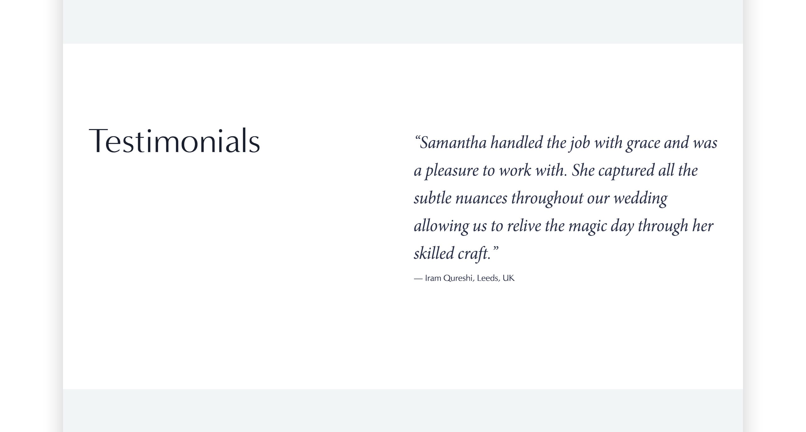
The importance of testimonials is so underrated in Landing Pages and heavily affects conversions. This is your team cheering for you while answering doubts a client could have.
A good testimonial commends your service, a great testimonial highlights parts of your service while answering doubts the client could have.
Note how I answered if the photography would be intrusive and if you capture the fine details:
If possible, try include a clear image of yourself (no sunglasses). I’ve added the image to the introduction that show’s transparency, looks professional and builds trust:
5. How can I order your service?
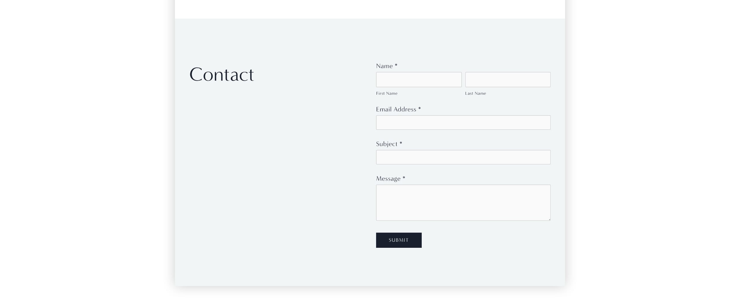
By this point in the scrolling-journey the user should be impressed and convinced you are the right person to hire for their wedding. We end with a clear contact form to capture their details and lock in that successful conversion.
FAQ: What are the benefits of using Squarespace?
Squarespace is a leading online website builder. What sets them apart is their superior level of design and award-winning customer support team available 24/7. Other main benefits are:
- No Website Hosting Needed - their platform is fast and secure.
- Online Content Management - all edits are done within your browser, no software needed.
- Easily Drag and Drop Images - unlimited galleries with unlimited bandwidth.
- Free Domain Name - when registering for your first website, if you pay annually (renews at standard rate).
- Beautifully Responsive - all templates work for all devices, so you only have to design your website once. Test and preview how your website will appear on a range of screen sizes.
- Blog Sections - can easily be added for content marketing and to share your journey.
- Commerce Solutions - are an upgrade away if you want to start selling products.
- Email Marketing - gather email addresses, send marketing emails and analyze the reader email activity.
- Member Areas - create private website sections only accessible to signed-up or paying members.
- Scheduling - add an online scheduler to your site to diversify your revenue with professional services or classes.
That’s a wrap! Don’t forget your 10% Off coupon*: OPL10
That’s a wrap! Don’t forget your 10% Off coupon: OPL10
I hope you enjoyed this overview and tutorial on how to building a converting Landing Page for your service. Props to Squarespace for creating a platform where we can create beautiful Commerce websites, easily. If you missed it I wrote a tutorial last month on how to Strengthen your next job application with a Squarespace Cover Page.
* The OPL10 coupon offer only applies to first payment of subscription on Squarespace, does not apply to future recurring payments or monthly plans, and may not be combined with any other offer codes or discounts.
Much love,
Rob
Twitter: @robhope
Email: [email protected]




![How to create a free link in Bio Site in minutes [video]](https://assets.onepagelove.com/cdn-cgi/image/width=420,height=222,fit=cover,gravity=top,format=jpg,quality=85/wp-content/uploads/2022/07/sqsp-thumb.jpg)
