← All typefaces
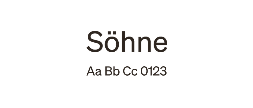
Söhne
Söhne revisits the grotesque lettering associated with New York’s subway wayfinding. Its design connects Akzidenz-Grotesk and Helvetica influences with the texture of physical signage. Alternate a and g forms offer small but meaningful changes to its otherwise restrained voice.
- Style
- Sans serif
- License
- Paid license
- Designer / foundry
- Klim Type Foundry ↗