AspireOne
 Abbas Monfared
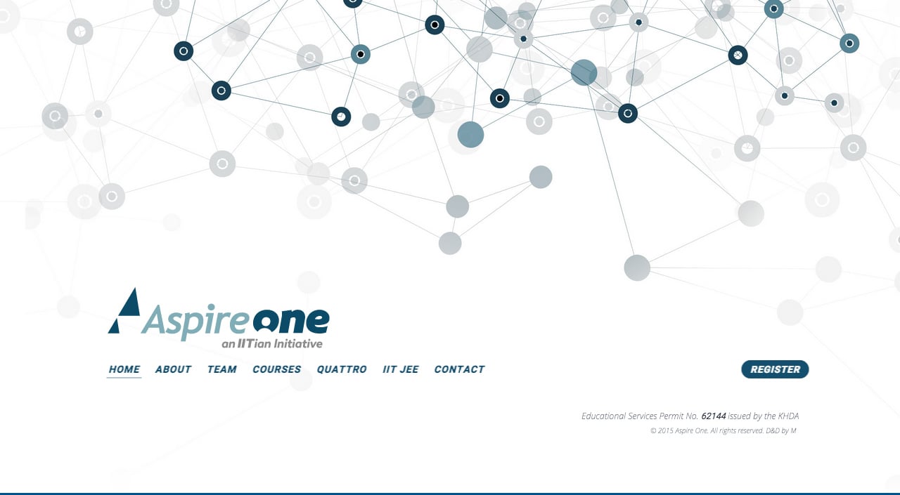
Responsive One Pager for educational startup ‘AspireOne’. There are a few elements we don’t normal accept (scrolljacking, minor typos, very long paragraph lengths, blurry text) but there is some very impressive CSS3 animation and transitions we wanted to feature. The Course content transitions are unique and that full screen off-canvas Register Form transition is awesome. Use the bottom sticky navigation for the best experience and not your mouse scroll.
This website has unfortunately been redesigned or gone offline, so I have removed the direct link to it. The screenshot below hopefully preserved enough of the design but if you are really keen to inspect further, try this Archive.org link. FYI: the site was first featured on 14 April 2015.
