Beaconia
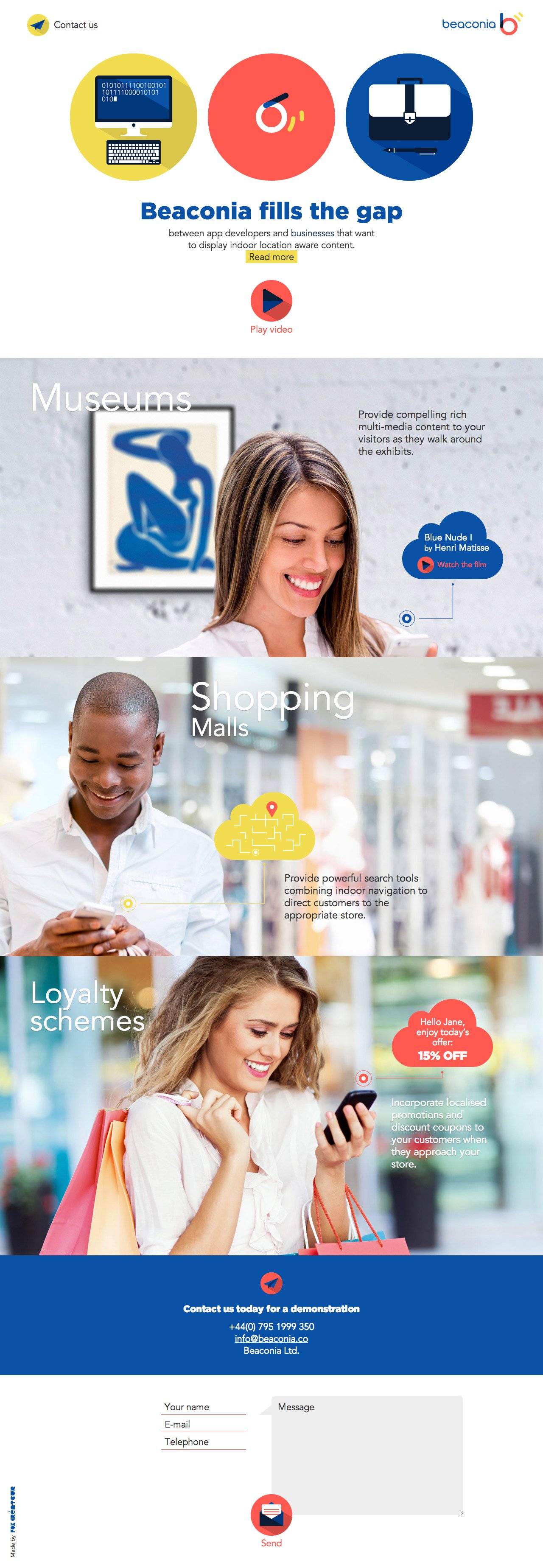
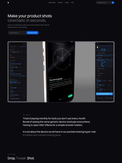
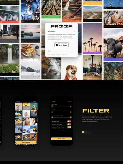
Author unknownOne Pager promoting an upcoming app called ‘Beaconia’ that claims to be a platform where business can promote specials to customers within a certain location. Interesting choice putting the contact link left and logo right in the header. The window also really needs to scroll down when you click the video play button. The site does mean well though and the imagery is positive. I also really like that fresh layout for a Contact Form.
This website has unfortunately been redesigned or gone offline, so I have removed the direct link to it. The screenshot below hopefully preserved enough of the design but if you are really keen to inspect further, try this Archive.org link. FYI: the site was first featured on 08 October 2014.
