Doze Studio
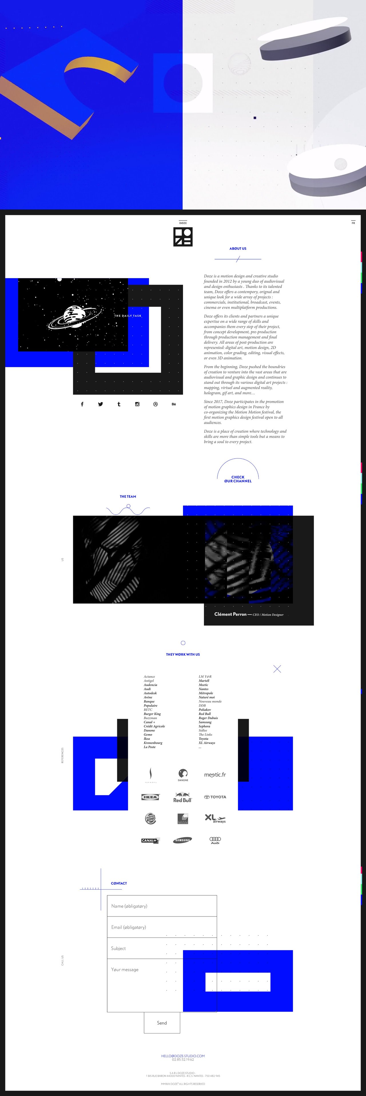
Author unknownWhat a pumping intro showreel video in this parallax scrolling One Pager for motion design outfit, Doze Studio. Scrolljacking aside, there is so much noteworthy attention to detail. They have reused the minimal DOZE logo throughout the site – favicon, preloader, section backgrounds and navigation states. Other highlights include the subtle page border appearing as you scroll, the mini animations under section headings, hover sensitive team carousel and the unique contact form select states. Excellent effort and stoked to see this built on WordPress too.
This website has unfortunately been redesigned or gone offline, so I have removed the direct link to it. The screenshot below hopefully preserved enough of the design but if you are really keen to inspect further, try this Archive.org link. FYI: the site was first featured on 04 July 2017.
