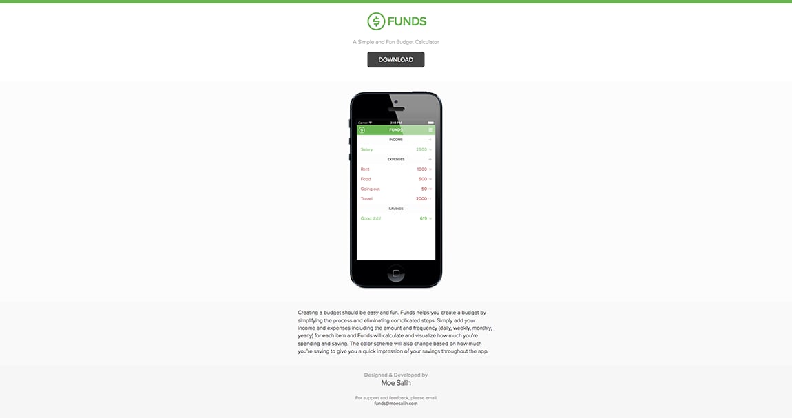
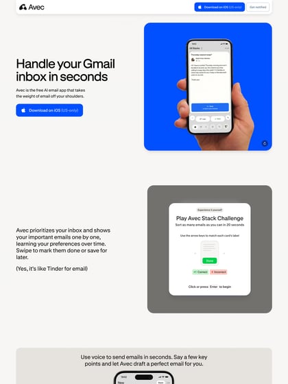
Funds
Author unknownReally simple One Pager for a new budgeting iPhone app called ‘Funds’. This One Page design works but I think if the device was on the left, with content and download button to right – it would be a better arrangement without having the user scroll for more info.
This website has unfortunately been redesigned or gone offline, so I have removed the direct link to it. The screenshot below hopefully preserved enough of the design but if you are really keen to inspect further, try this Archive.org link. FYI: the site was first featured on 26 September 2013.