What it means
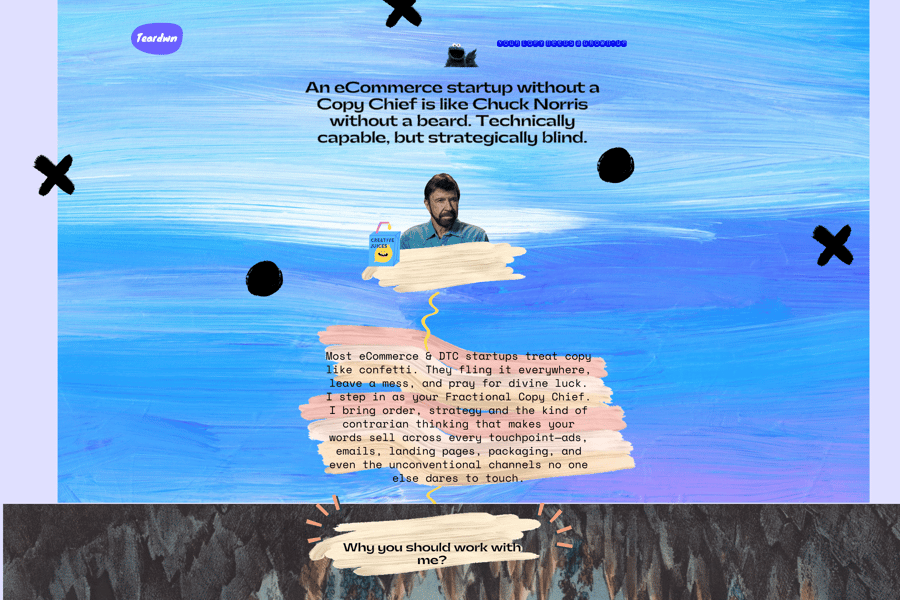
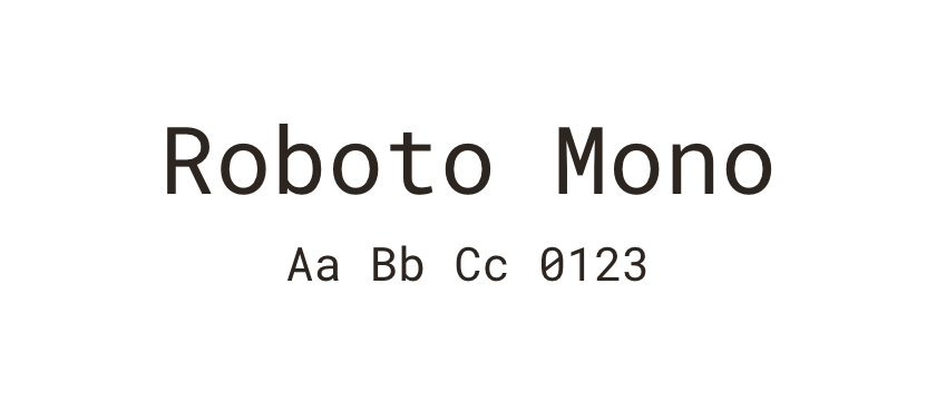
This is useful when the alignment of characters carries meaning, as in code and certain tabular displays. The resulting rhythm also gives labels a distinctive texture. Equal advance widths do not mean every drawn letter fills the same area: an i still has more visible space around it than an M.
Use it in practice
Use it deliberately for code, technical annotations or a small secondary voice. Check numbers and punctuation as carefully as letters.
Watch out for
Long prose in a monospace face can feel wide and repetitive. Avoid using it everywhere just to create a technical mood.